Culture, Craft and Savoir-faire: How we created the visual identity for “Contamos todos” at Macedo de Cavaleiros
Words: Maria Helena.
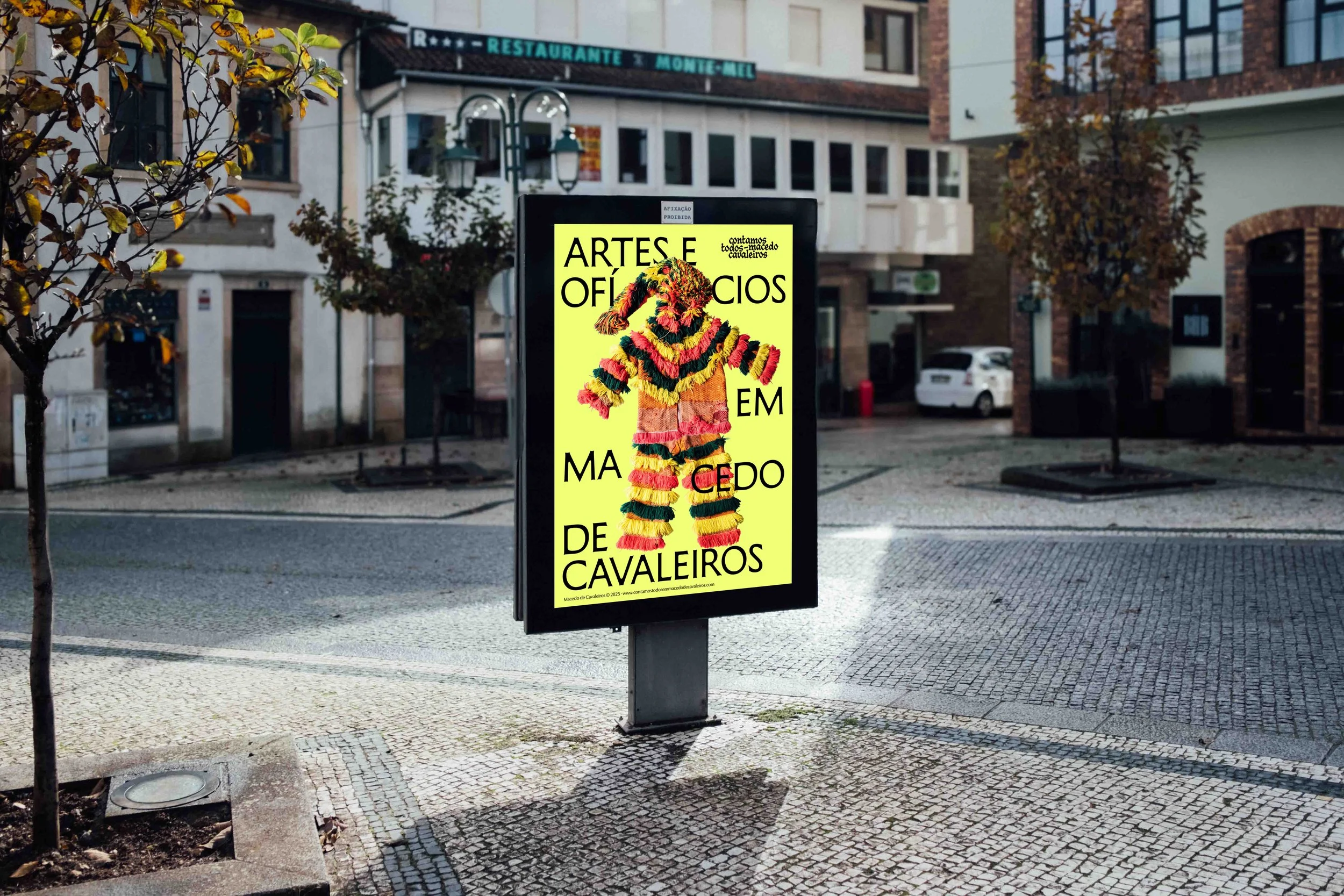
Poster Mockup.
This year we started a new project in Trás-os-Montes, North-East Portugal, where we're working across two different areas: Saber Fazer, with a research, education and editorial initiative dedicated to wool and silk, and Ofício, covering all the work of creating a visual identity and preparing the project's communication and editorial materials.
Contamos Todos is a social integration through culture project that also includes another component dedicated to theatre and performing arts, led by the fantastic cooperative Filandorra - Teatro do Nordeste.
All the visual identity work aimed to build a bridge between the "object" of the work and the people it's for: the culture of Macedo and its tangible and intangible heritage, and a new generation of producers, craftspeople and cultural agents, supported by an inclusive network of educators and professionals established and active in the region.
With this project, we wanted to reflect on different ways of looking at folklore, the vernacular, and the interactions of a heritage constantly changing and reinventing itself.
We also wanted to create a system that felt alive enough to be applied across multiple formats, while staying open enough to evolve as the project develops.
At the centre, "Contamos Todos" directly connects to some of the core principles of Barbot Bernardo and Saber Fazer's practice: craft, culture and education. With its own research and rigorous technical knowledge, Saber Fazer's program for "Contamos todos" connects Macedo de Cavaleiros' rich textile heritage with educational training, turning this knowledge into a resource for contemporary projects and businesses.
With this in mind, we began our work, informed by Saber Fazer’s project research, as well as the landscape and cultural background of Trás-os-Montes, which includes the textile heritage within the Caretos costumes, the masked figures who appear during winter festivals.
The goal was to establish a bridge between the region's material and cultural world and new visual signals, creating an identity system capable of working in different media and communication materials.

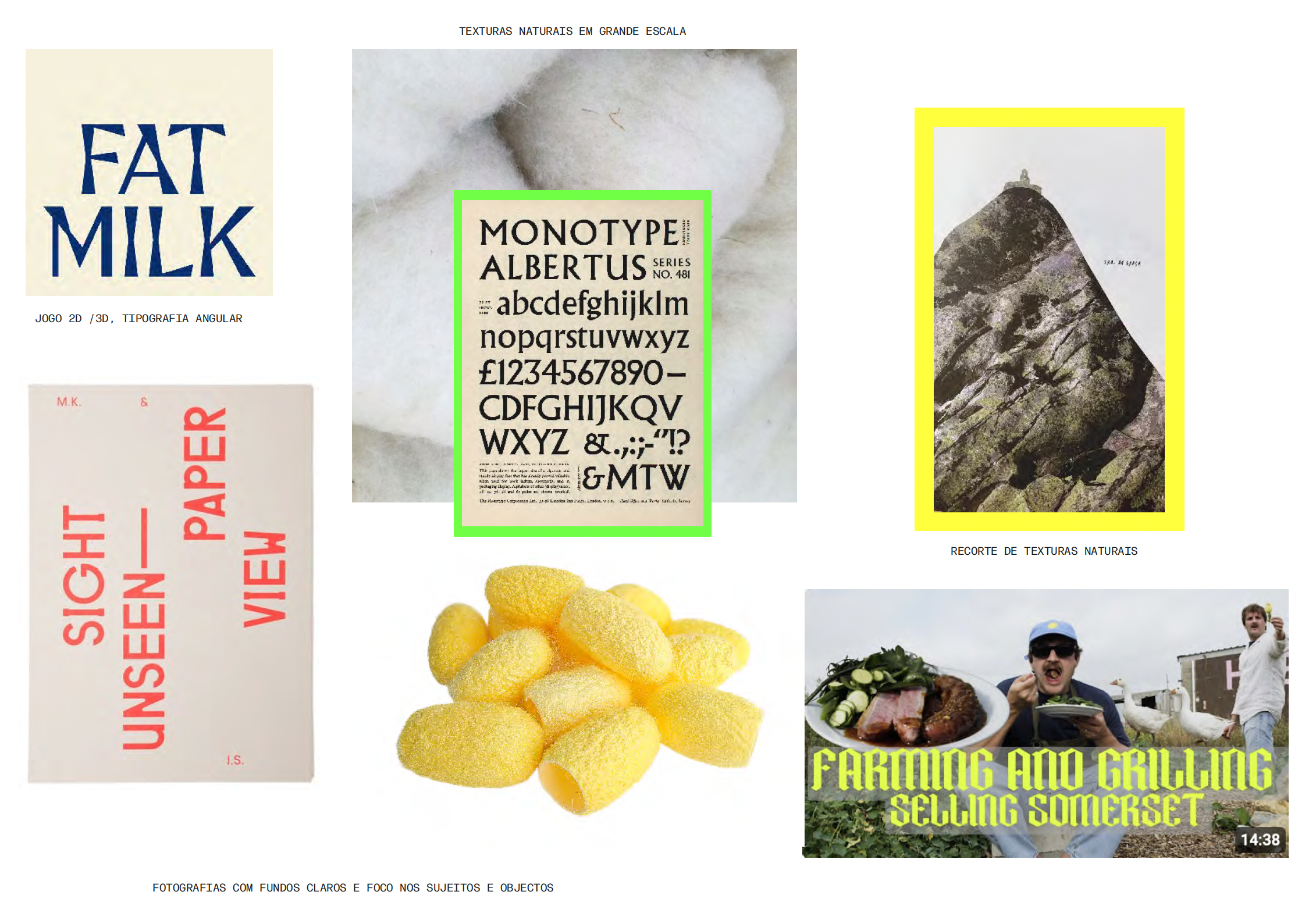

The moodboards with our references, concepts and first ideas.
We started with the logo, set in a blackletter-influenced typeface, which connects to the idea of handmade lettering and folk visual language. When used in a bright colour, it loses its heavy, dark tone and takes on new layered meaning. Working across different media and scales, the logo is compact enough to fit in the corner of a publication cover without disappearing, and bold enough to fill a full slide on its own.
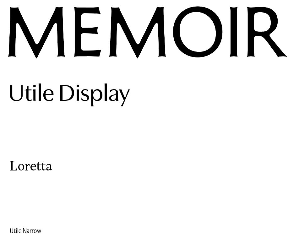
The typography system is defined in three levels. For large-scale display use and headlines, we chose Memoir — a serif with Roman proportions, slight contrast, and "melted joints" that go from sharp to soft. For titles and mid-scale text, we use Utile Display, a sans-serif with asymmetric strokes that create a sense of rhythm and classical character. Body text runs in Loretta, chosen for its editorial readability, low contrast and open counters — comfortable across long stretches of text. For small text, such as footnotes or technical information we use Utile Narrow, pairing with the display option, compact and highly readable for small sizes.


Mockups showcasing the visual system in use.


Editorial mockup for a publication. When used in a bright colour, the logo loses the dark tone and takes on new meanings. Poster mockup for the Theatre and Performance Arts area of the project.
For this project, we did something we’ve never done before: we developed two colour palettes. One is inspired by local textile weaving patterns, and the other by nature and the silk cycle, such as mulberry leaves, silkworm and cocoon yellow tones. We also looked at the natural landscape with the dark stone tones like granite and schist and the greens and blues from the forest and river flows.
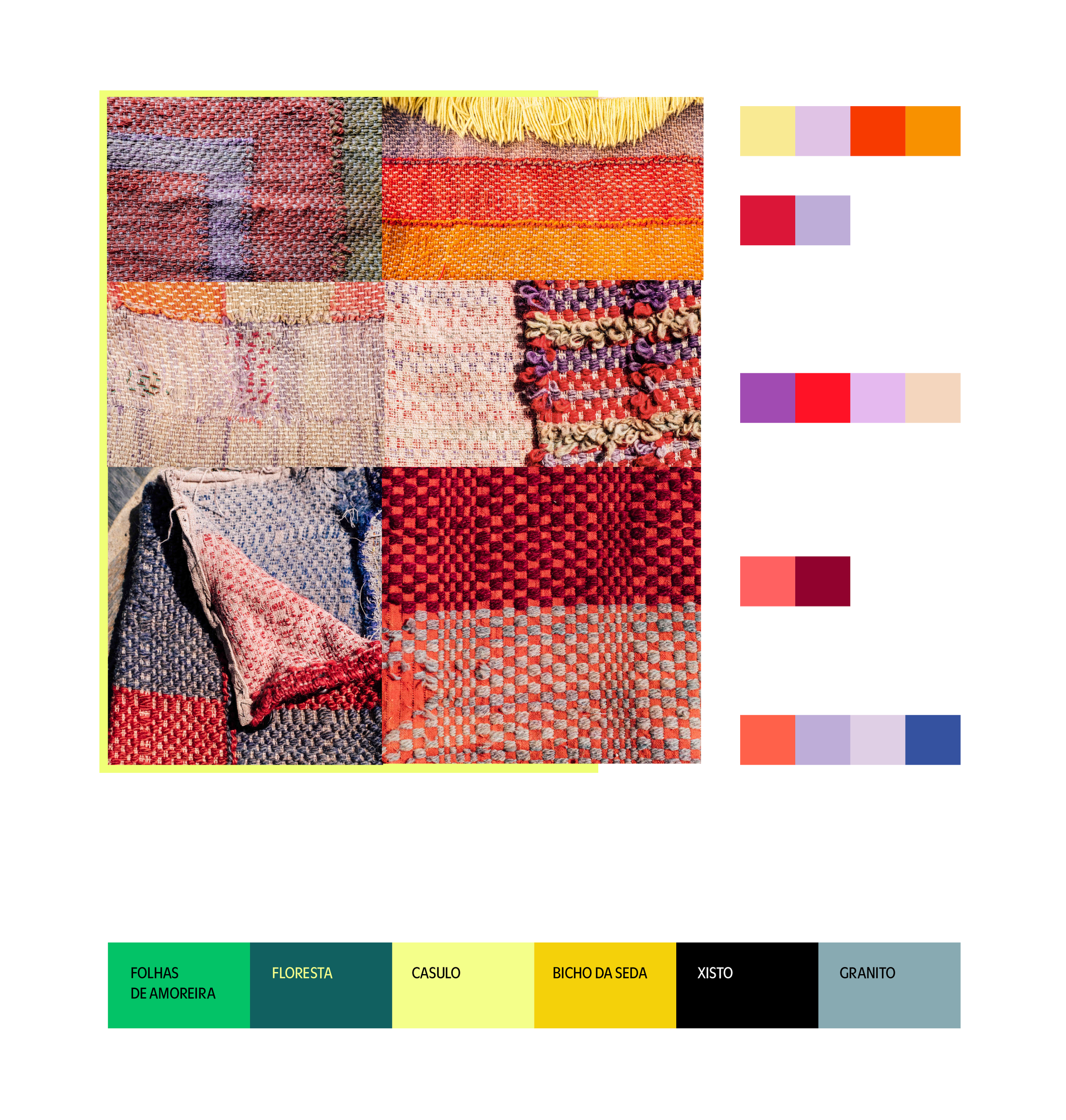
Two colour palettes: the first inspired by local textile weaving patterns and the second inspired by nature and the silk cycle.
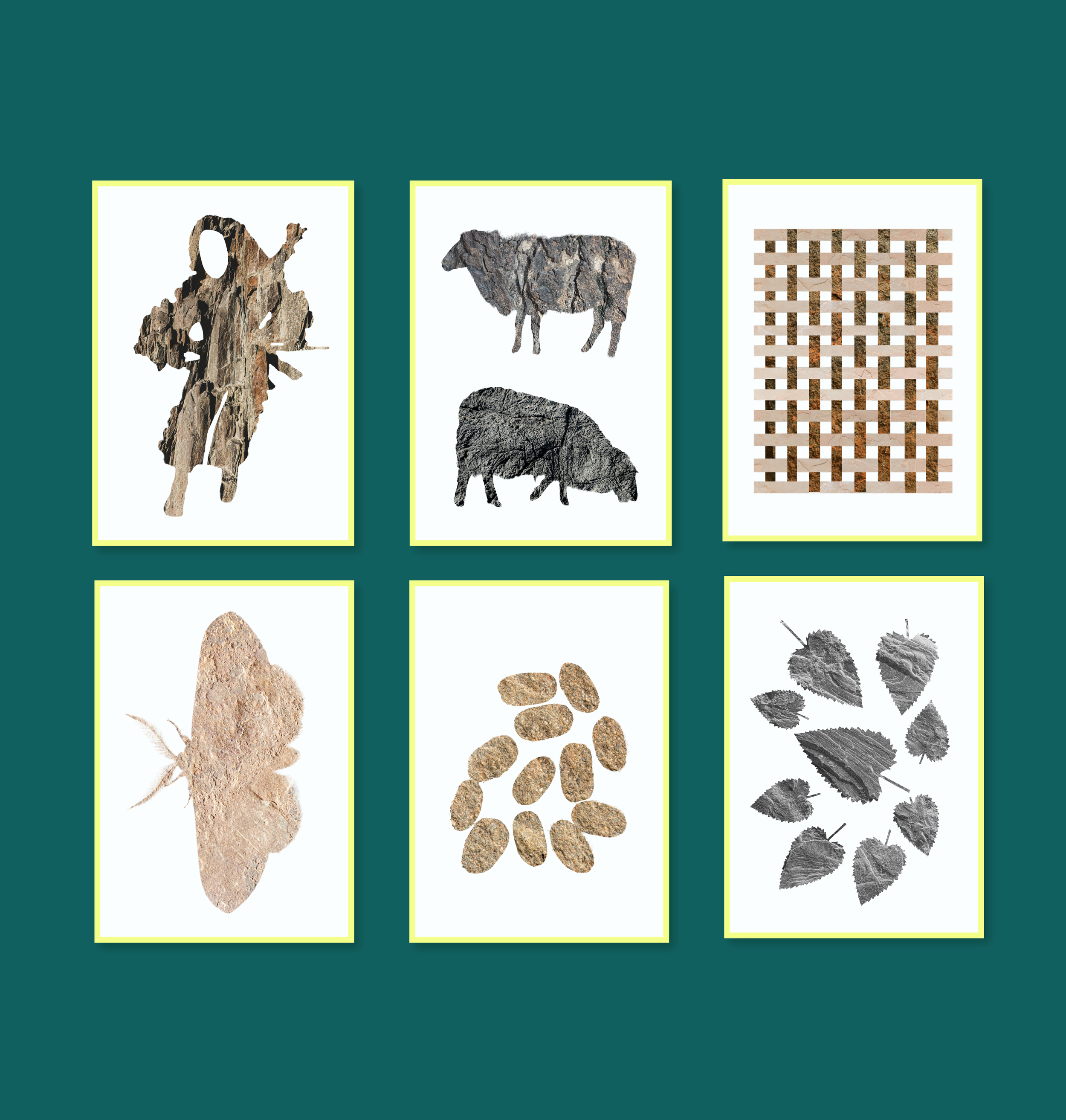
For the imagery, the visual language is built around natural texture cut-outs of cultural figures and objects (the "careto" traditional figure, woven patterns, silk sheep, butterflies and cocoons) filled with photographic natural textures of the region.
As this is an ongoing project, we will continue to update and showcase further developments.
Credits:
Creative direction: Miguel Barbot
Art direction and design: Maria Helena
Photography: Alice Bernardo
Web development: Cristiana Braz and Mariana Teixeira
Project co-financed by the NORTE 2030 Regional Program