Helping Type Thrive - Ligado Studio was created to support the type design community and we designed their visual identity.
Words: Maria Helena. Photos of the founders: Miguel Barbot
As you might know, Joana Correia has been a friend of the studio for some time now — we regularly work together on various projects, including Nova Type Foundry's communication strategy and graphic design (which you can read about in an earlier post).
Recently, Joana and co-founder Paley Dreier asked us to develop the visual identity for their new venture, Ligado Studio, a consultancy that supports type designers and foundries in growing their businesses.
Joana is a type designer and founder of Nova Type Foundry, with over a decade of industry experience in different roles, and Paley spent over 15 years building and scaling type businesses, working on licensing deals and distribution partnerships.
Together, they founded Ligado Studio to bridge the gap between creative craft and sustainable business in the type industry.
Type designers today are asked to be far more than designers — they manage licensing, handle business negotiations, plan library releases, build marketing strategies and maintain client relationships, often entirely on their own.
Ligado steps into that gap as a working partner, offering foundry growth and strategy, type development guidance, marketing and communications support (a partnership with our own studio), and one-on-one coaching, always tailored to each practice's specific stage and reality. It is, in their own words, collaborative, practical and rooted in the realities of type design and foundry life.
Our first challenge was one of positioning. Ligado operates in the world of type design, a field that tends to attract strong visual opinions and a sophisticated audience — for people who notice kerning from across the room. The aim is to communicate confidence, warmth, and a certain directness — the visual equivalent of a good conversation with someone who really knows their subject.
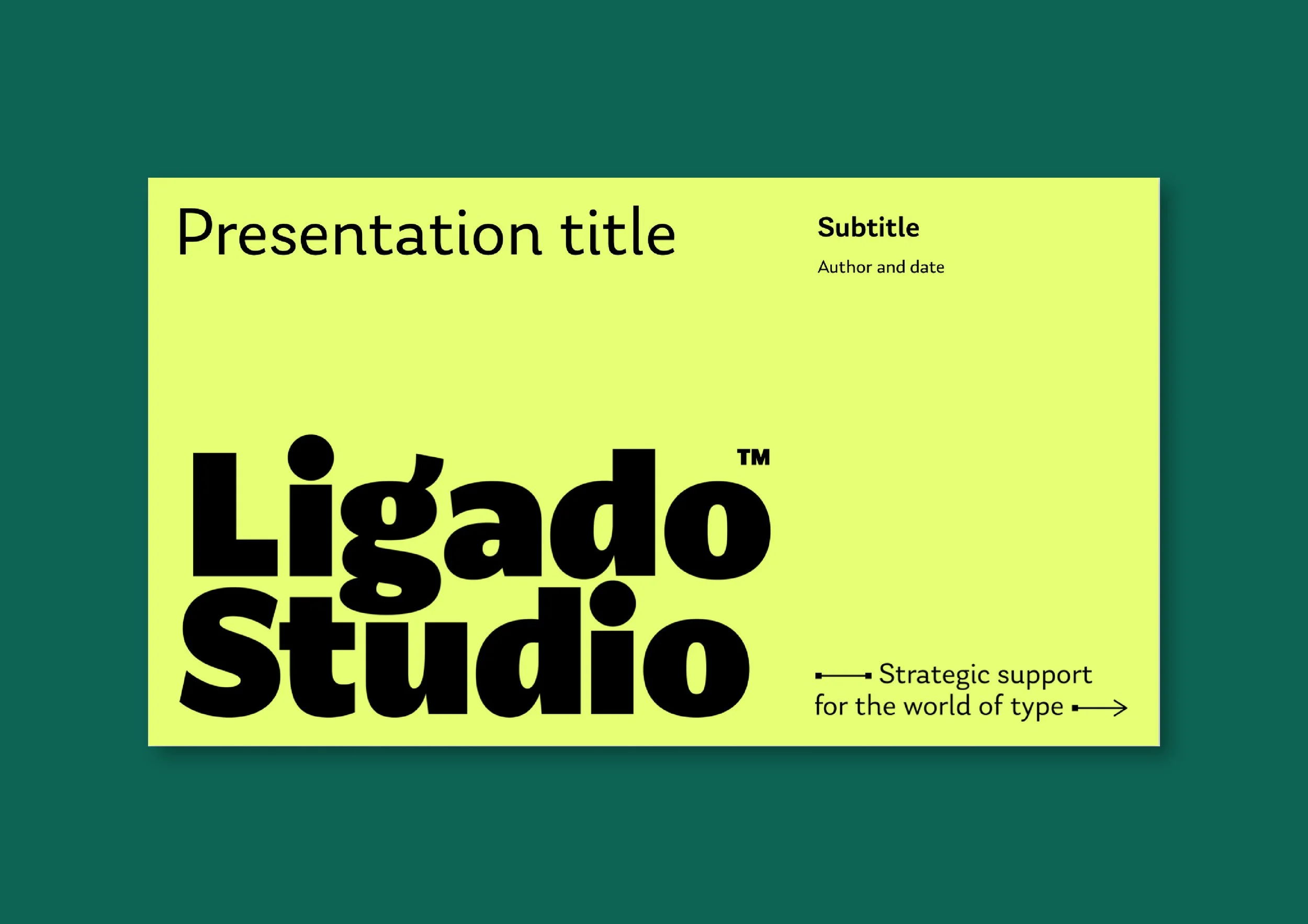
The logo for Ligado Studio needed to work across the digital platforms where Joana and Paley spend most of their professional lives. So this means flexibility, boldness, seriousness/professionalism, and approachability. It needed to work in both larger and smaller sizes while creating a distinctive imprint.
Typeset in Anona Black, a font by Nova Type Foundry, the aim was to bring the typographic design and details to the forefront. We used stylistic alternates for "a" and "g" and worked on each glyph individually to create connections and a balanced distribution of positive and negative space.
The logotype works across formats, giving the identity flexibility for everything from website headers to presentation decks and email signatures. The main logo is stacked in two lines, which gives it a compact footprint. At display size, the rounded forms of the g, d, and o become almost sculptural.
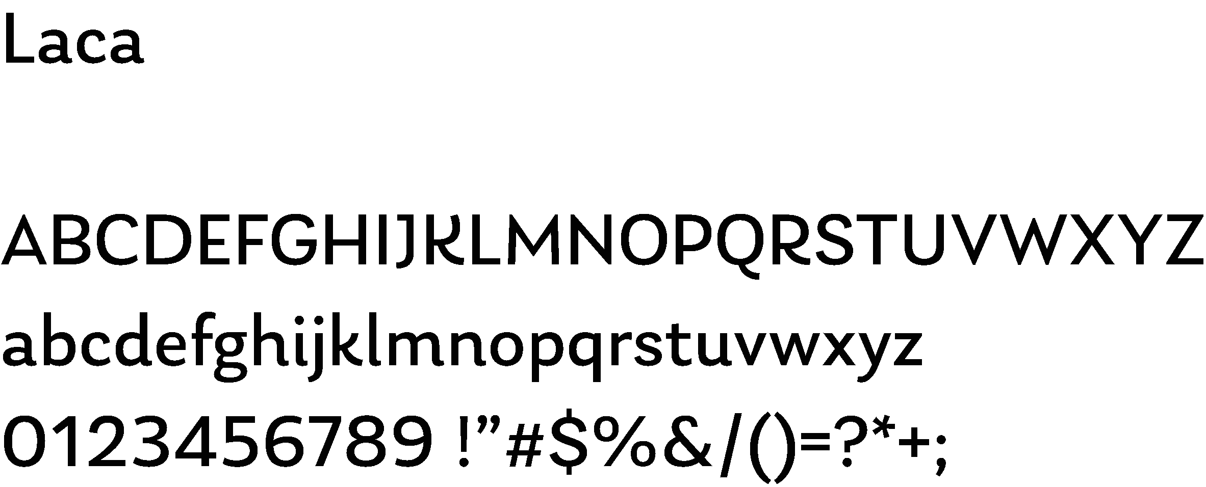
For headlines and body copy, the main typeface is Laca Pro, from Nova Type Foundry, with a textured, humanist, detailed style that balances distinctiveness and legibility.
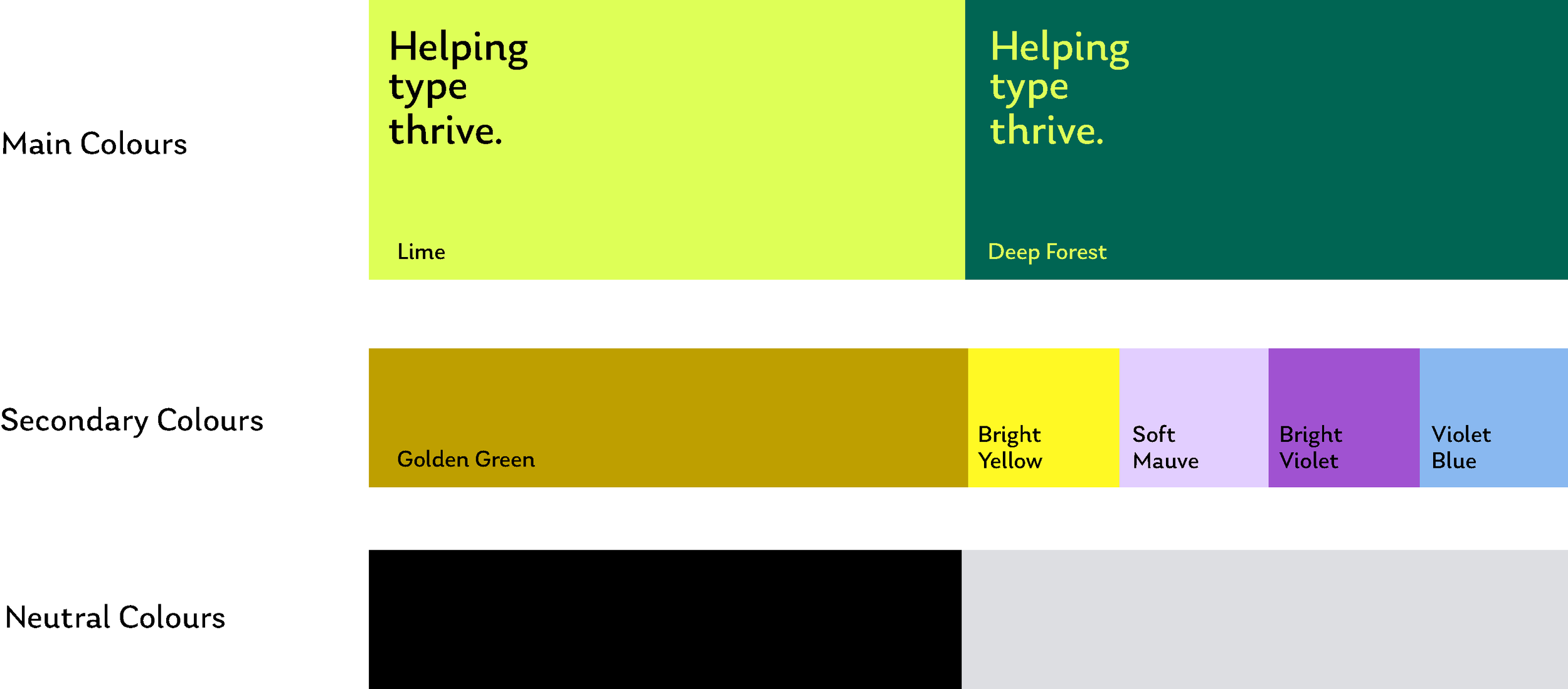
The colour lime green appeared early in our research as it felt true to what Ligado is: a bit unexpected in its field, optimistic, alive. The pairing with a deep forest green created a good level of contrast and brightness. The palette is complemented by a range of secondary colours, both warm and cold, always bright.
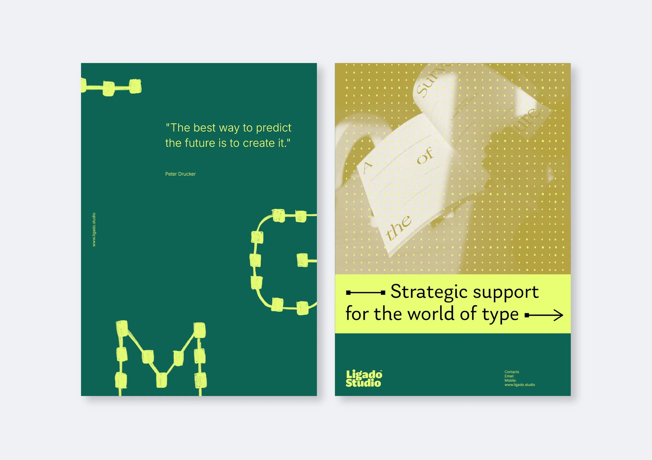
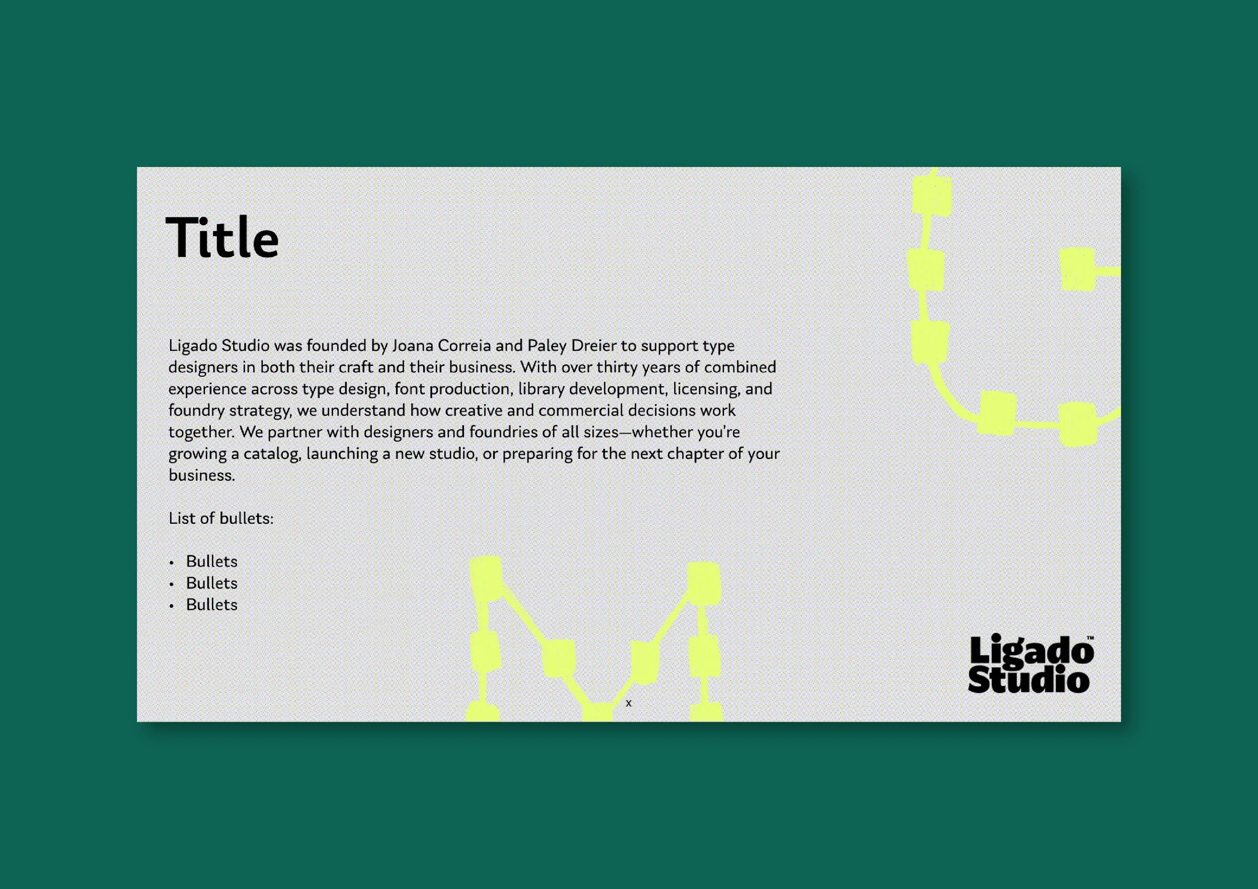
The square dot and the use of lines run through the visual system within grids and graphics, used as spot images, backgrounds, and structural elements — connecting inherently to the world of type design (the act of drawing, anchor points and geometry), while also reading as diagrams of networks, relationships, and growth.
This concept is also evident in the graphic brand copy such as Strategic support for the world of type, which communicate forward motion and growth.
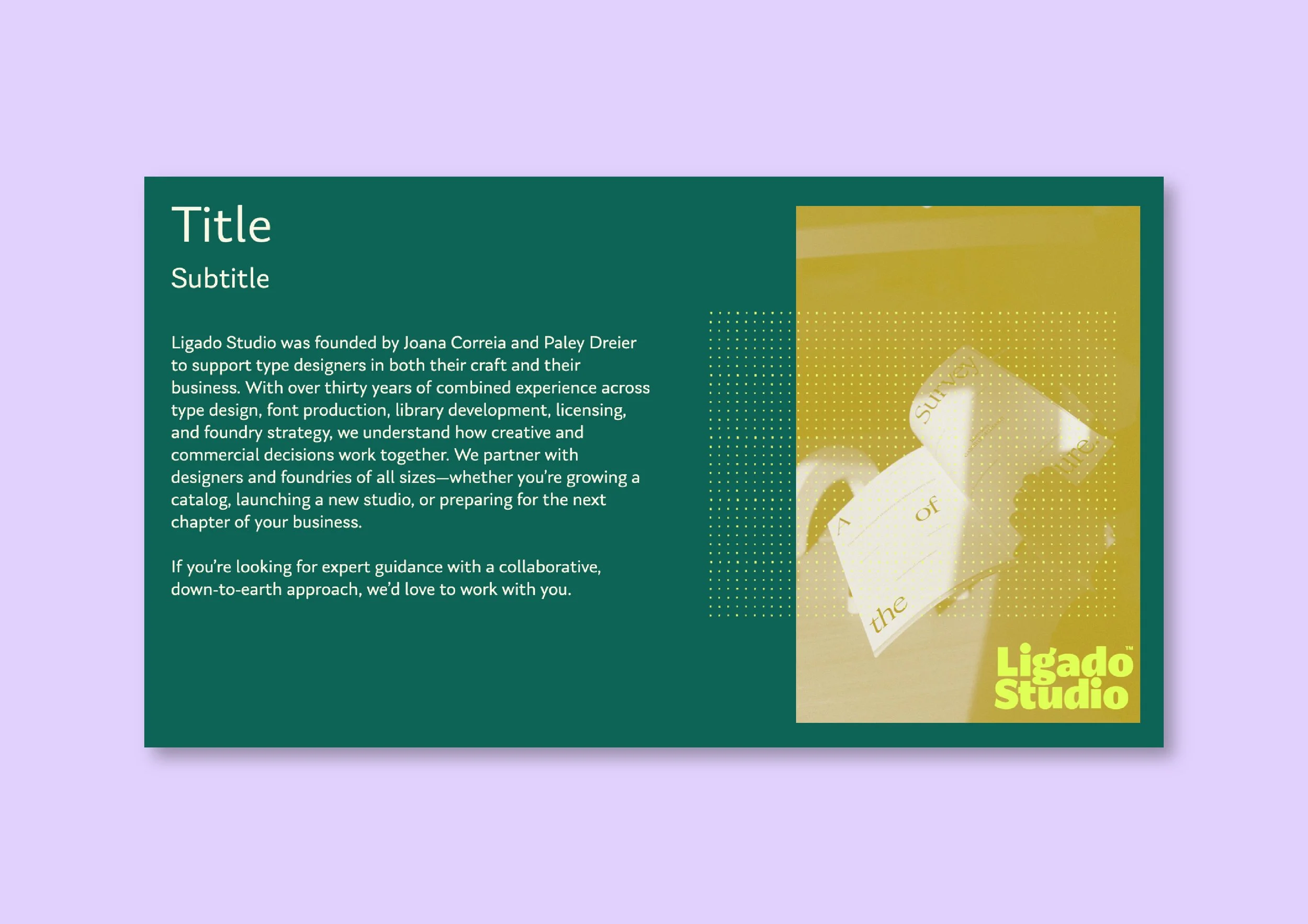
Template presentation spreads
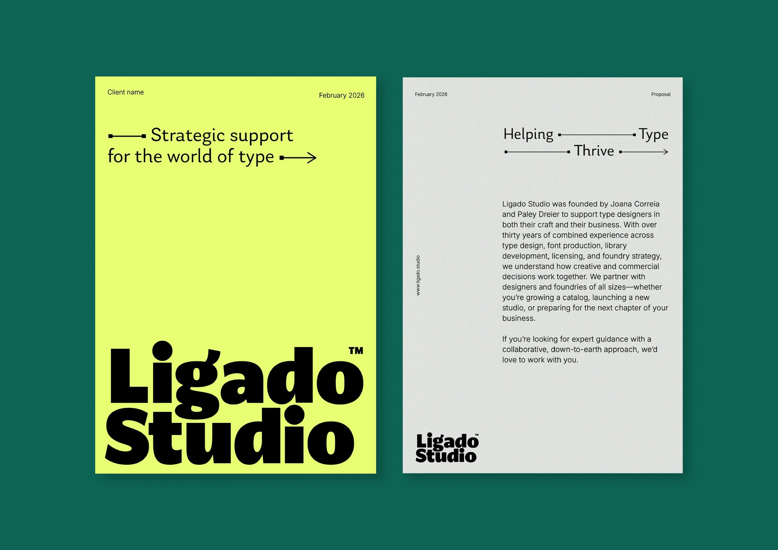
The graphic headlines communicate forward motion and growth.
For the presentation template we used Inter typeface for body copy, an alternate typeface for software that doesn’t allow custom type.
Ligado Studio's touchpoints are almost entirely digital: website, social media, newsletters, online calls, slide decks and presentations. Designing for these contexts requires a specific logic — you're thinking about legibility across different formats and applications, and making adjustments, such as an alternative typeface, when software doesn't allow custom options or uploading fonts, like Google Slides. In that case, the typeface Inter is used instead of Laca.
The website reflects these principles, reinforcing the idea of the line as a connector. We used lines in different ways throughout the page to structure content and information, for example, with expandable text areas. We've built with generous space and clarity using structural texture and accent colours that signal energy and focus.
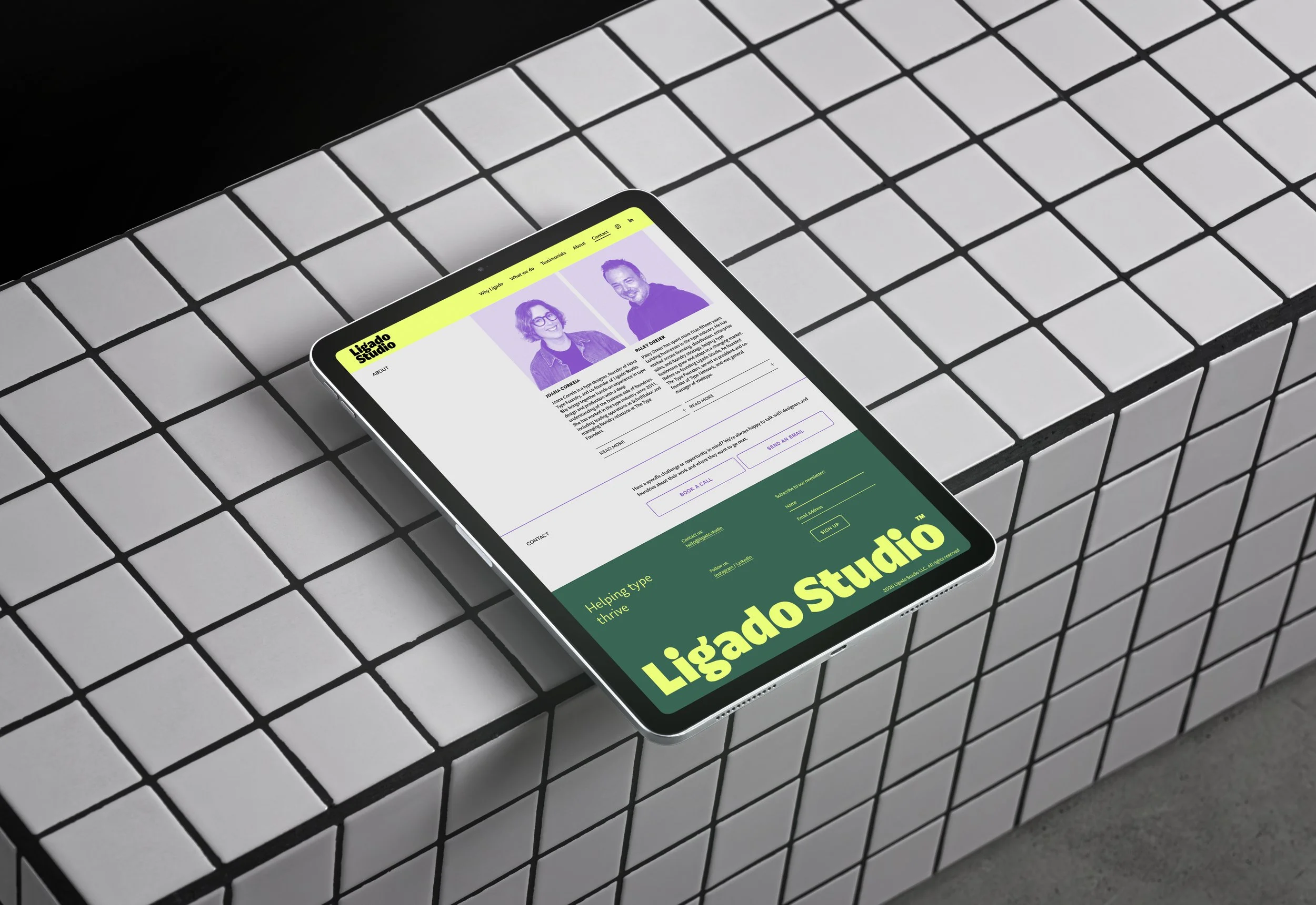
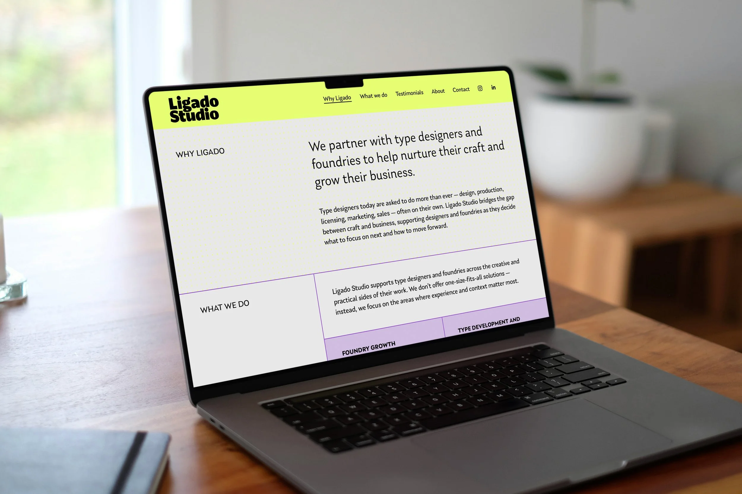
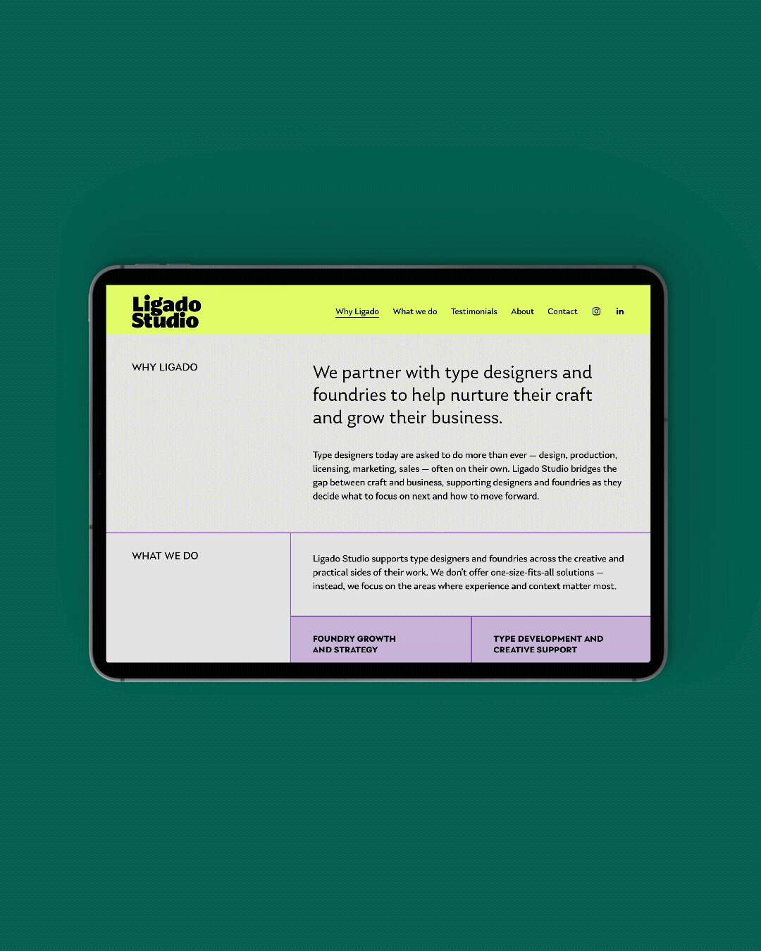
The one-page website uses lines to structure the content and communicate the brand’s concept.
For daily use, we designed a proposal templates and presentations that can be edited and adapted to different purposes.
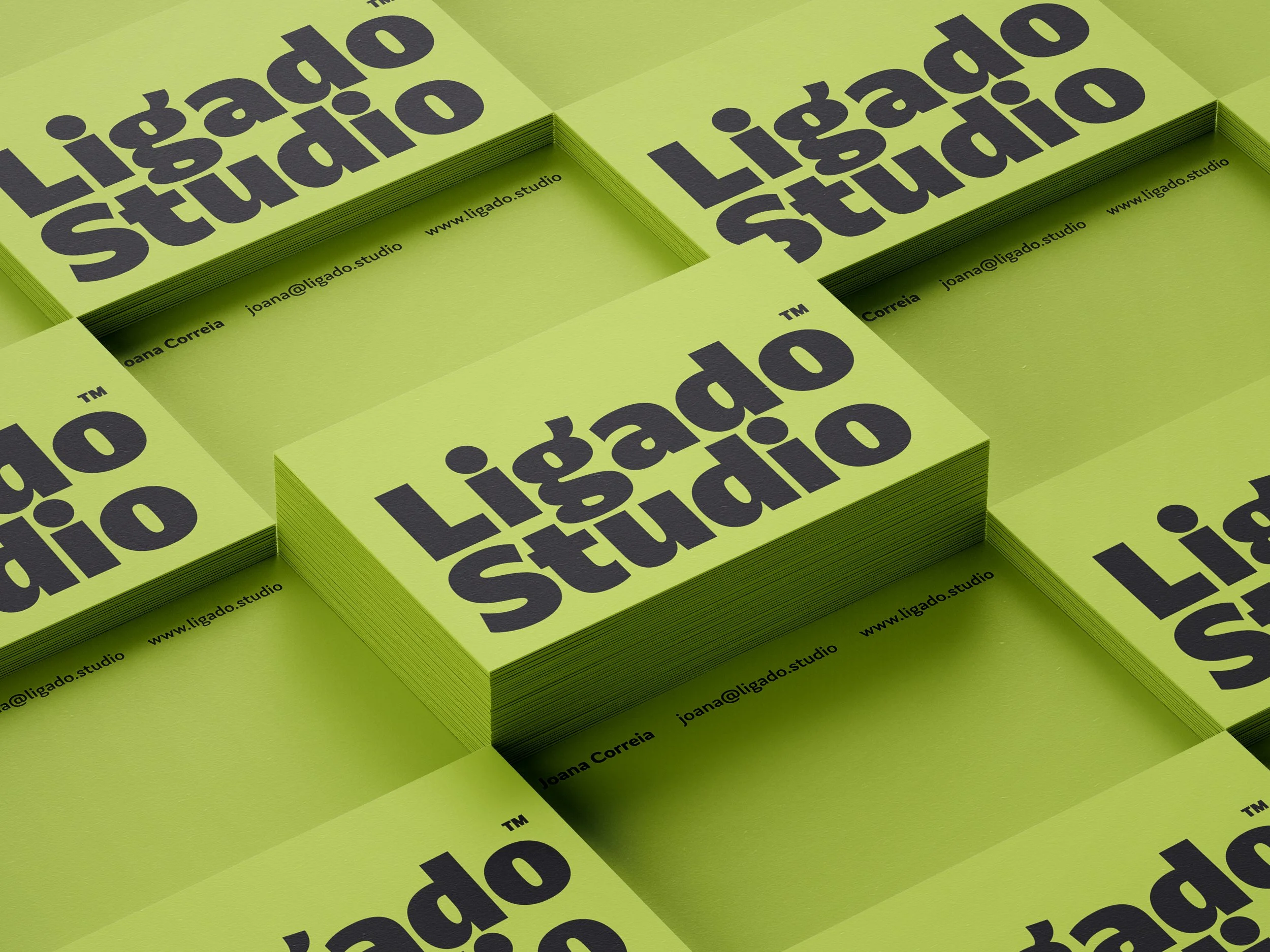
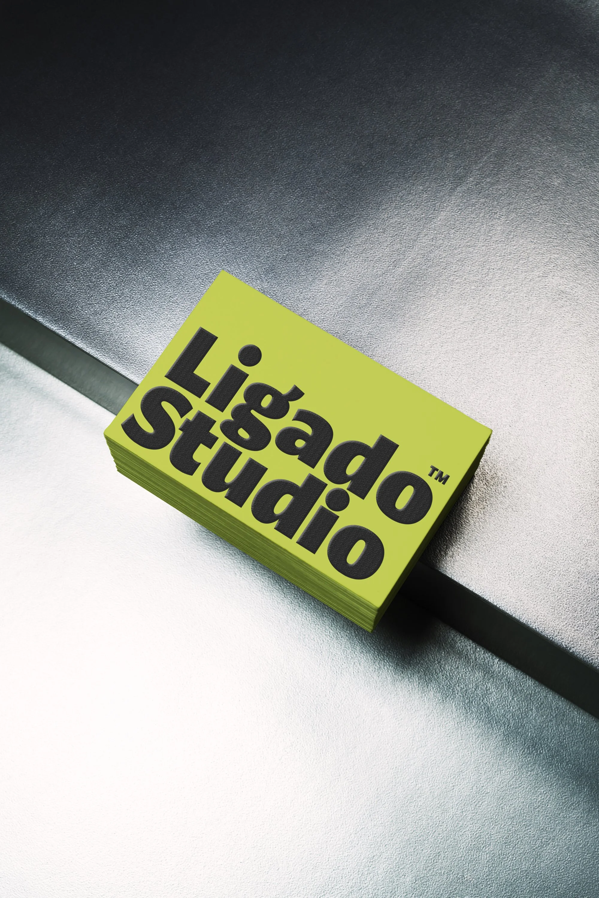
The business cards are printed in black on lime green paper with an embossed logo. We like to focus on high-quality coloured paper, highlighting the branding through embossed details for an unforgettable sensory experience.
You can visit Ligado Studio here.
Credits:
Creative Direction: Miguel Barbot
Art Direction: Maria Helena
Graphic Design: Maria Helena
Web Development: Cristiana Braz