
How we made Susto’s identity

We are very proud to show the new brand identity we developed for Susto, a design brand to be (re)launched in 2024, which is informed by our client's artistic practice.
Our work with Susto began in 2021 with a strategic consultancy process to define the business model for the brand. Subsequently, our studio took on the challenge of creating a new identity.
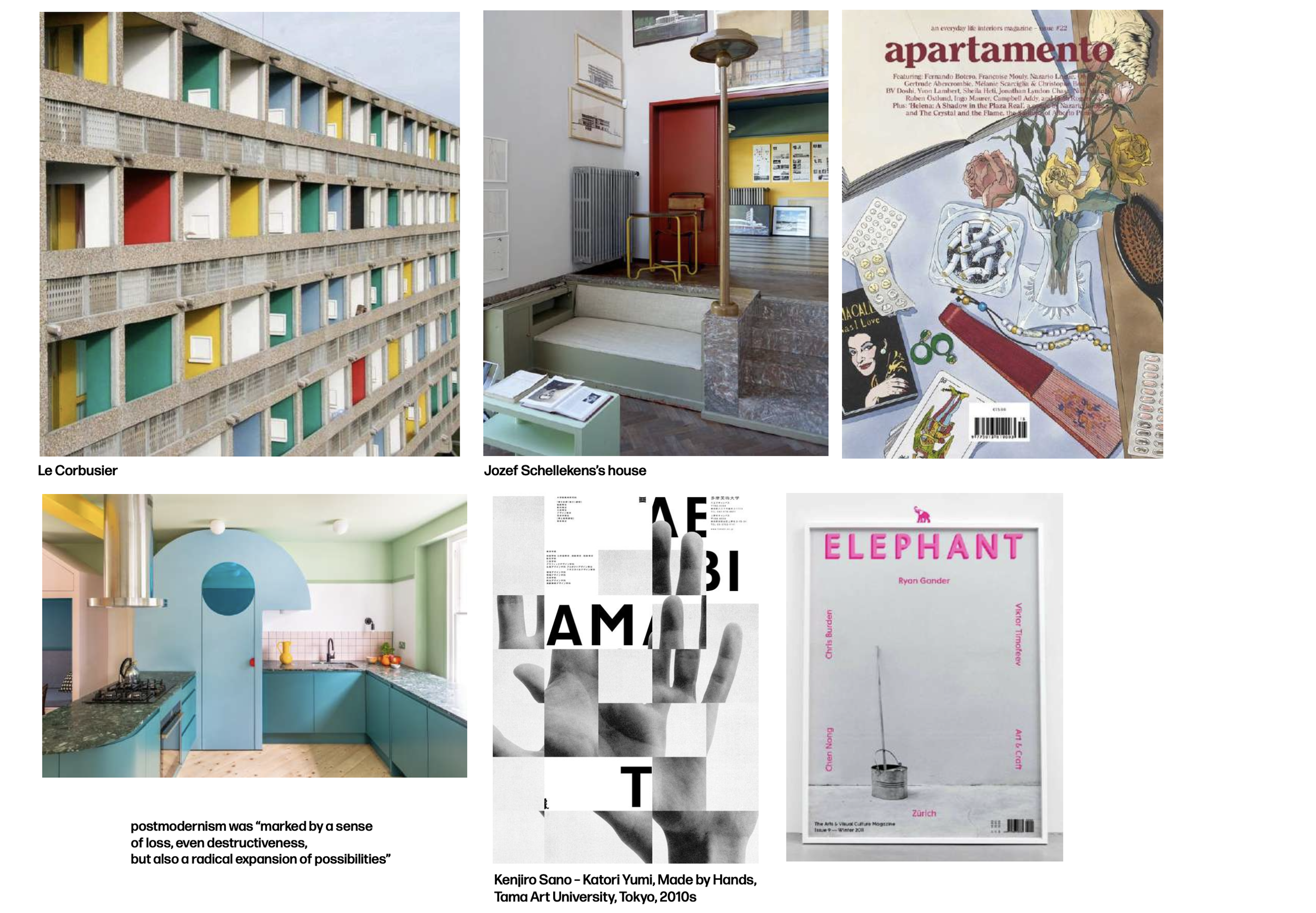
The creative direction of the graphic project bounced between two possible paths: one inspired by neo-postmodernist currents, closely linked to the creative direction of the brand itself and the client's artistic work, and that of brutalism, in the most literal sense of the word and therefore more linked to the materiality of the objects and the author's experimental process (see moodboards below).


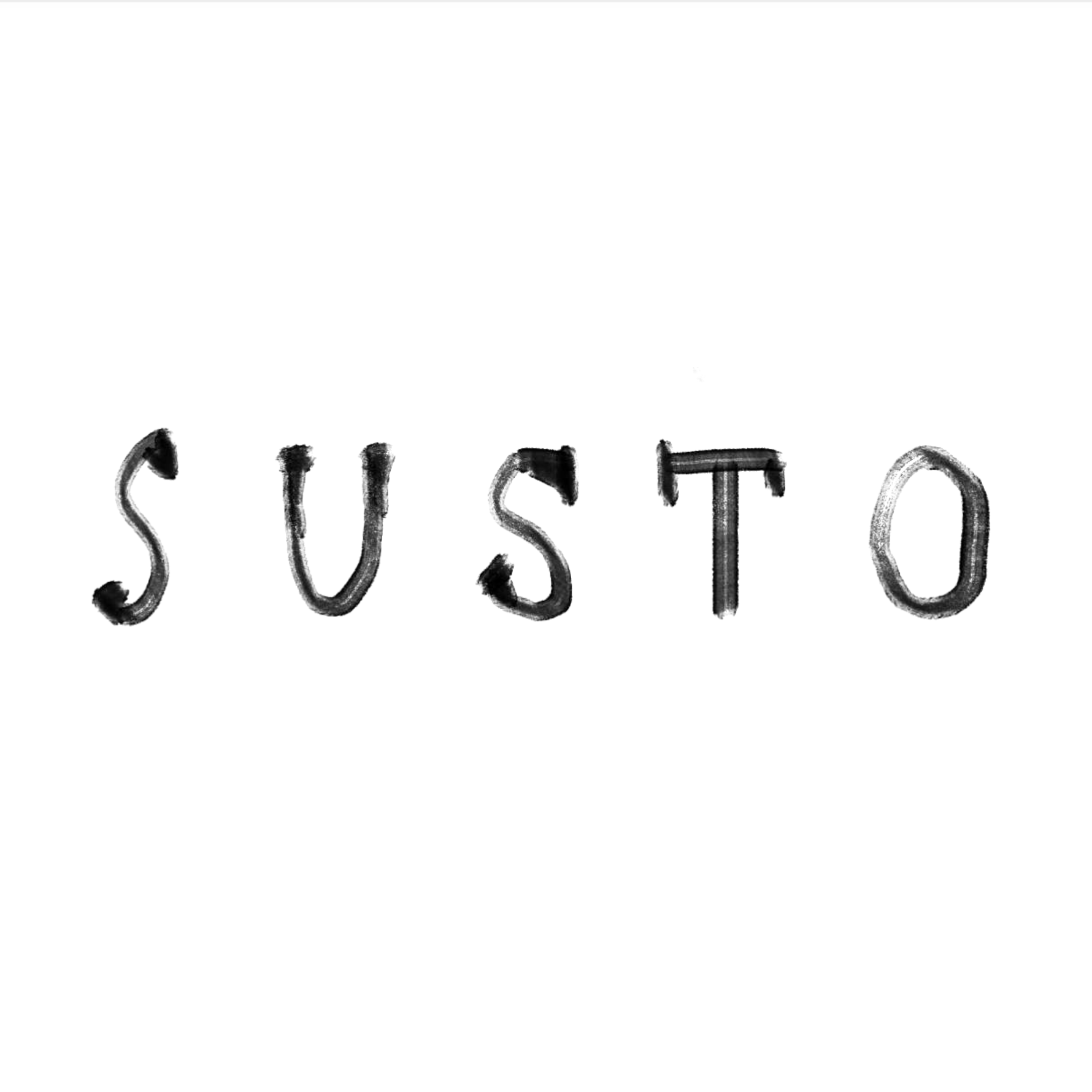
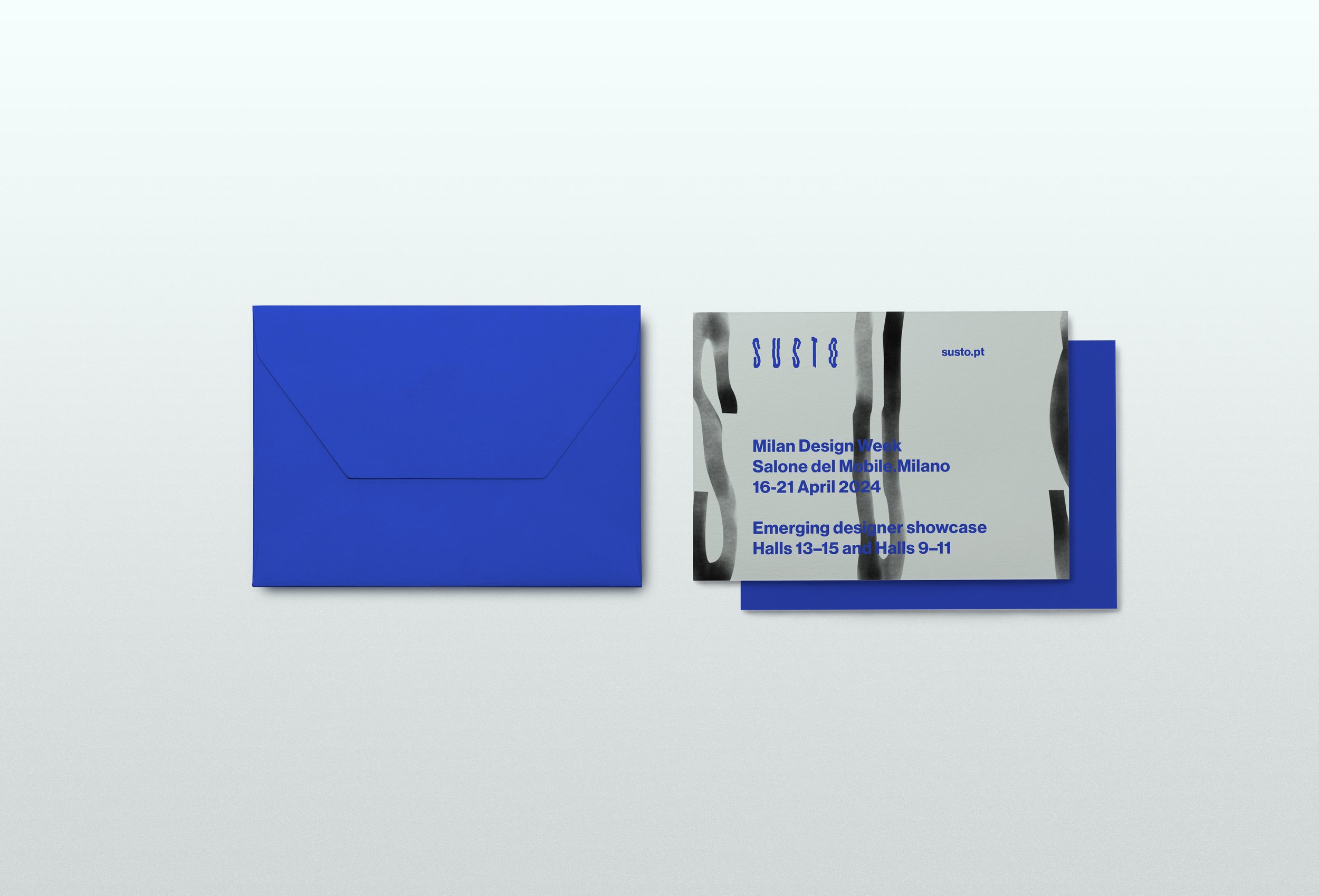
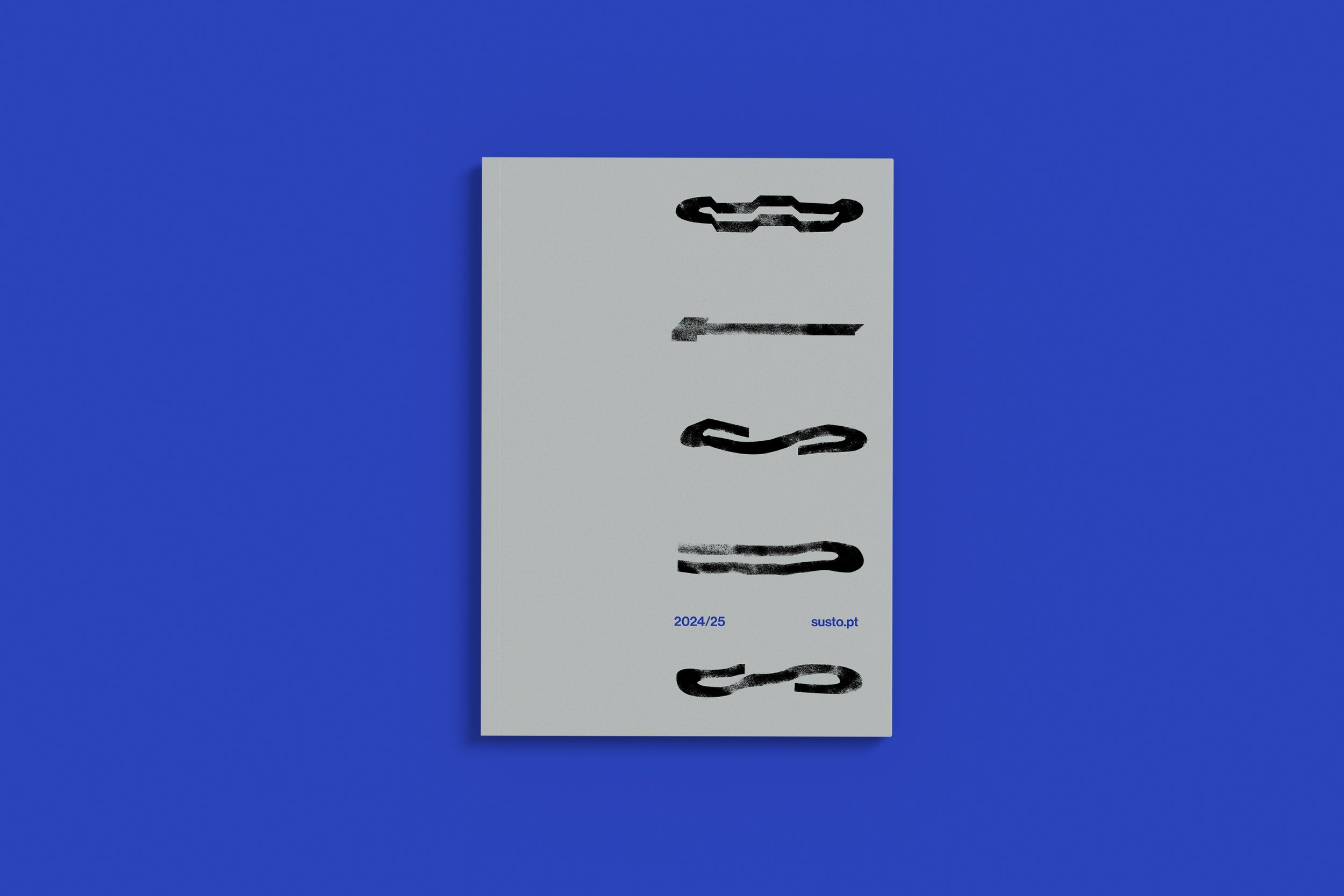
The logo was designed by Maria Helena with a "custom" typography, which is transformed into different versions, taking on very different textures and expressions between them.
It was a trial and error process and a continuous process of refining the shapes until we reached the desired result.
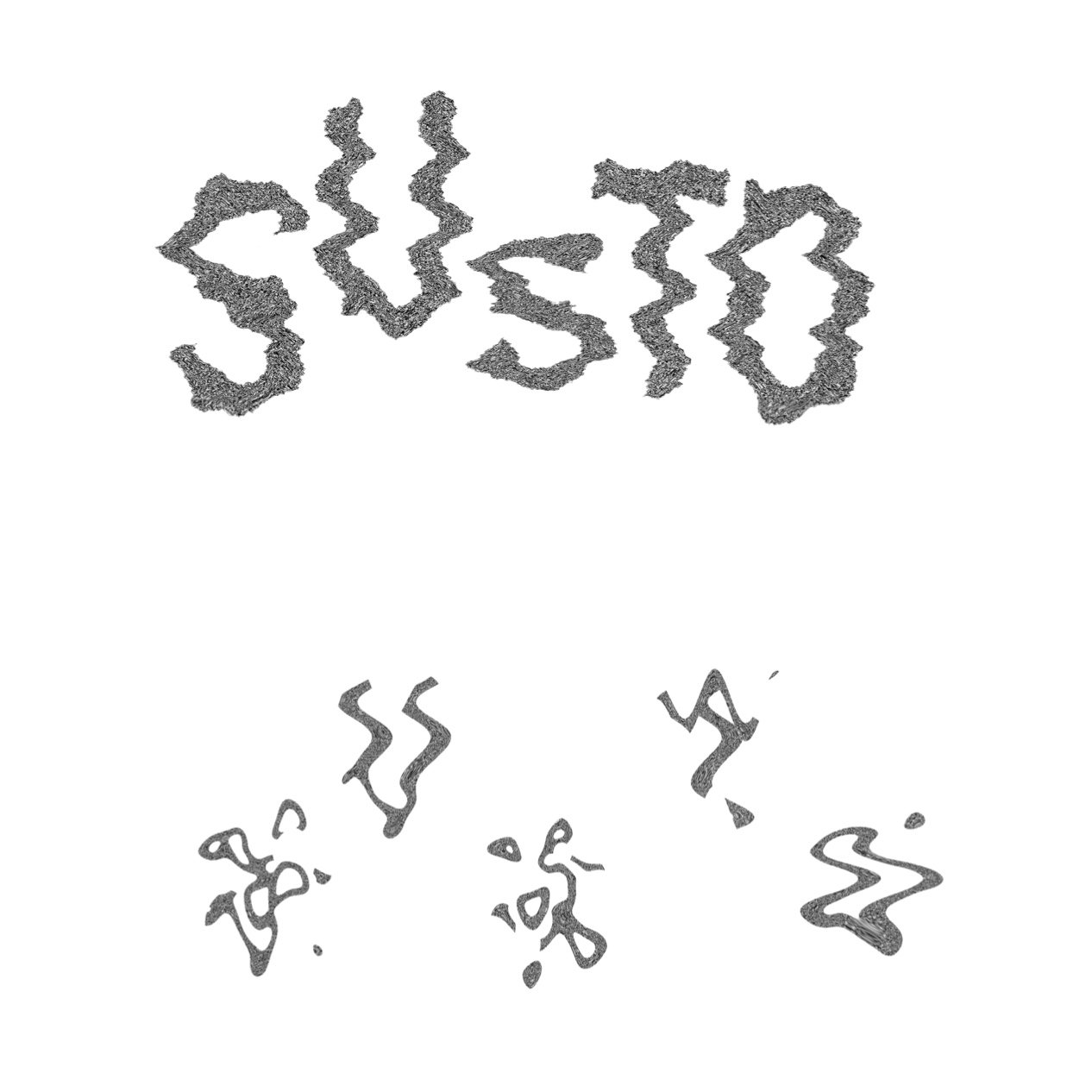
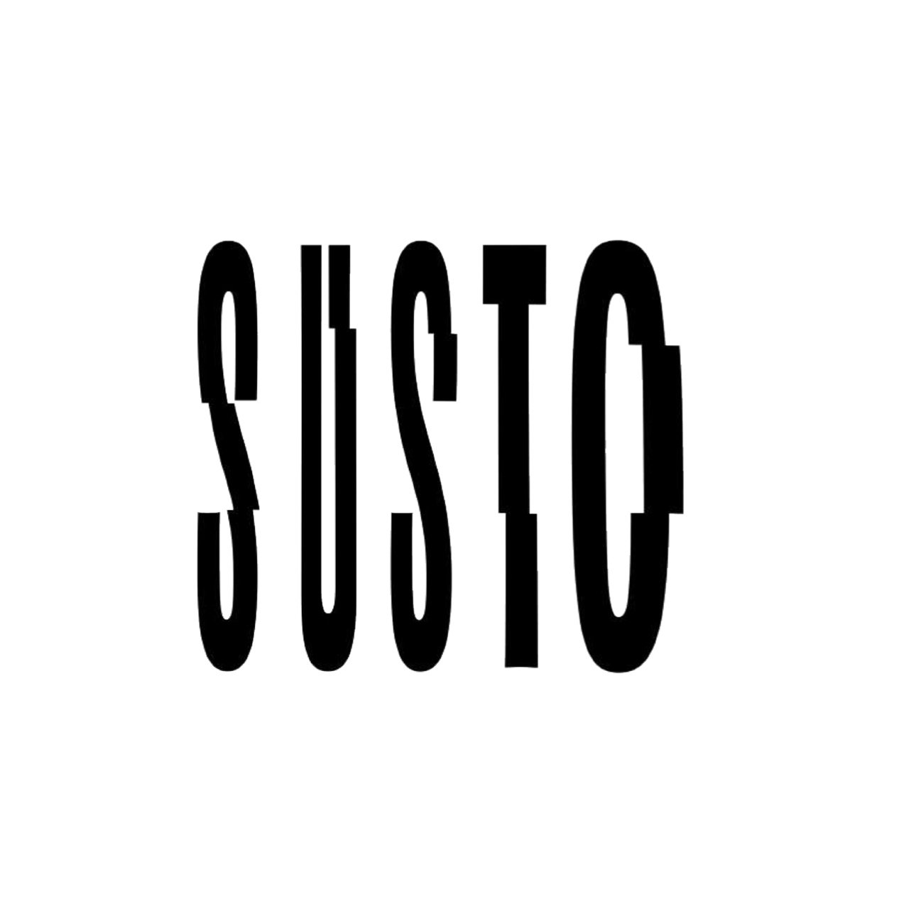
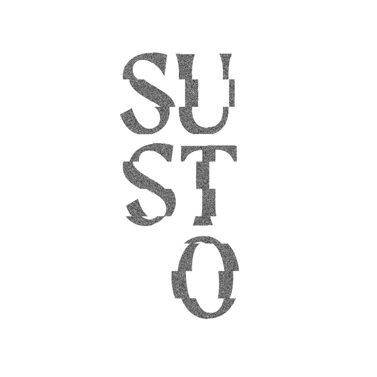
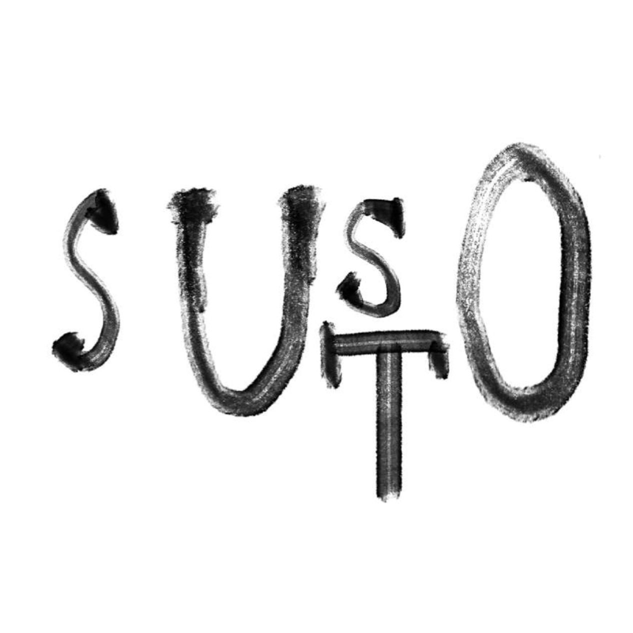
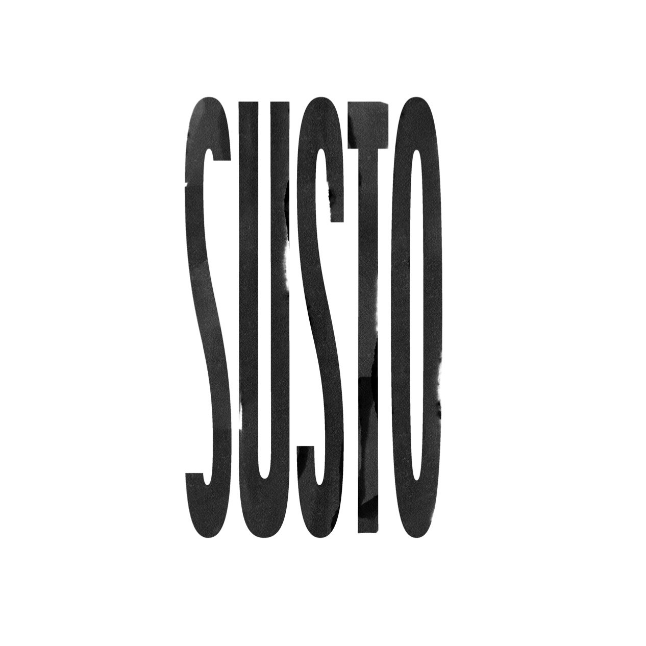
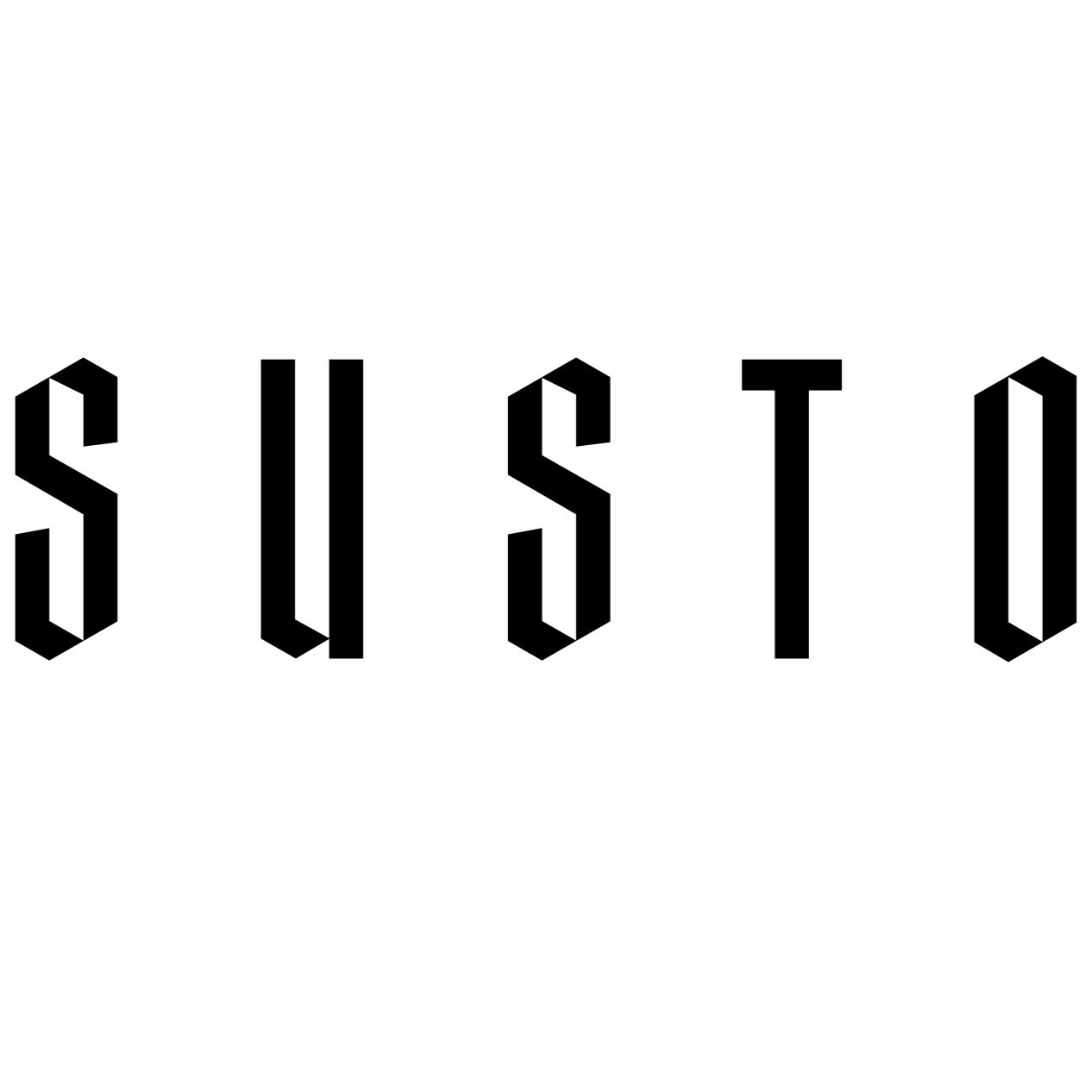
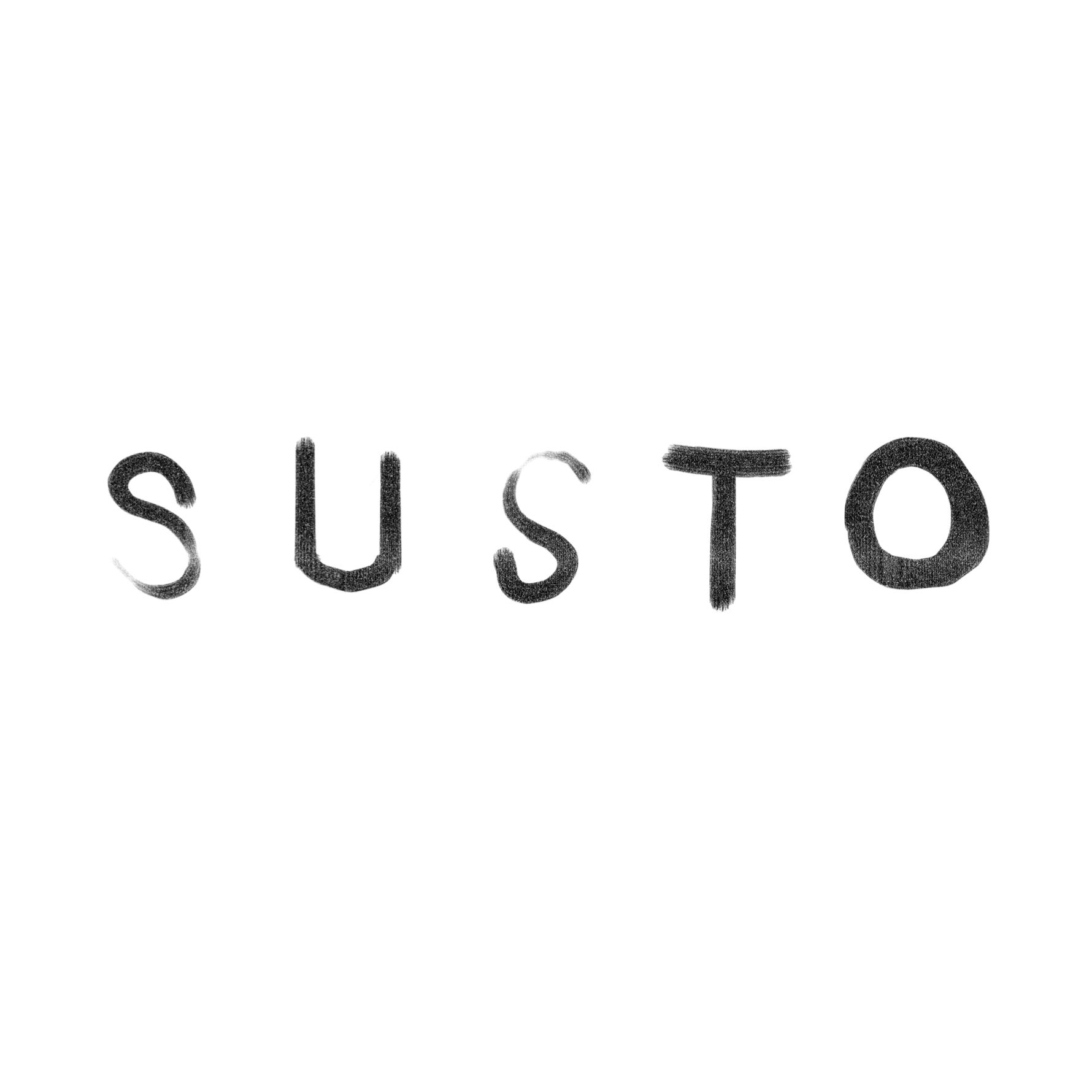
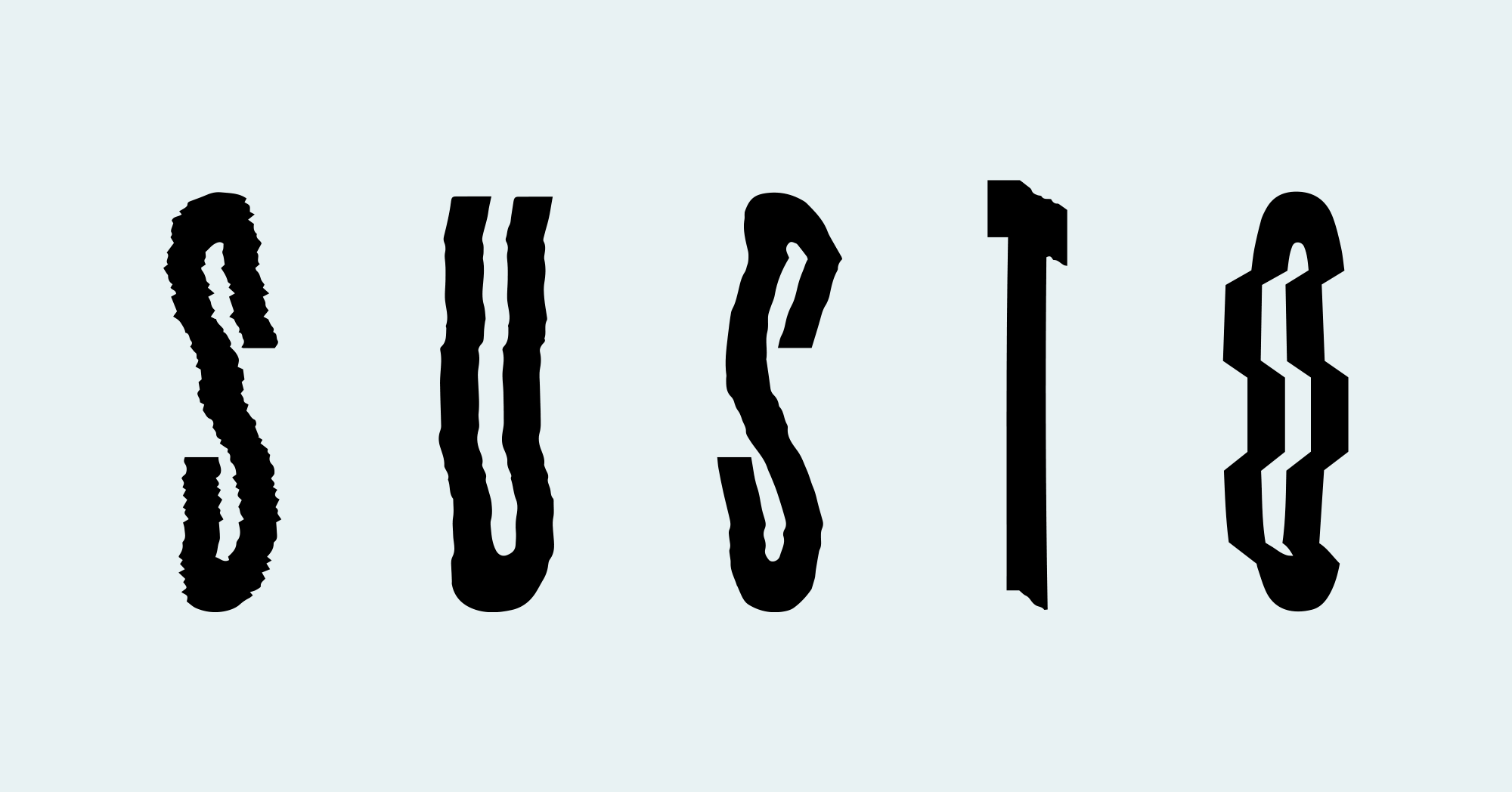
Above: some experiments. Below: the final version and its variations.


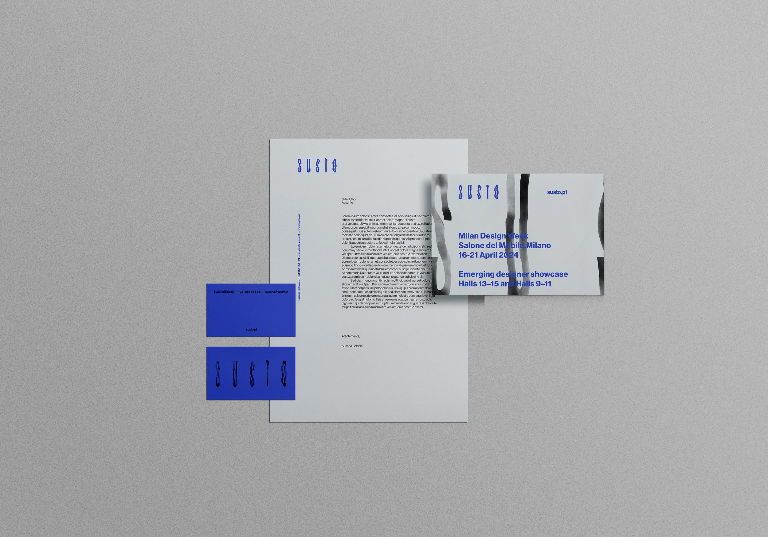
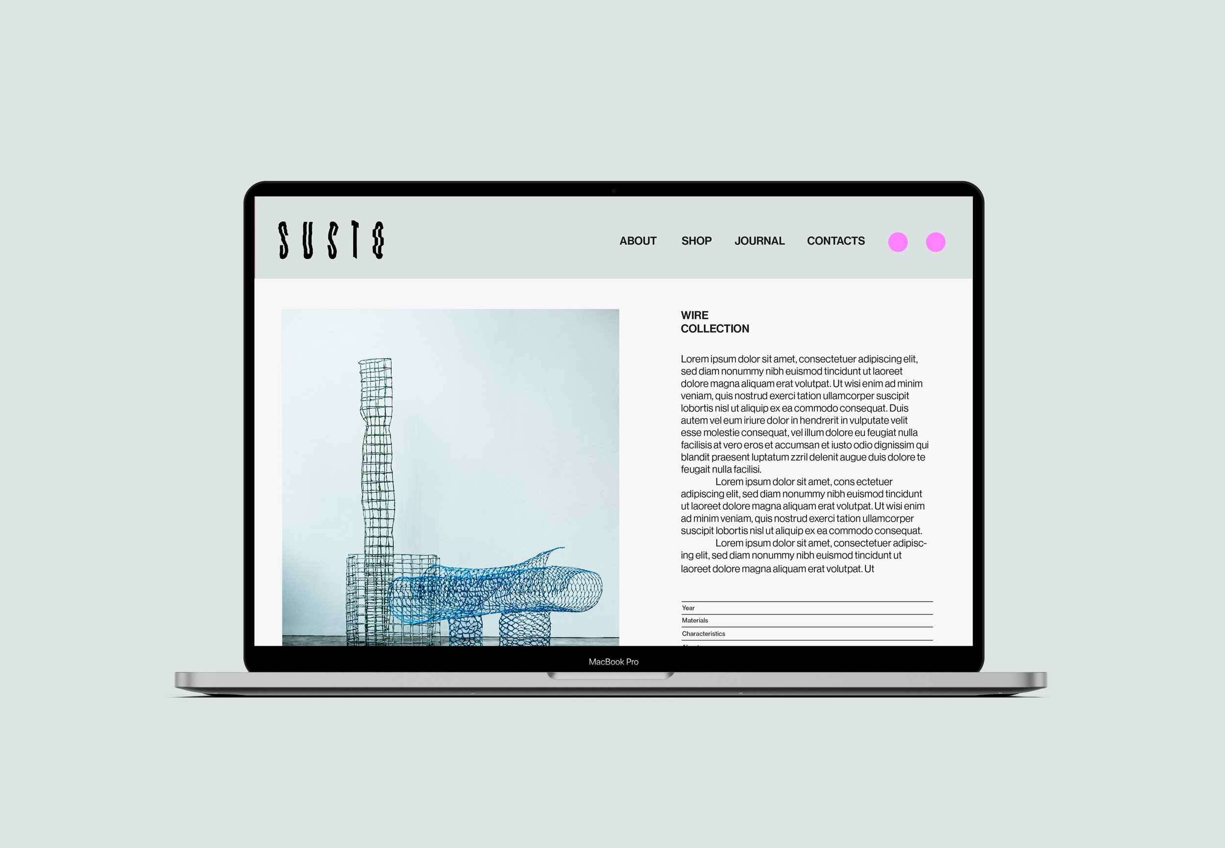
The chosen colour palette is expressive but, at the same time, minimal and versatile, allowing for very flexible use both digitally and on paper.
The typography chosen for the texts of the catalogues, website and other elements is Neue Haas Grotesk from Linotype.
"The original metal Neue Haas Grotesk™ would, in the late 1950s, become Helvetica®. But, over the years, Helvetica would move away from its roots. Some of the features that made Neue Haas Grotesk so good were expunged or altered owing to compressions dictated by technological changes. Christian Schwartz says, "Neue Haas Grotesk was originally produced for typesetting by hand in a range of sizes from 5 to 72 points, but digital Helvetica has always been one-size-fits-all, which leads to unfortunate compromises." Schwartz's digital revival sets the record straight, so to speak. What was lost in Neue Haas Grotesk's transition to the digital Helvetica of today has been resurrected in this faithful digital revival."
This typography's choice isn't unrelated to its history; Neue Haas Groteslk (or Grotesque) was the first name of the famous Helvetica (which later evolved into its current version). Susto's work is fundamentally handmade; therefore, choosing this original "Helvetica", more faithful to the original types, is a tribute to artisanal work processes whilst maintaining the functional aesthetics we like to have in our projects.

Credits:
Creative Direction: Miguel Barbot
Art Direction: Maria Helena
Graphic Design: Maria Helena, Mariana Teixeira
Photography: Miguel Barbot, Susana Baldaia
Typography: Neue Haas Grotesk, Linotype