
How we made the GatewayCrafts identity

At the beginning of 2023, we launched the GatewayCrafts project.
This Erasmus+ project is underway and was proposed and is coordinated by Saber Fazer/Ofício, having Cru Creative Hub (Portugal) and Matera Hub (Italy) as partners.
The focus of GatewayCrafts is to develop and distribute high-quality educational content within small-scale manufacturing and artisanal work, oriented and adapted for contemporary audiences and digital media.
The learning strategy combines conventional elements of online learning with other methods developed for social media and informal learning.

The challenge of GatewayCrafts Communication Design is to be itself an alluring gateway for potential students, as well as audiences looking for information and new discourses about creative industries, artisanal work and small-scale manufacturing. The goal is to communicate the project's positioning, what distinguishes it in this universe, demonstrate technical rigour with lightness and fluidity, and, above all, create curiosity.
The creation of the brand identity included Communication Strategy, Art Direction, Graphic Design and Implementation (internally and by our partners).
As the content lives mainly in digital environments, our communication strategy is broadly based on UI/UX concepts, from the macro view of digital marketing materials to usability details.
From the first impression to the full use of the platform, the public goes through different moments of interaction with the brand. For each moment, we've created the corresponding communication outputs: Discovery, Engagement and Learning.
With this flexible design system, we have specific guidelines for each component, as well as how the system works as a whole and at each moment of interaction with the brand. The system encompasses several elements from the Logo, Typography, Colour, Visual imagery, Iconography, Graphics and Composition.
The modernist Logo was designed with Forma DJR typographic family by David Jonathan Ross, which we use in our own website and also adopted for Saber Fazer’s new website. We aimed to create a timeless, simple, yet highly sophisticated Logo. Its beauty comes through the simplicity of forms, legibility and connection to the GatewayCrafts content.
The Logo includes several ways of use, as well as an imprint version that we use as a watermark or alternative graphic element. The tagline is used strategically, especially in conjunction with the Logo, in a rigorous manner, depending on the formats and media. The body text is also set with the same typographic family.

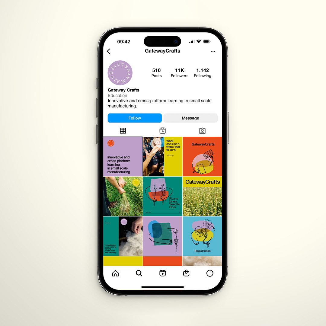
We chose a vibrant palette of colours to be used in several graphic combinations, illustrations and media, especially on video.
The elements that form the brand's imagery have a vital presence through Illustration, Colours and Composition. The expression is rich and textured with the use of minimal lines.
The Illustration has its own system and rules of use (forms, scale, composition, position and colour combination). Each Illustration comprises two intercepted colours, conveying the idea of analogue/digital and crossing platforms or knowledge. This interception generates movement through texture and transparency.
Iconography is a supporting element for branding or educational materials and calls to action. It confirms the educational and direct nature of the project and can evolve depending on the communication requirements.
When applying the visual identity to various media (banners, websites, social media, blogs, newsletters, videos), the result combines rigour and energy, structure and spontaneity - essential in disseminating knowledge.

To follow GatewayCrafts, you can visit the website, follow on social media and subscribe to the newsletter.
Erasmus+ is the European Commission's program for education, training, youth and sport.
Credits:
Creative Direction: Miguel Barbot, Maria Helena
Art Direction: Maria Helena
Graphic Design: Maria Helena, Mariana Teixeira
Illustration: Maria Helena
Photography: Alice Bernardo