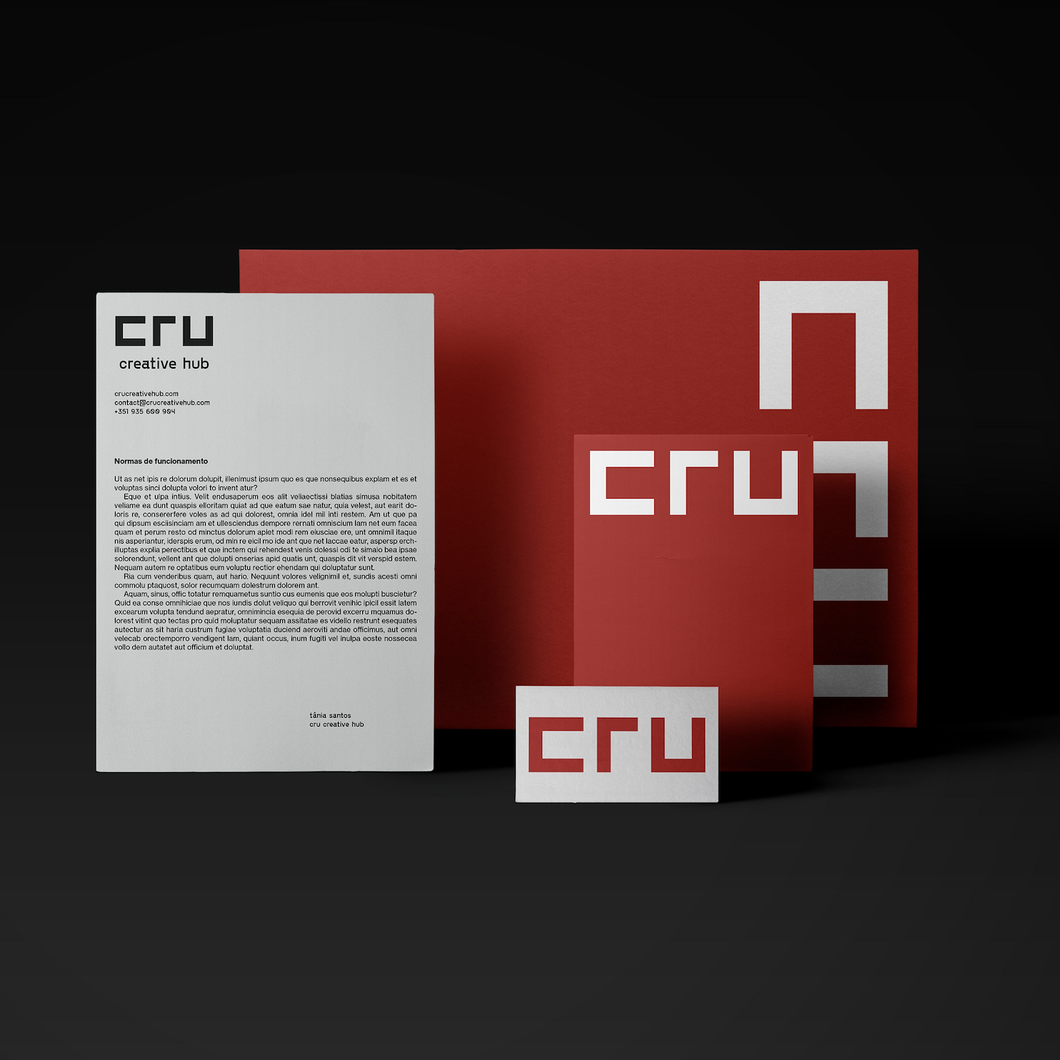
Case Studies


Culture, Craft and Savoir-faire: How we created the visual identity for “Contamos todos” at Macedo de Cavaleiros
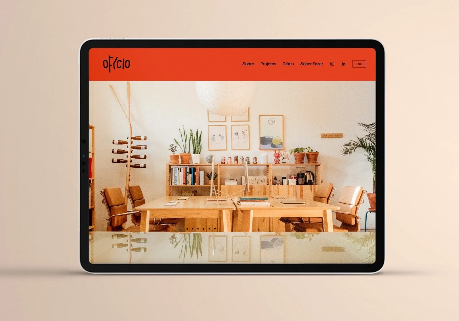
This year we started a new project in Trás-os-Montes, North-East Portugal, where we're working across two different areas: Saber Fazer, with a research, education and editorial initiative dedicated to wool and silk, and Ofício, covering all the work of creating a visual identity and preparing the project's communication and editorial materials.
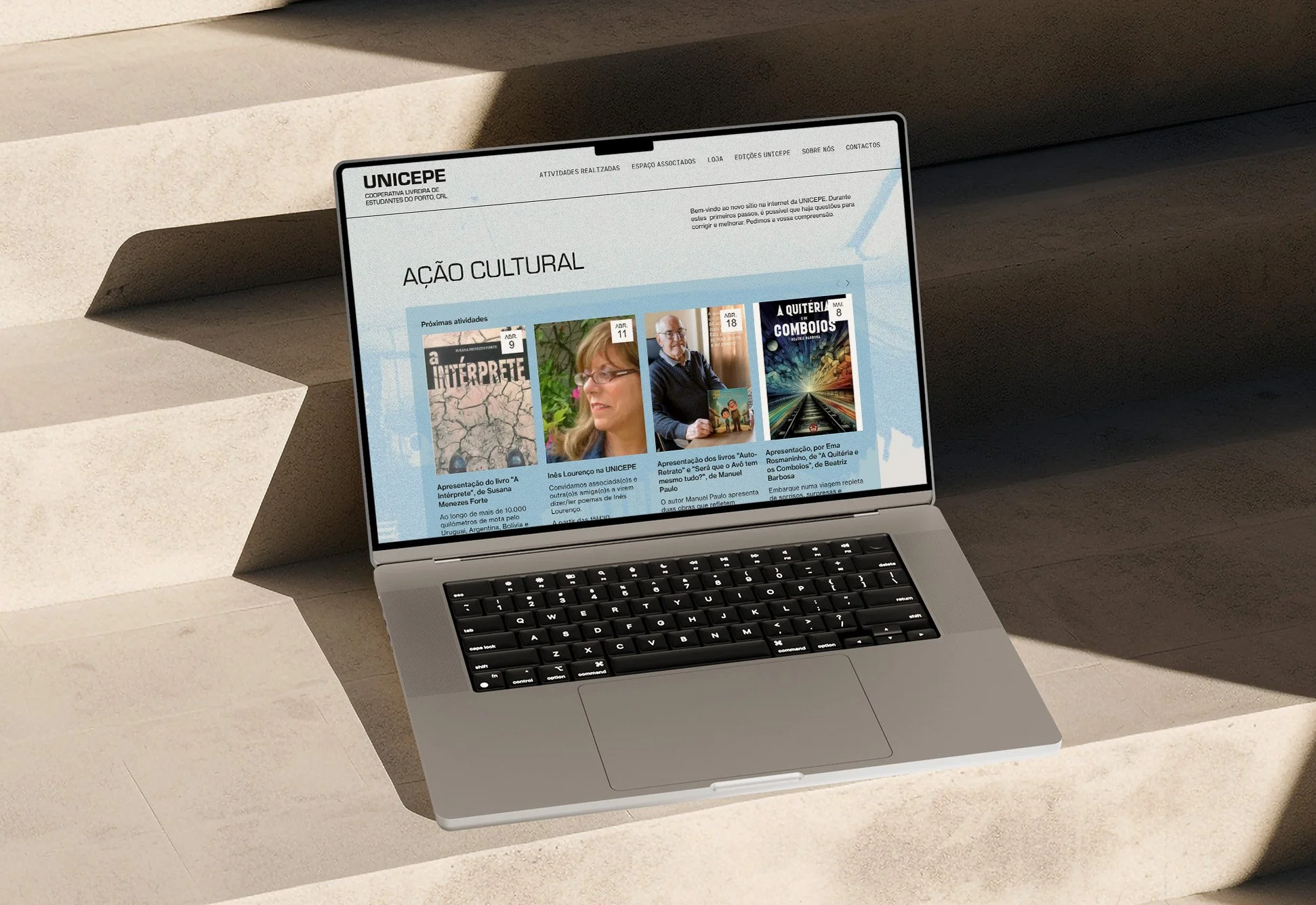
Unicepe - How we designed a new website (and a bit more) for the bookshop that marked a generation of politically engaged readers.
Founded in Porto in 1963, in the middle of Salazar’s Estado Novo dictatorship, Unicepe - Cooperativa Livreira de Estudantes do Porto CRL began as an act of resistance as much as a bookshop. At a time when books could get you into trouble, it set out to make ideas accessible: cheaper books, harder-to-find titles, foreign works and even banned works. Now, over 60 years later, we were tasked with designing a new website that will carry the next generation of readers and thinkers (and troublemakers) into the future.
We designed the visual identity and learning tools for 10,000 years of textile heritage
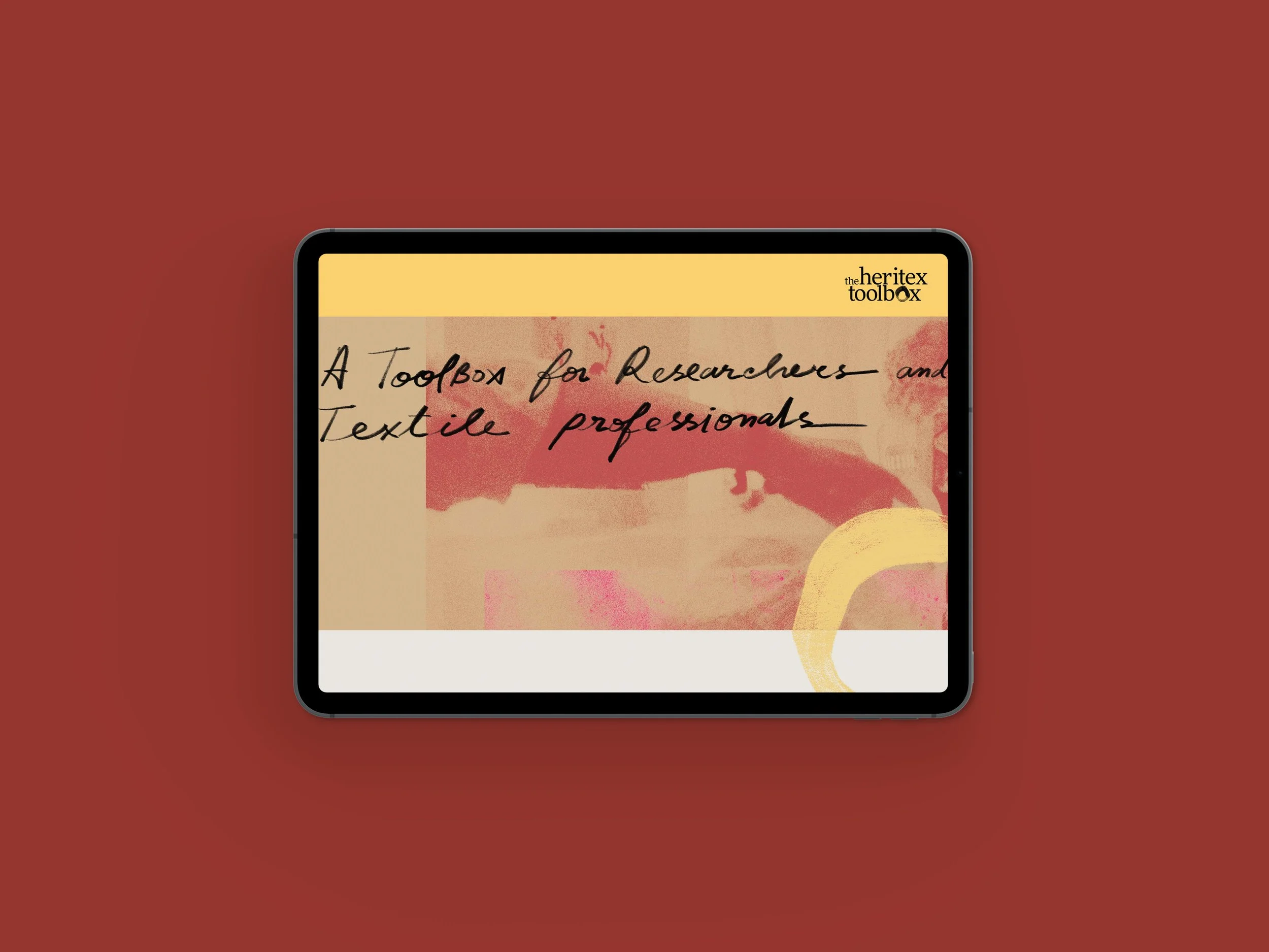
This is the story of how we designed the visual identity, website, e-book and timeline for The Heritex Toolbox.
The Heritex Toolbox is a tool for researchers and textile professionals, designers or creators: a website with fact sheets, an e-book and an interactive timeline spaning more than 10.000 years, that allows users to navigate the development of natural fibres and trace how techniques, dyes, and traditions evolved across centuries and across the globe.
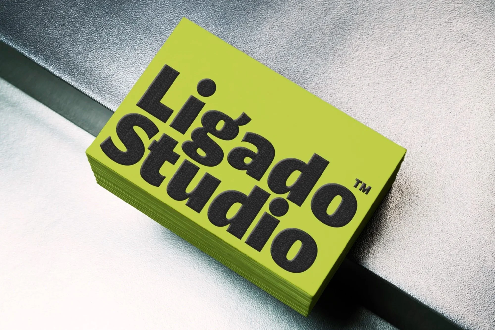
Helping Type Thrive - Ligado Studio was created to support the type design community and we designed their visual identity.
As you might know, Joana Correia has been a friend of the studio for some time now — we regularly work together on various projects, including Nova Type Foundry's communication strategy and graphic design (which you can read about in an earlier post).
Recently, Joana and co-founder Paley Dreier asked us to develop the visual identity for their new venture, Ligado Studio, a consultancy that supports type designers and foundries in growing their businesses.
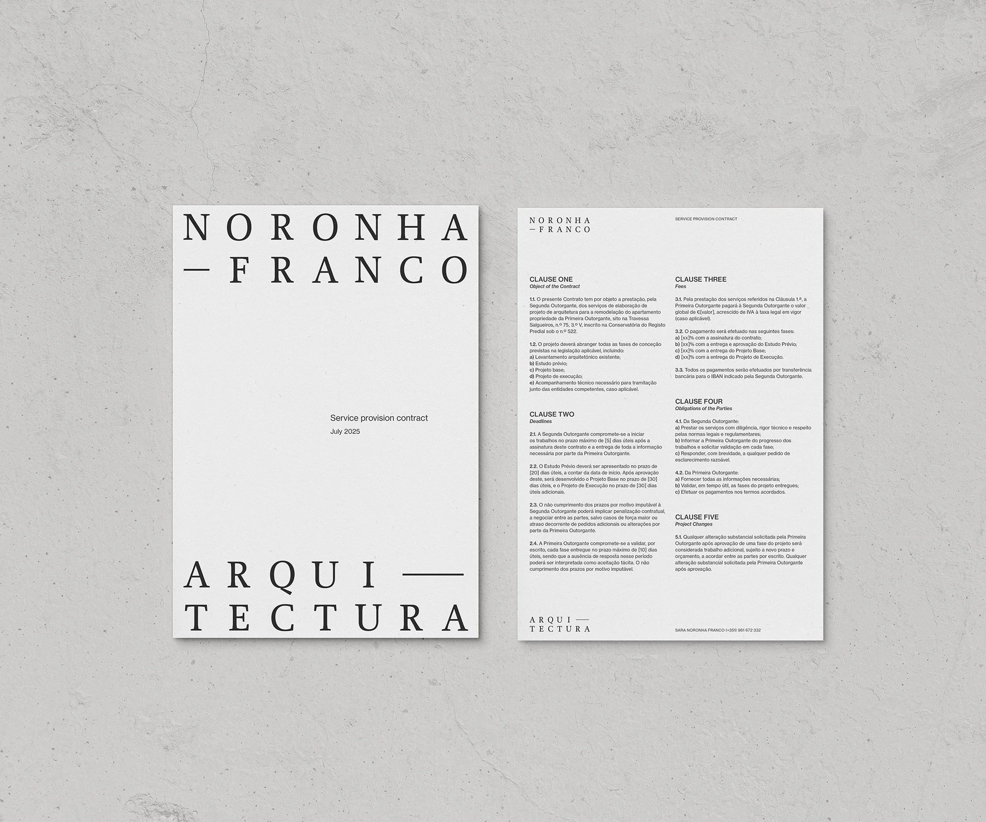
How we designed Noronha Franco Arquitectura visual identity
Sara is an architect whose work unfolds between Lisbon, Porto, and her native Funchal on Madeira Island, where she is currently based — cities and landscapes that each carry distinct rhythms, stories, materials and light.
Inspired by a shared design vision, Sara challenged us to develop the visual identity for her architectural practice, Noronha Franco Arquitectura, which was launched just a few weeks ago.
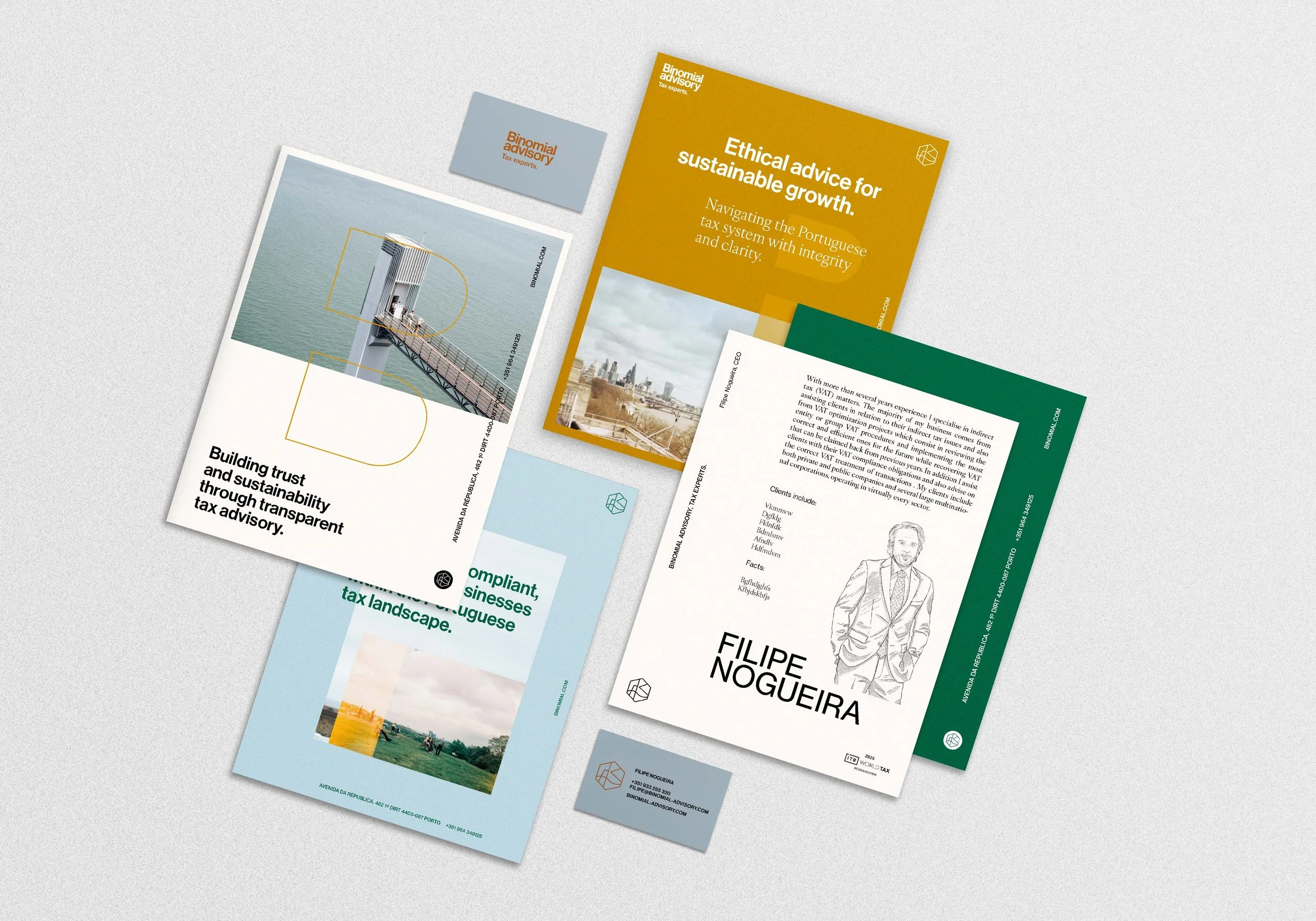
Binomial Advisory: how we designed the visual identity and helped the founder create a brand and position his practice.
Filipe, founder of Binomial Advisory, is a good friend with a decades-long career in “big guys” consulting, having decided to go solo by the end of last year. We met in the mid 90’s, don’t ask me how, and I’ve been following his career closely since then. After working an early stint in auditing, he became a Tax expert.
For this, challenging the typical perception of Tax consultants was our first design hurdle: reframing the practice as a proactive partner in compliance and sustainability, helping both private and public sectors navigate the tax system and avoid unnecessary legal issues. This idea guided how we positioned Binomial Advisory as a trusted, positive force
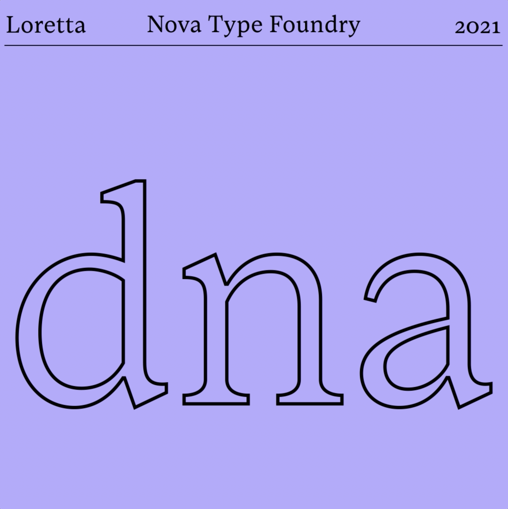
Nova Type Foundry: our new designs for MyFonts and beyond
A typeface is often judged in the very first moment a designer encounters it, and the way it is presented can make or break the spark of connection that leads someone to explore it further. That’s why when Joana Correia from Nova Type Foundry asked us to develop a new set of visuals to display her typefaces on the MyFonts platform, we took it very seriously.
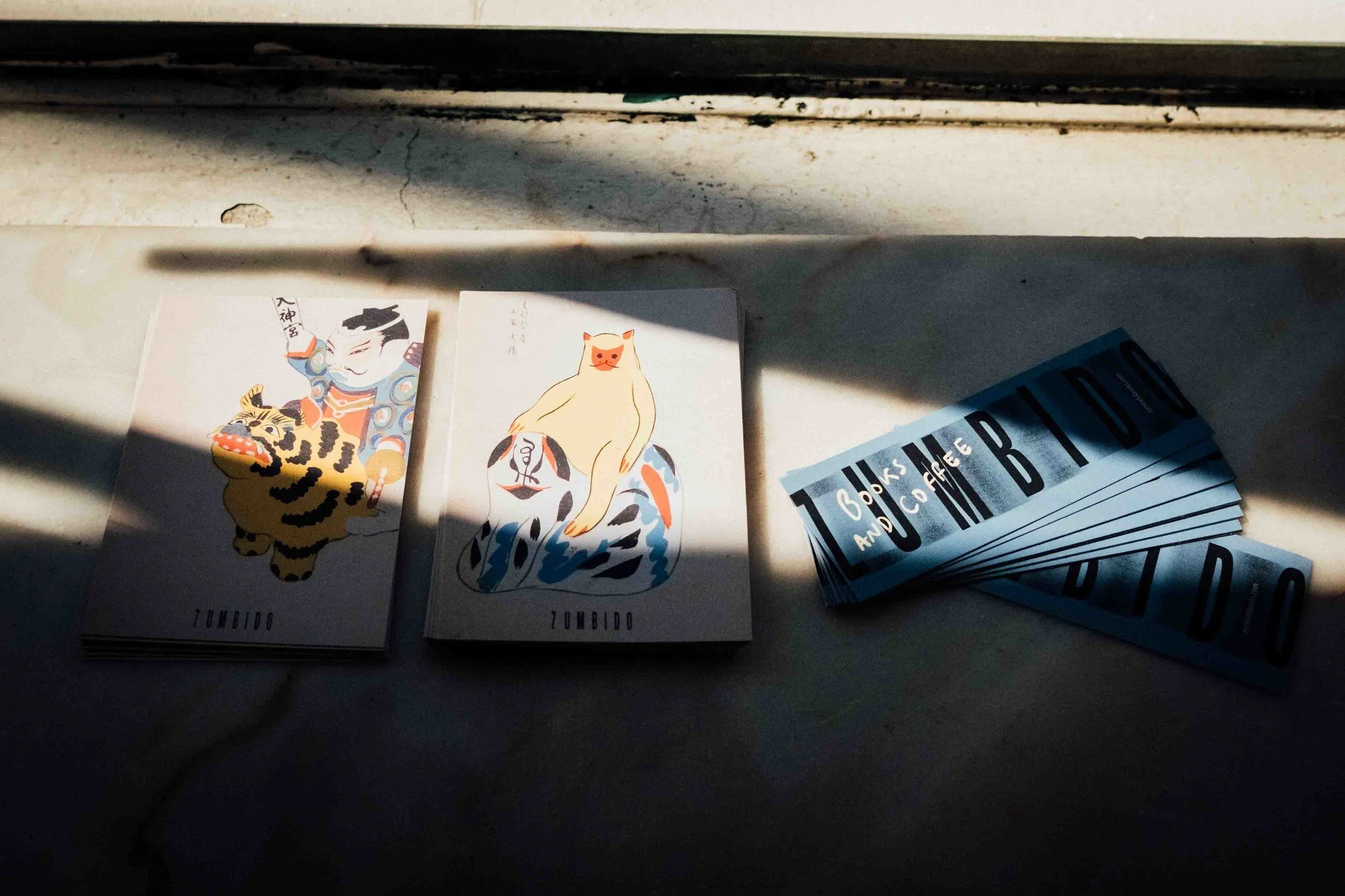
How we made Zumbido’s visual identity
The thing about working with culture, creativity, and independent retail is that typically, there is no big budget involved. It is a lot of fun, though.
Zumbido is, as you guessed, a low-budget project, so we had to assist the client with most of the choices, from furniture and interiors to coffee equipment.
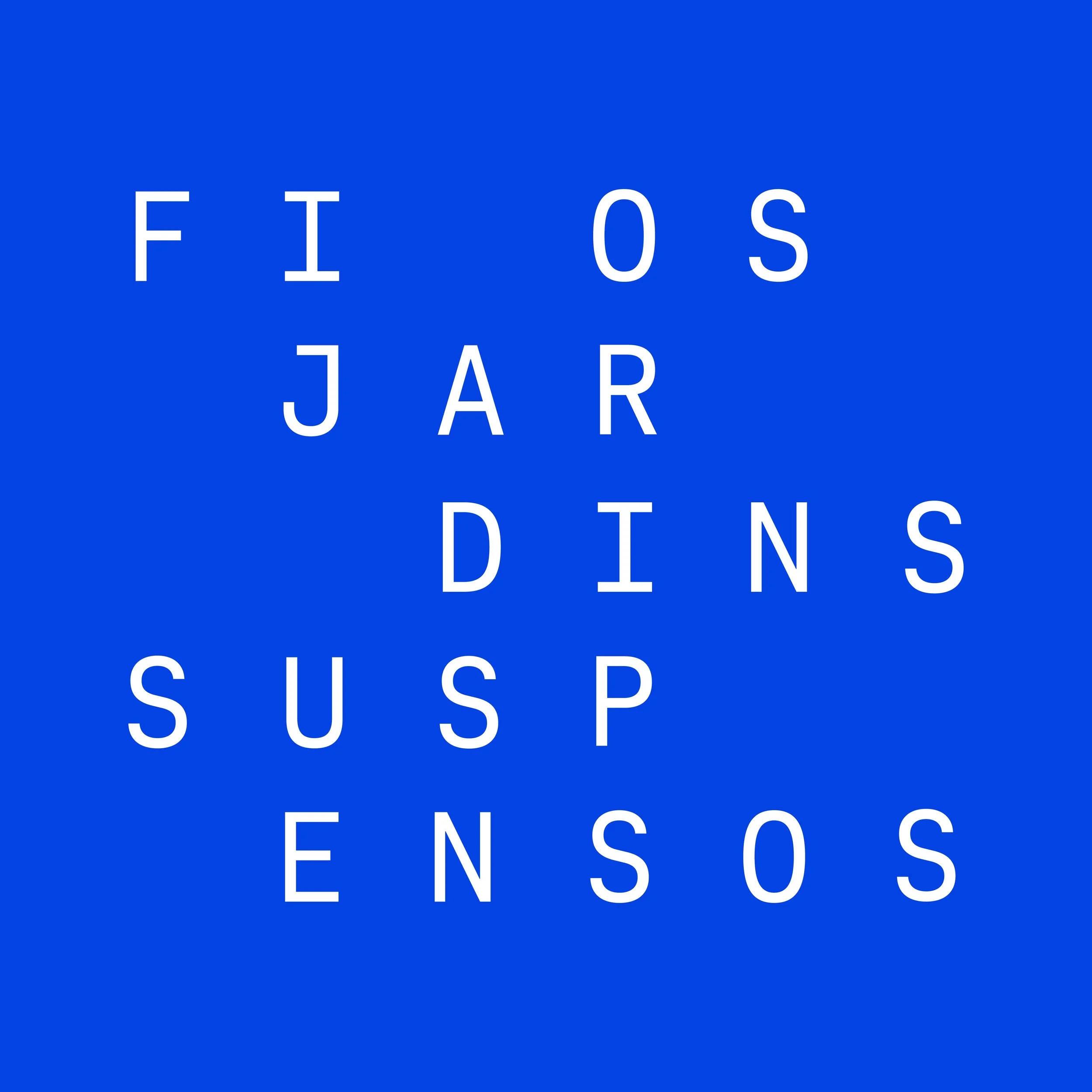
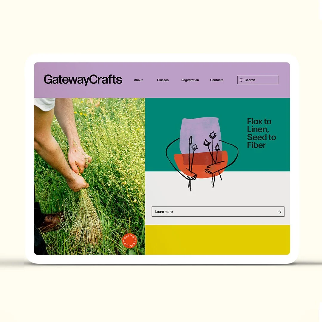
Business and Brand Strategy and a new Visual Identity for Fios Jardins Suspensos
We were in the last stretch of 2023 when we started a strategic design project with our friends Fios Jardins Suspensos.
In the first stage of this project, we helped them define a business and e-commerce strategy for the European Market. Then, we created a new brand strategy, which resulted in the total redesign of their identity and the development of a new Shopify Website by our design studio Estúdio Ofício .
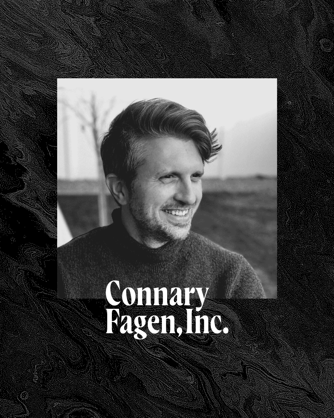
The Type Founders & Connary Fagen, Inc.
It was a delight when, later last year, we started collaborating with The Type Founders, home to some of the most renowned type foundries from around the world.
Our strategic marketing and social media communication work started with the amazing Connary Fagen, Inc., a type foundry and studio known for its soulful typefaces with extensive and inclusive language support.
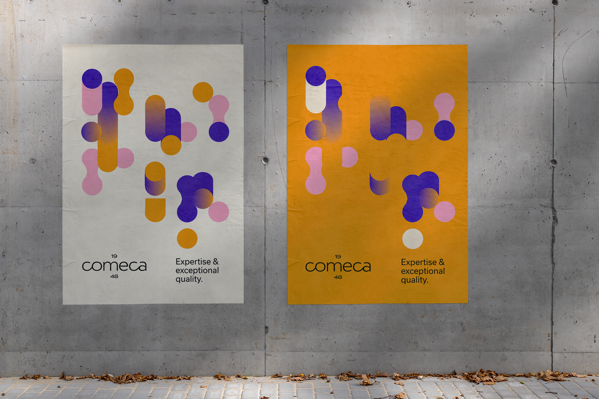
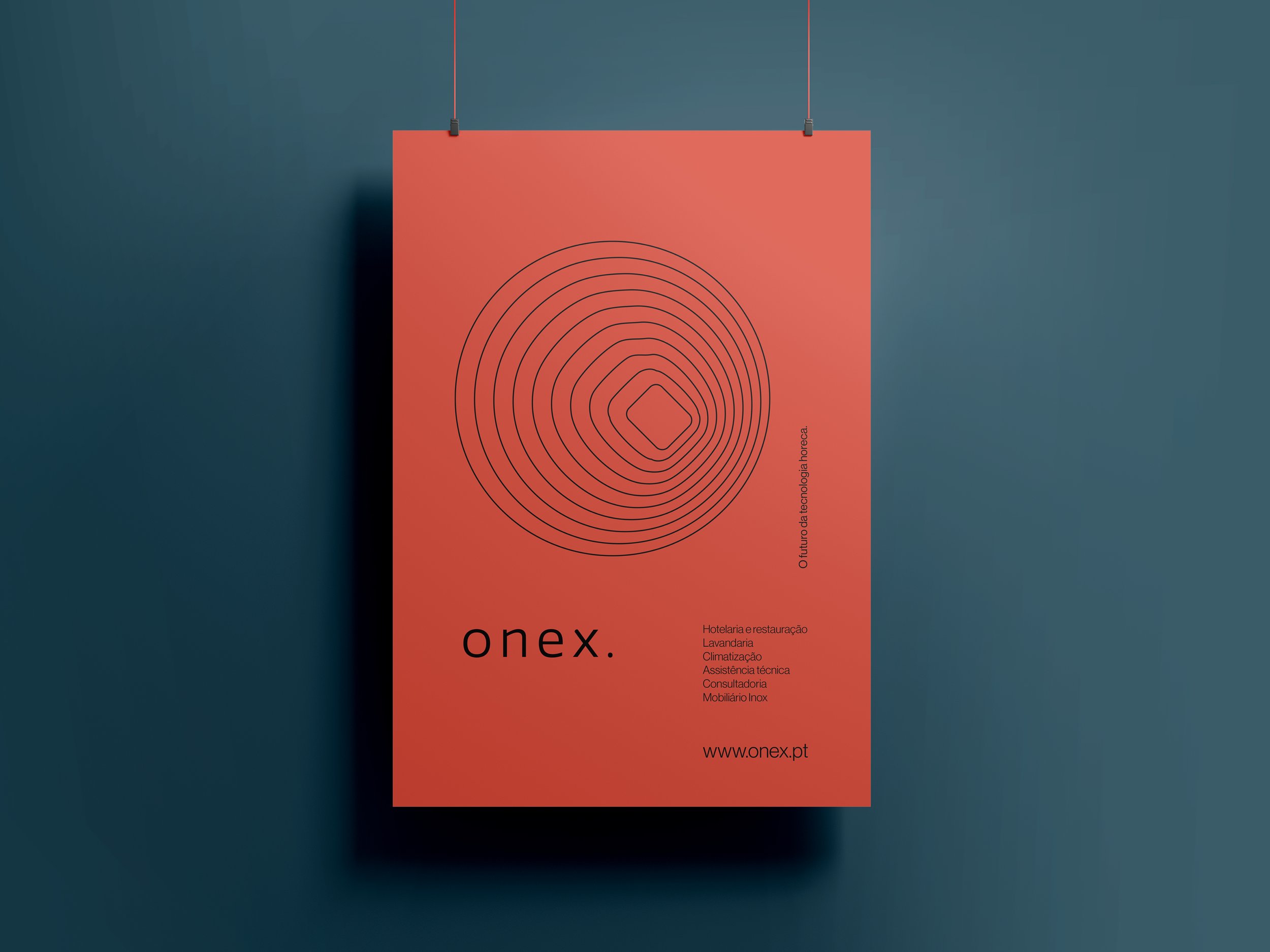
How we designed Comeca’s new visual identity
With over 75 years of experience, Comeca is a leading company supplying appliances and technology for the HORECA sector (an acronym for Hotel, Restaurant, and Café/Catering).
We started this project by creating a plan for a complete brand redesign and a new brand strategy considering the significant but exciting challenges that the clients are currently facing and to mark Comeca’s 75 anniversary.
How we made Golden Pilates visual identity
Summer was in full bloom when Estúdio Ofício, Barbot Bernardo’s graphic design studio, kick-started the project to design the new identity for Golden Pilates, a new Portuguese pilates machines manufacturer.
Ofício is Moving
Estúdio Ofício has a new social home at @_estudiooficio and a new portfolio page at ooficio.com, where you can find our latest designs (some of them are yet to be launched).
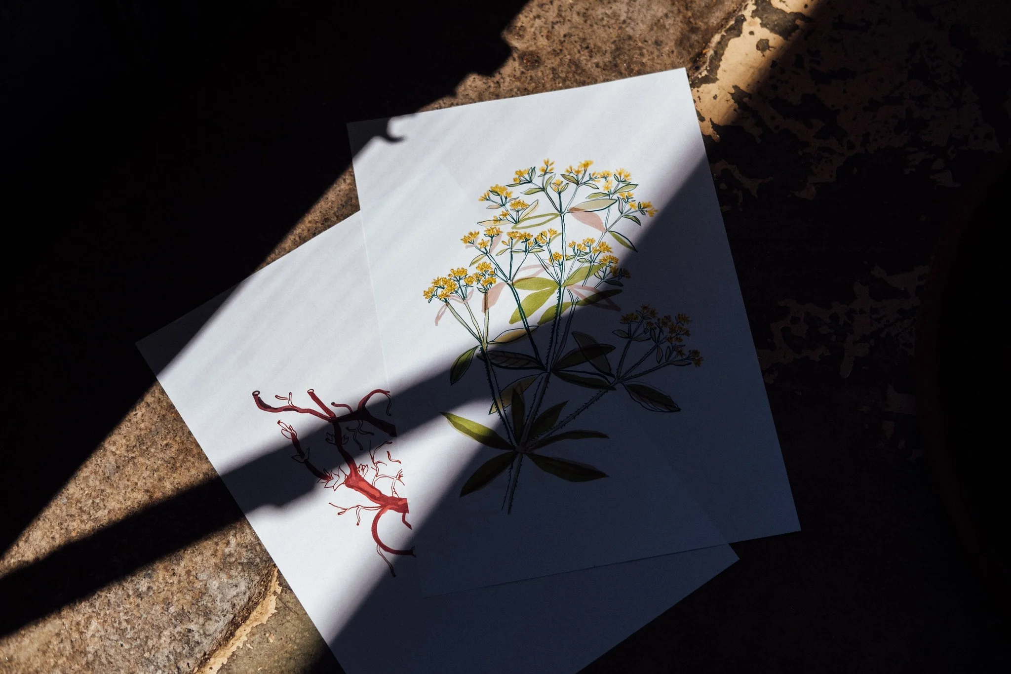
Work in Progress: Botanical Illustrations for Saber Fazer’s new book
Here is a preview of a set of botanical illustrations that Oficio’s art director, Maria Helena , is currently drawing for Saber Fazer, our education and editorial unit, upcoming book on natural dyeing.
The book, to be published in the next few months, was written by Guida Fonseca and Alice Bernardo.
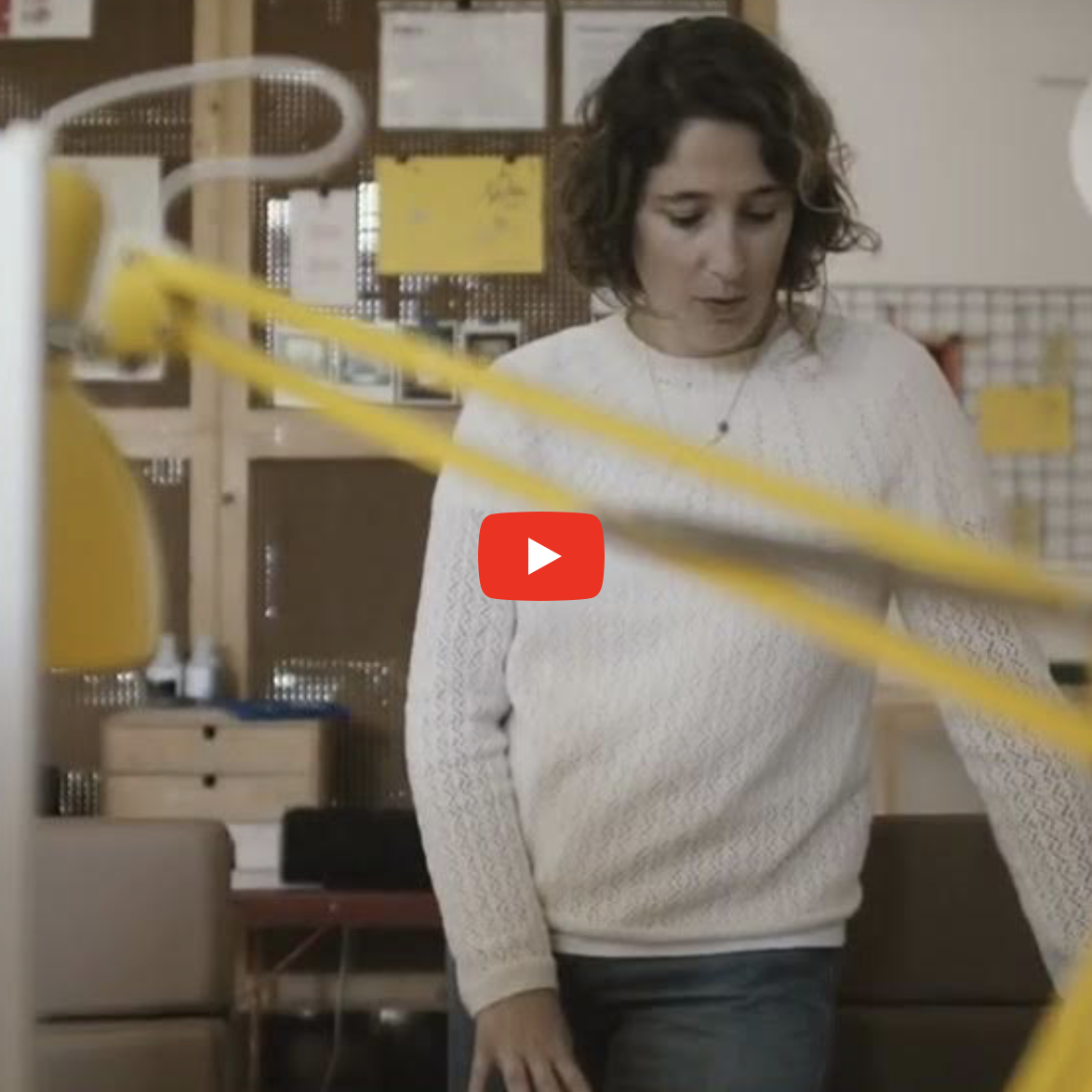
Nova Type Foundry Video
We prepared this short video to present Nova Type Foundry as a sponsor of the Typographics 2024 Conference, a fantastic event gathering leading type designers happening this week in New York.
Nova Type Foundry and Joana Correia have been close partners and one of our dearest friends since the foundation of Ofício, our design studio, and we couldn't be prouder of what she has achieved in the type design world!
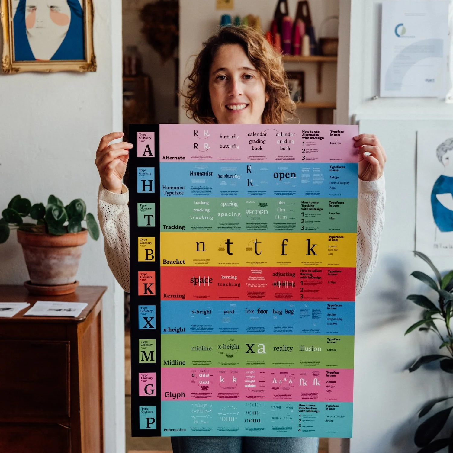
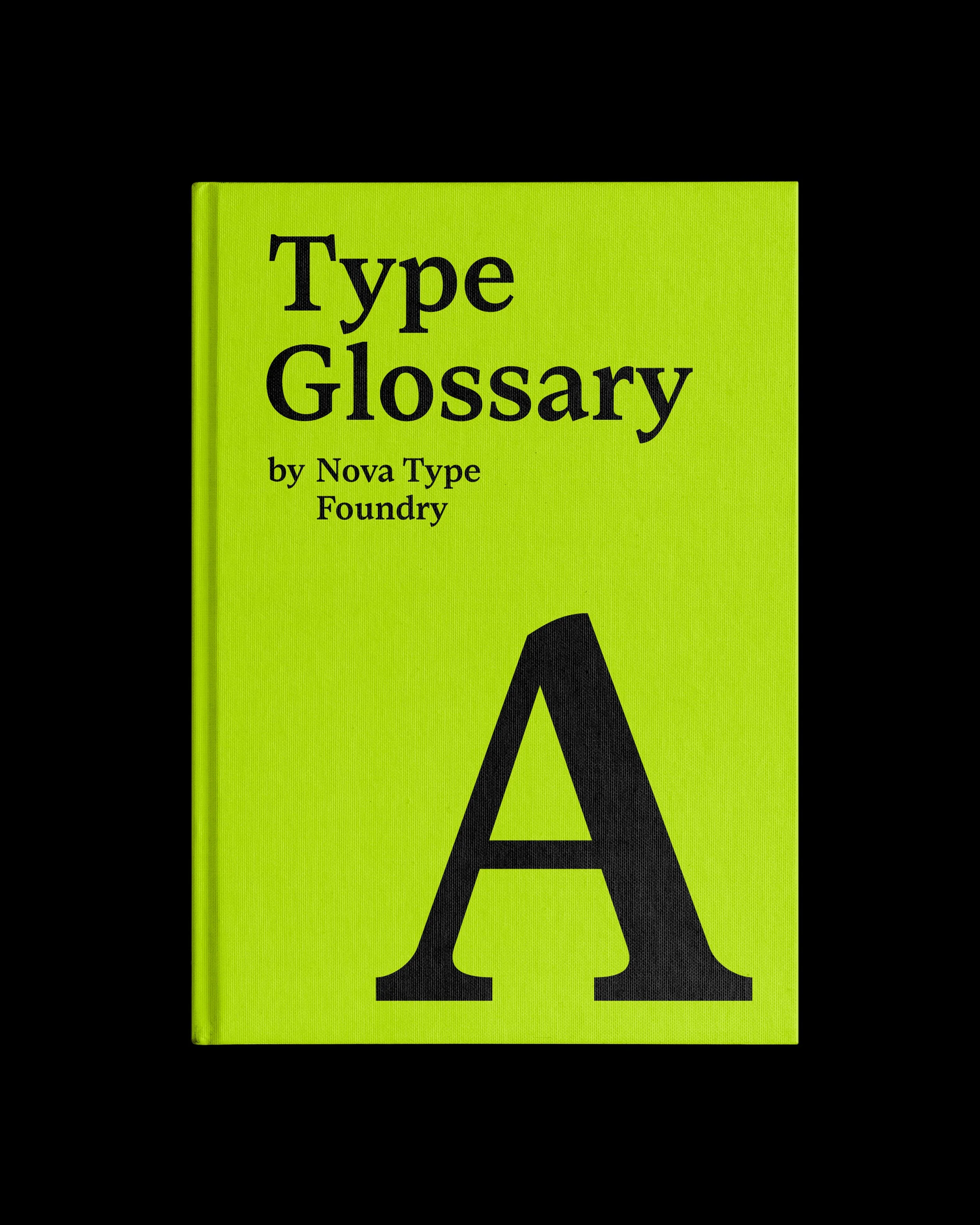
Nova Type Foundry Poster
We are delighted to show you the poster we designed to celebrate Joana Correia and Nova Type Foundry participation as a sponsor of the 2024 Typographics Festival in New York!
The poster showcases a few of the Nova Type Foundry Type Glossary, an essential part of the copywriting and graphic design he wave been doing for one of our dearest friends.
Interview with Joana Correia (Part 2)
This post is the second part of the interview with our good friend and partner Joana Correia from Nova Type Foundry (you can read the first part here).
For this second part of the interview, we packed great insights about the creative process of designing a new typeface, the specifics of independent foundries, being a woman in design, the business of typedesign, Joana's inspirations and a few reading recommendations for those starting a career.
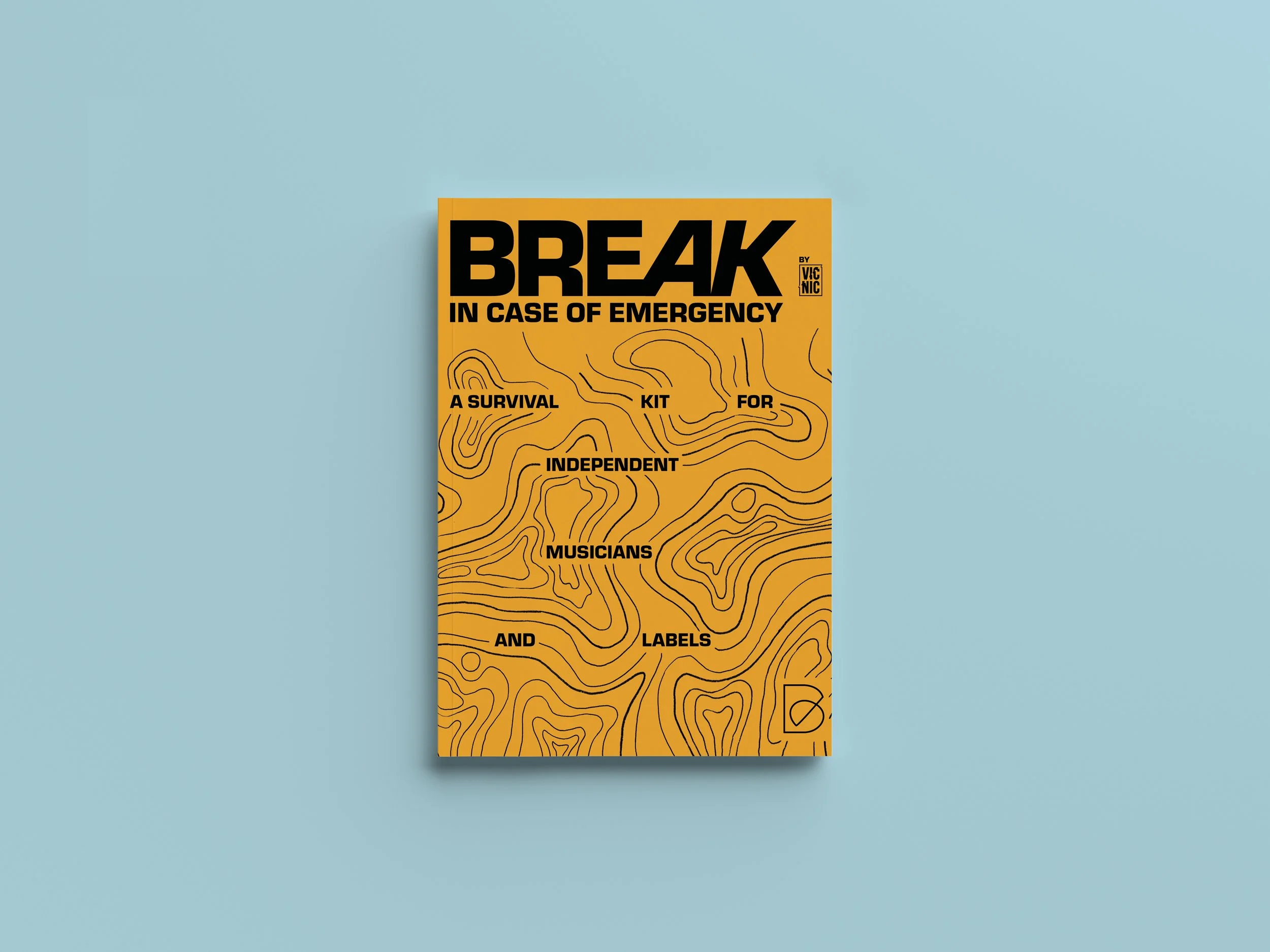
Free Download: The Break In Case of Emergency survival kit for independent musicians and labels!
Finally, here is your free download link for BREAK2023's digital guidebook, the SURVIVAL KIT prepared by the VicNic crew!
All the full masterclasses and roundtables are also freely available in video format on their YouTube playlist.
Interview with Joana Correia (Part 1)
Porto-based Joana Correia, founder of Nova Type Foundry, has been a great inspiration. Joana has helped us grow as a design studio since we first sat down here on Rua da Aliança just over two years ago.
With her support, we have worked on ideas for new projects, learned so much about Type Design and the Type Foundries business, and met and maintained contact with many of the great talents of this international community.
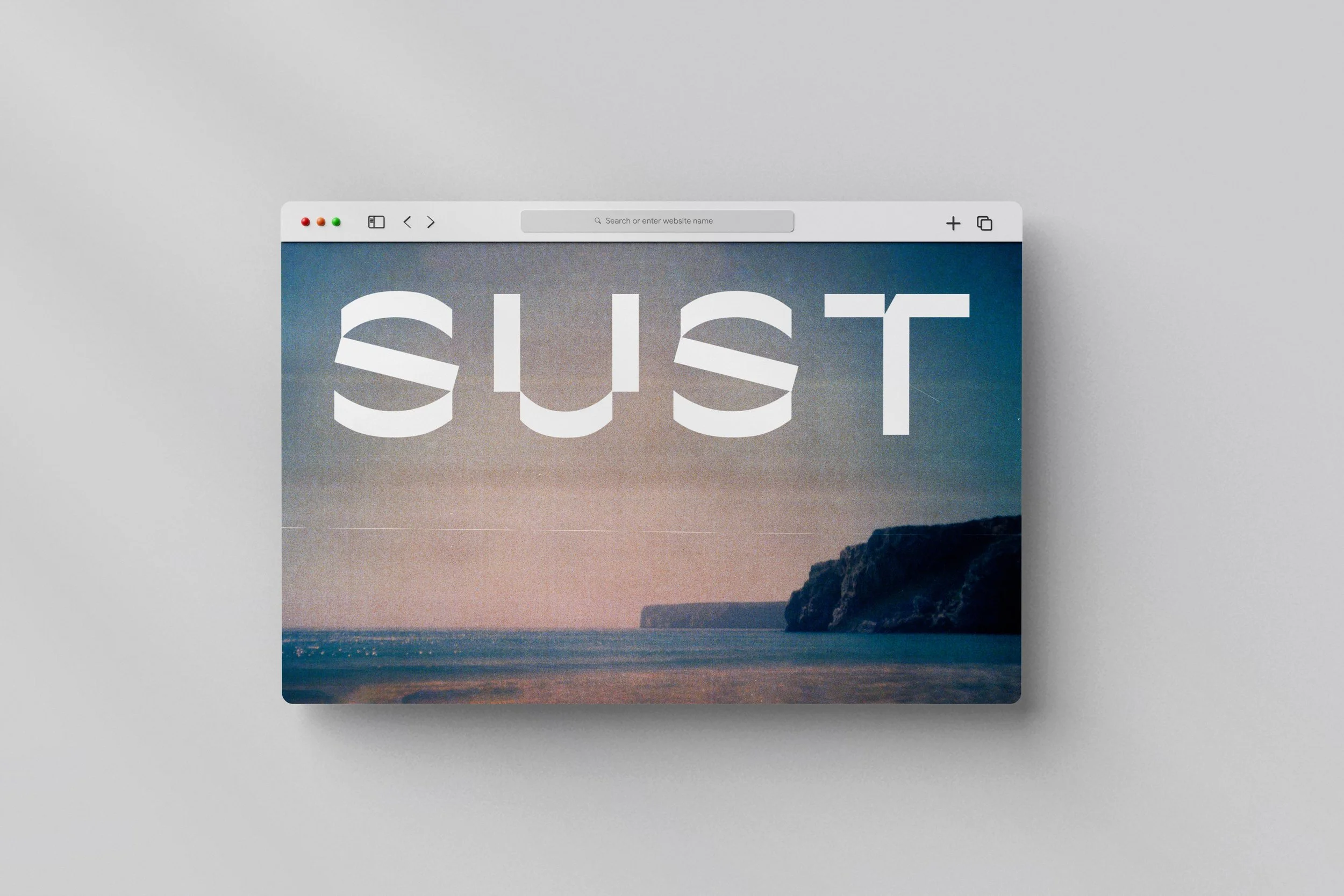
How we made Susto’s identity
Our work with Susto began in 2021 with a strategic consultancy process to define the business model for the brand. Subsequently, our studio took on the challenge of creating a new identity.
The creative direction of the graphic project bounced between two possible paths: one inspired by neo-postmodernist currents, closely linked to the creative direction of the brand itself and the client's artistic work, and that of brutalism, in the most literal sense of the word and therefore more linked to the materiality of the objects and the author's experimental process.