Case Studies


Work in Progress: Botanical Illustrations for Saber Fazer’s new book
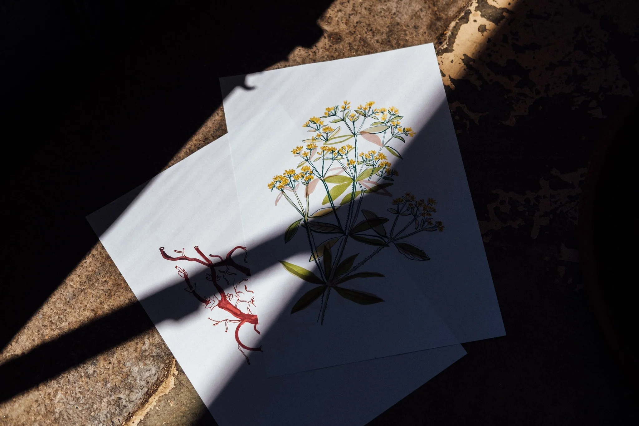
Here is a preview of a set of botanical illustrations that Oficio’s art director, Maria Helena , is currently drawing for Saber Fazer, our education and editorial unit, upcoming book on natural dyeing.
The book, to be published in the next few months, was written by Guida Fonseca and Alice Bernardo.
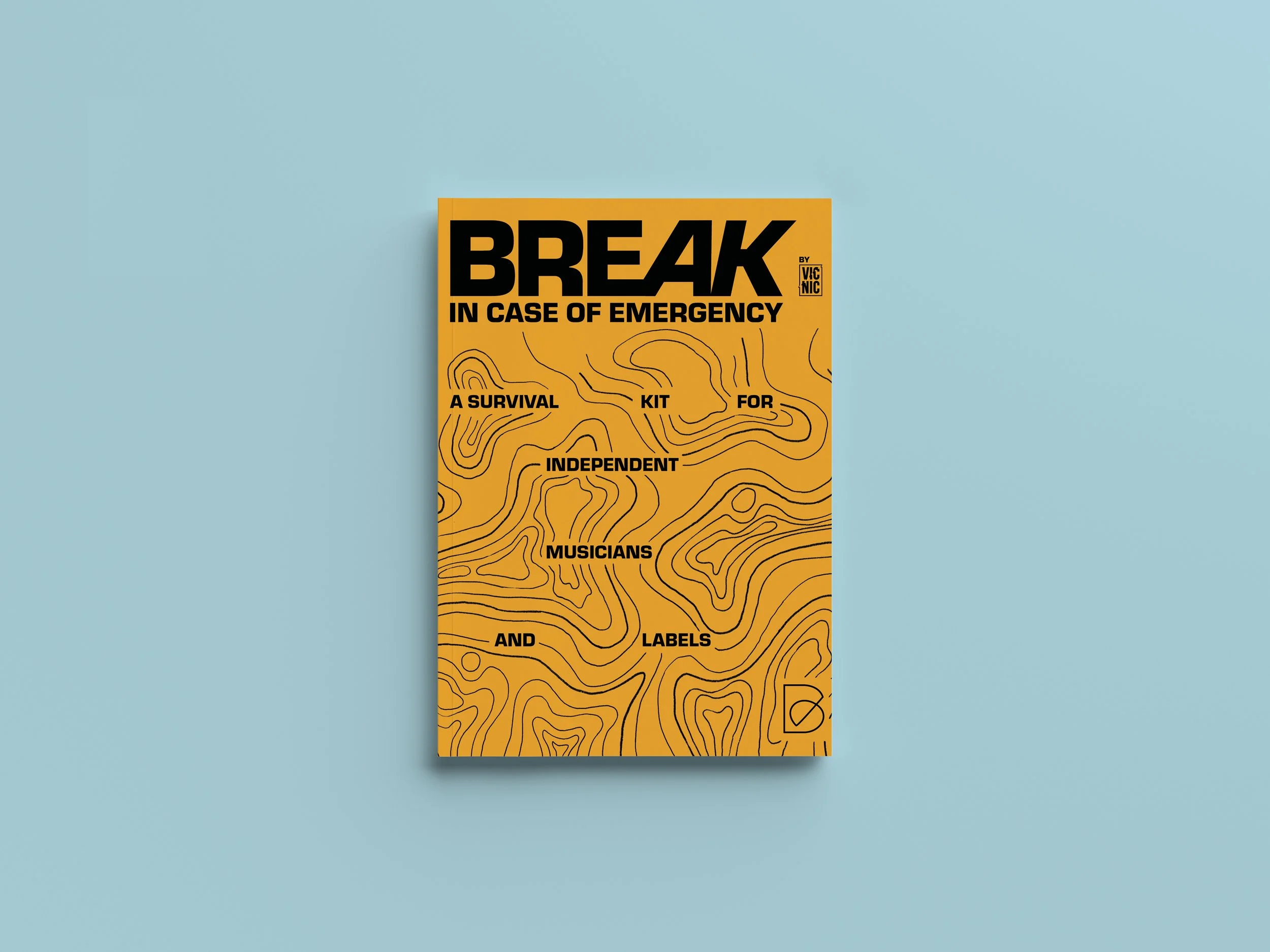
How we made the BREAK IN CASE OF EMERGENCY identity
Hugo Branco from Vic - Aveiro Arts House and Navalha, Associação Cultural, challenged us to design the identity of Break In Case of Emergency 2023, a kind of festival dedicated to sharing practical knowledge on themes and trends that affect the music industry.
"BREAK IN CASE OF EMERGENCY is a two-week hybrid boot camp for independent musicians and labels, focused on exchanging practical skills concerning some of the most pressing aspects of today's independent music industry.”
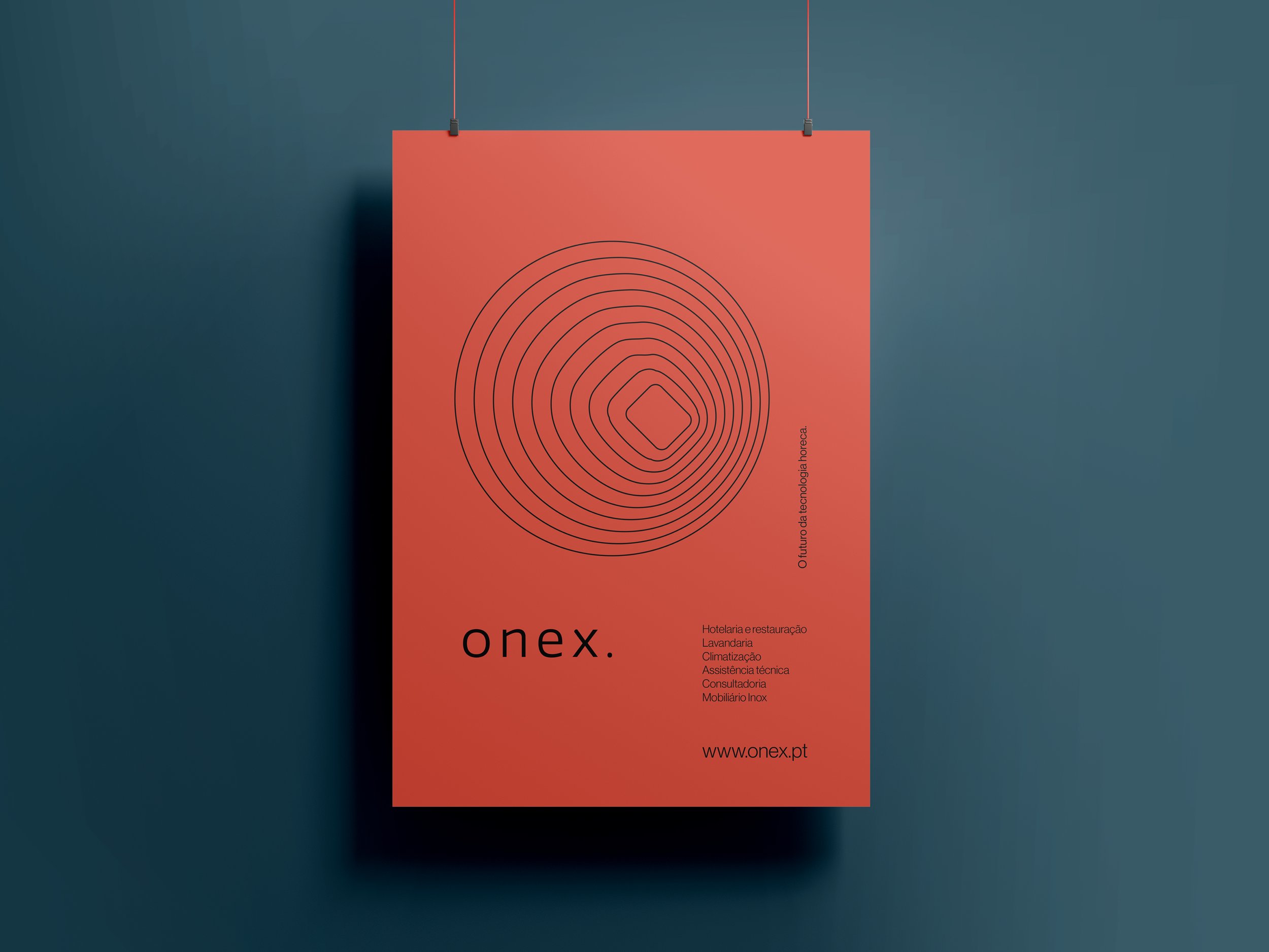
How we made the ONEX. identity
Recently we finished the branding and graphic design strategy for a leading Portuguese catering solutions provider.
The challenge with ONEX (Onexperience Group) entailed simplifying how the brand is presented in different markets and developing a new identity and shared visual system for the seven companies composing the conglomerate.
We developed a comprehensive visual system to organize the brand presence in different media. The strategy was to put forward a strong presence, combining typographic elements with an expansible set of symbols and colours representing each of the present and future business areas.
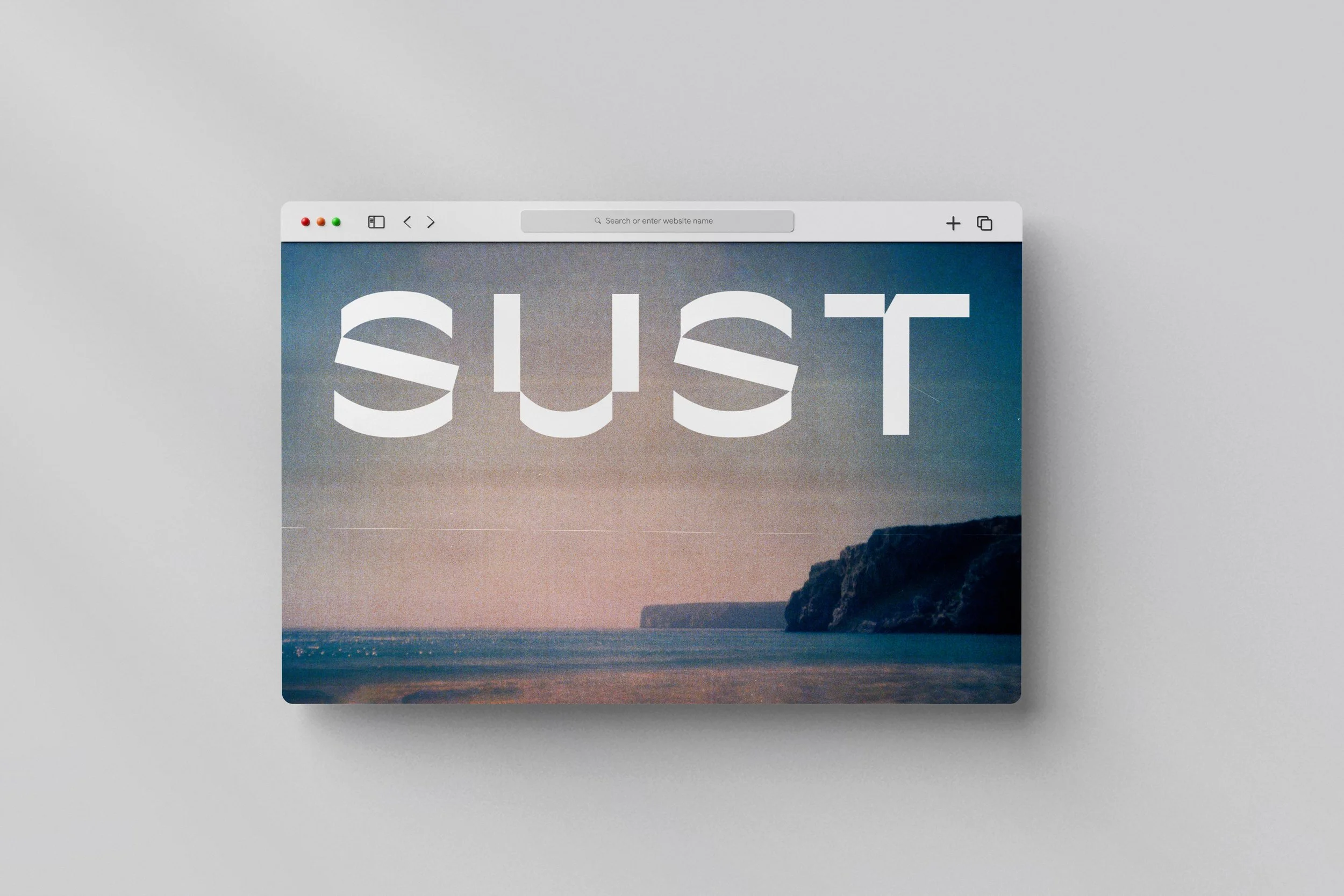
SUST.CO
Today we returned to 2020 to tell the story of a project that still needed to be posted here.
The Sust.co identity was a challenge proposed by Sofia Ferreira, who later hired our strategic consultancy services. We can only tell you a few details about the project and the client's plans. Still, we can say that it is linked to one of our central themes, "Craft", which means beautiful things, handmade and/or on a small scale and to last.