Case Studies


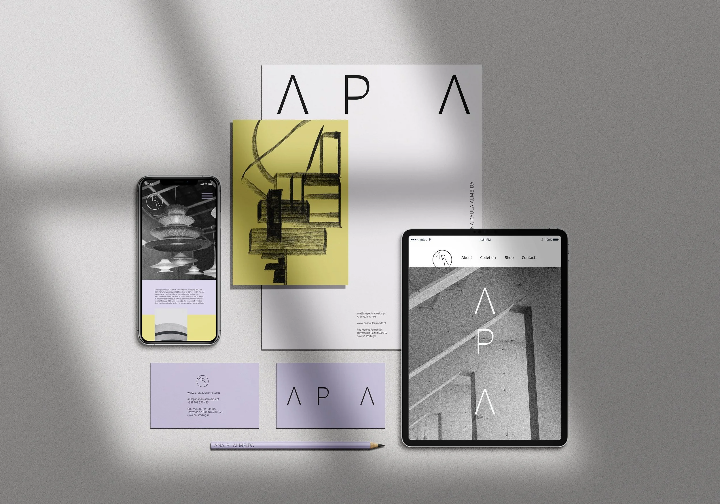

How we created Ana Paula Almeida's identity
Ana Paula Almeida, artist and maker, among many other things, came to us with a challenge. To think strategically about the brand, she was creating for a product and, based on that thought, to develop the entire visual identity.
The product in question is a lamp whose most distinctive feature (in addition to the design) is that it is built with wool yarn. These yarns are the leftover stock from the wool factory that now houses the New Hand Lab, a life project by Ana.
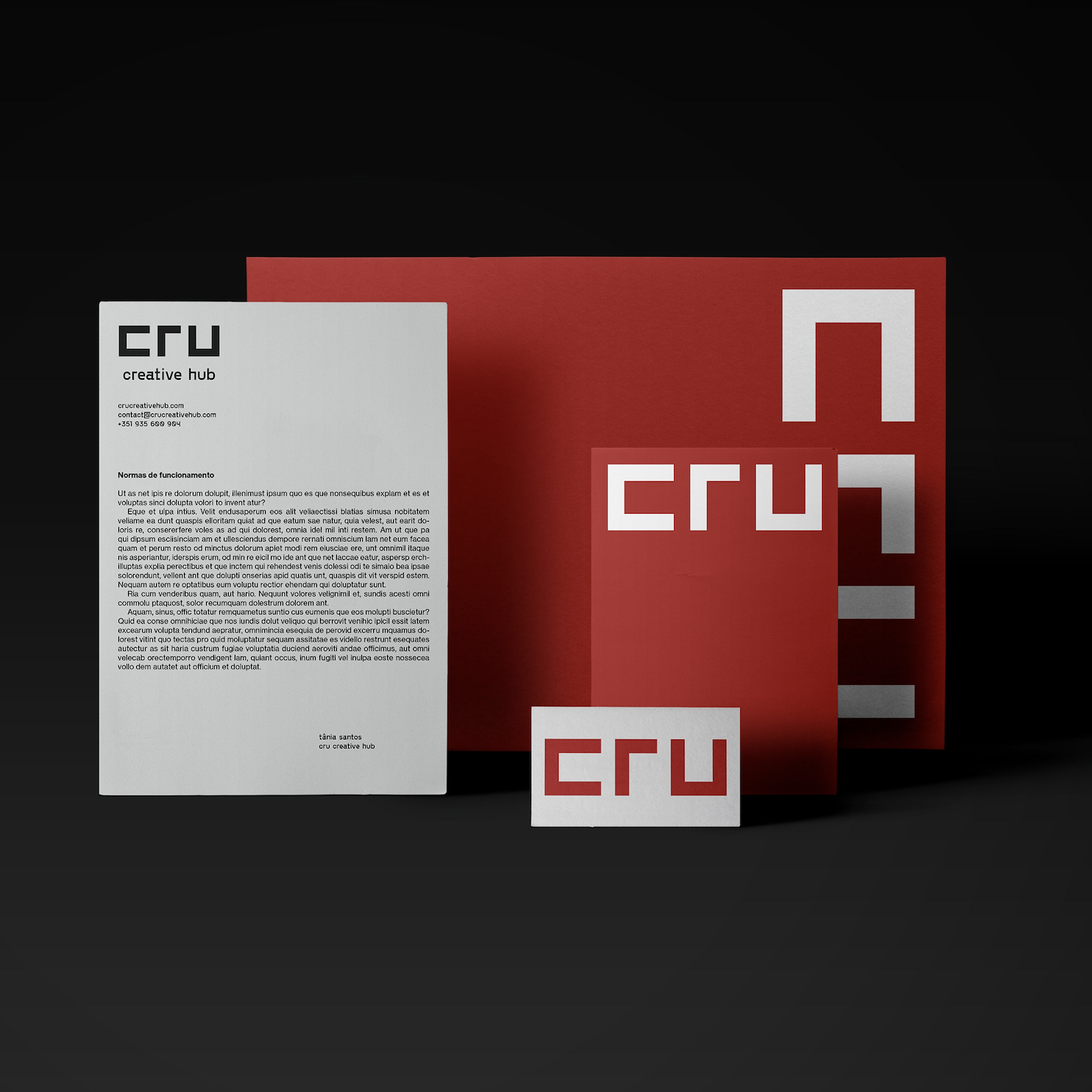
From co-work to creative hub: How we rebranded CRU
Cru was founded in 2012. The original logo was used for almost one decade until the founders asked us to help rebrand this iconic space in the heart of Porto's art district. By then, we had just finished a strategy project that repositioned Cru from a Cowork to a Creative Hub, something we will tell later in a different post.
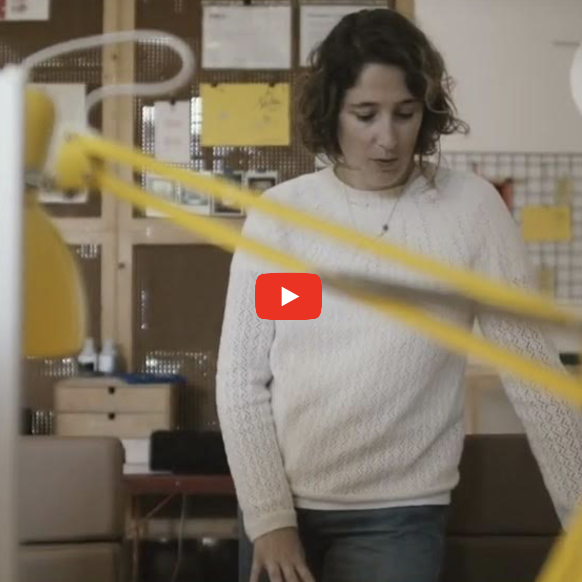
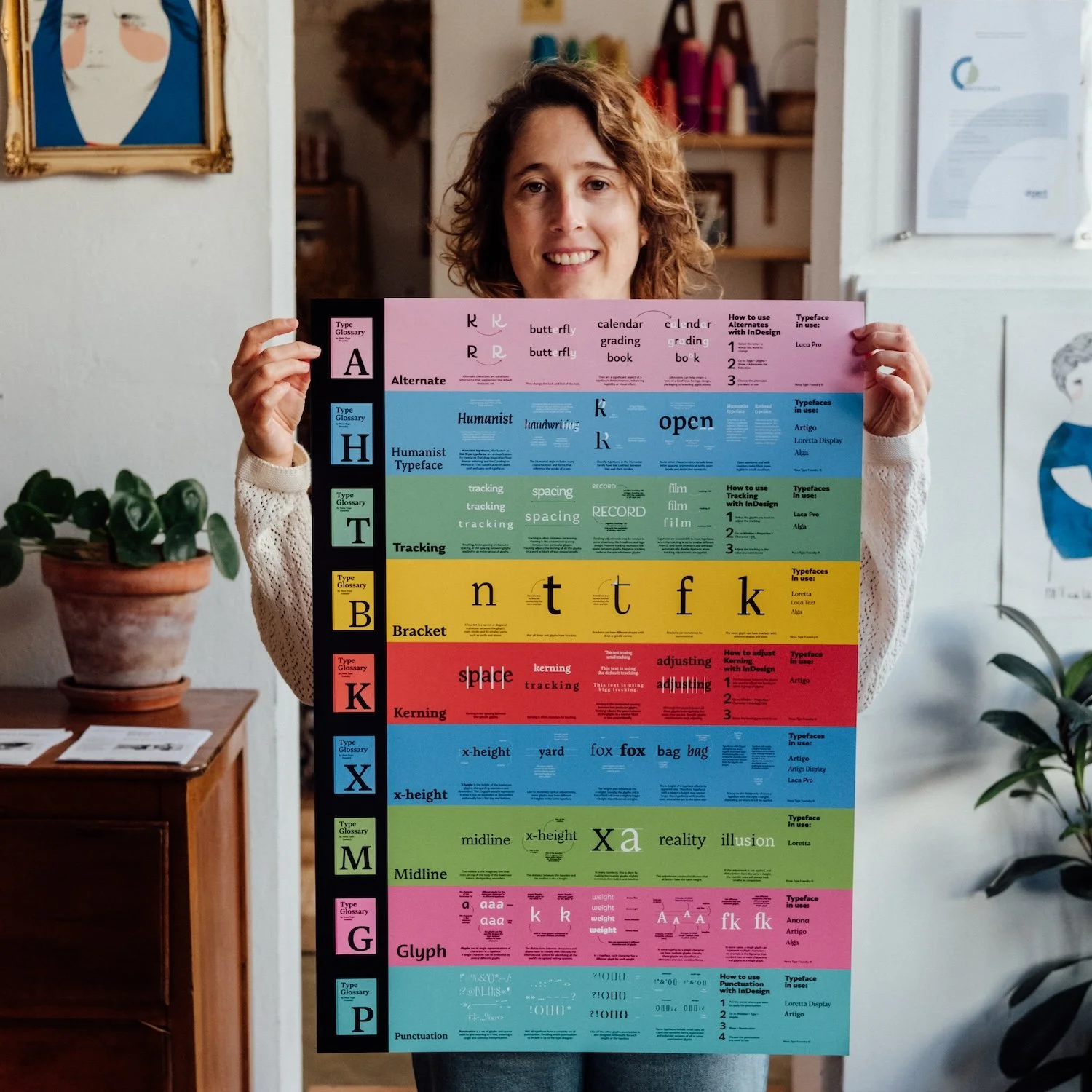
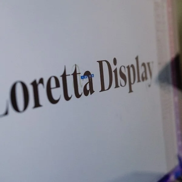
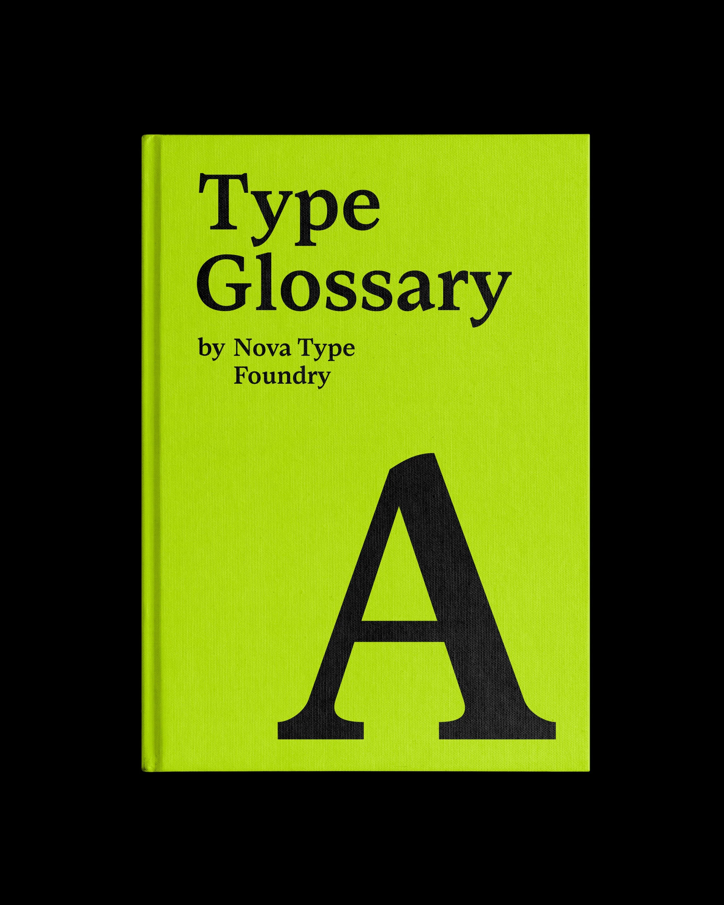
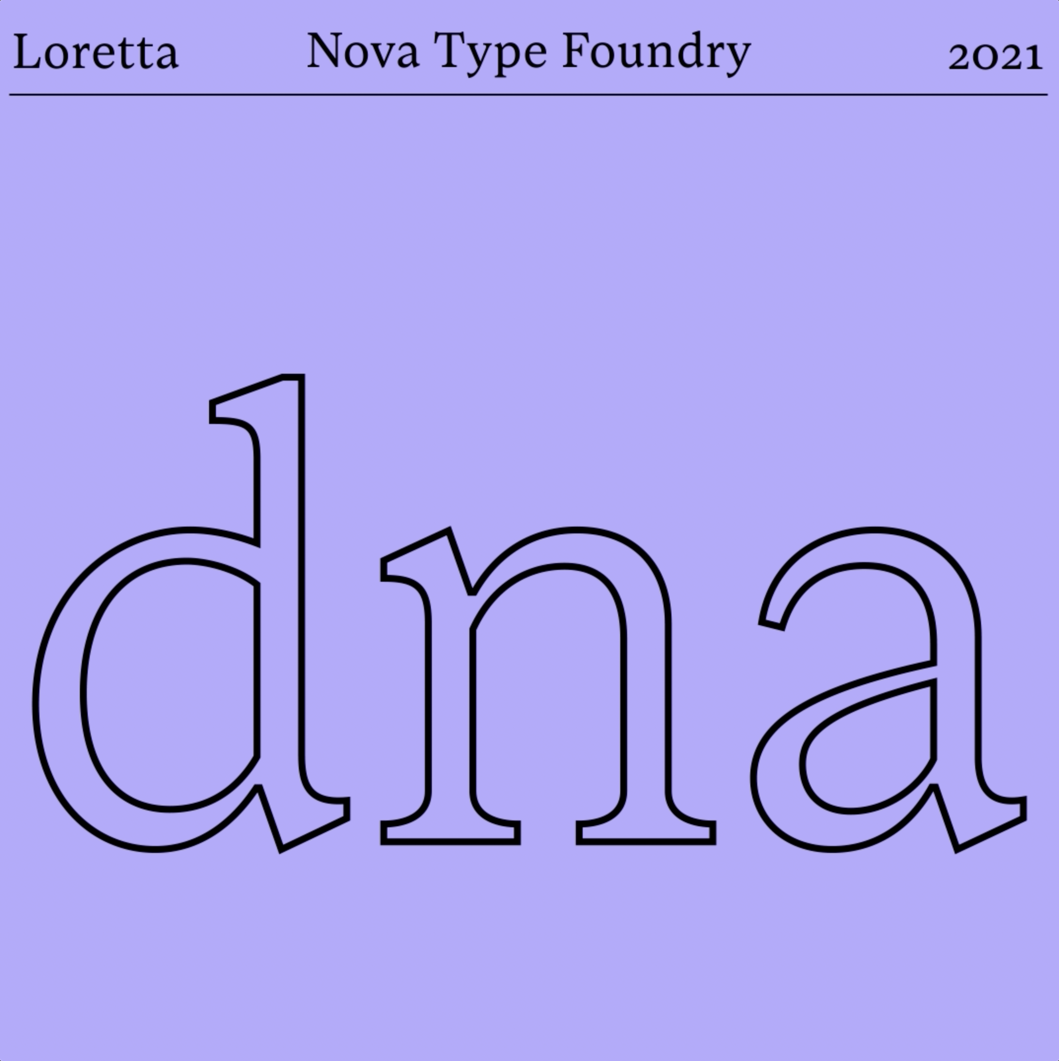
Nova Type Foundry
Typography is a subject we love — kerning, small capitals, punctuation, alignment, baseline grids and optical sizes — we love it all. So Joana, the founder of Nova Type Foundry, asked us for help regarding Nova's social media communication: strategic marketing within a subject we hold dear.
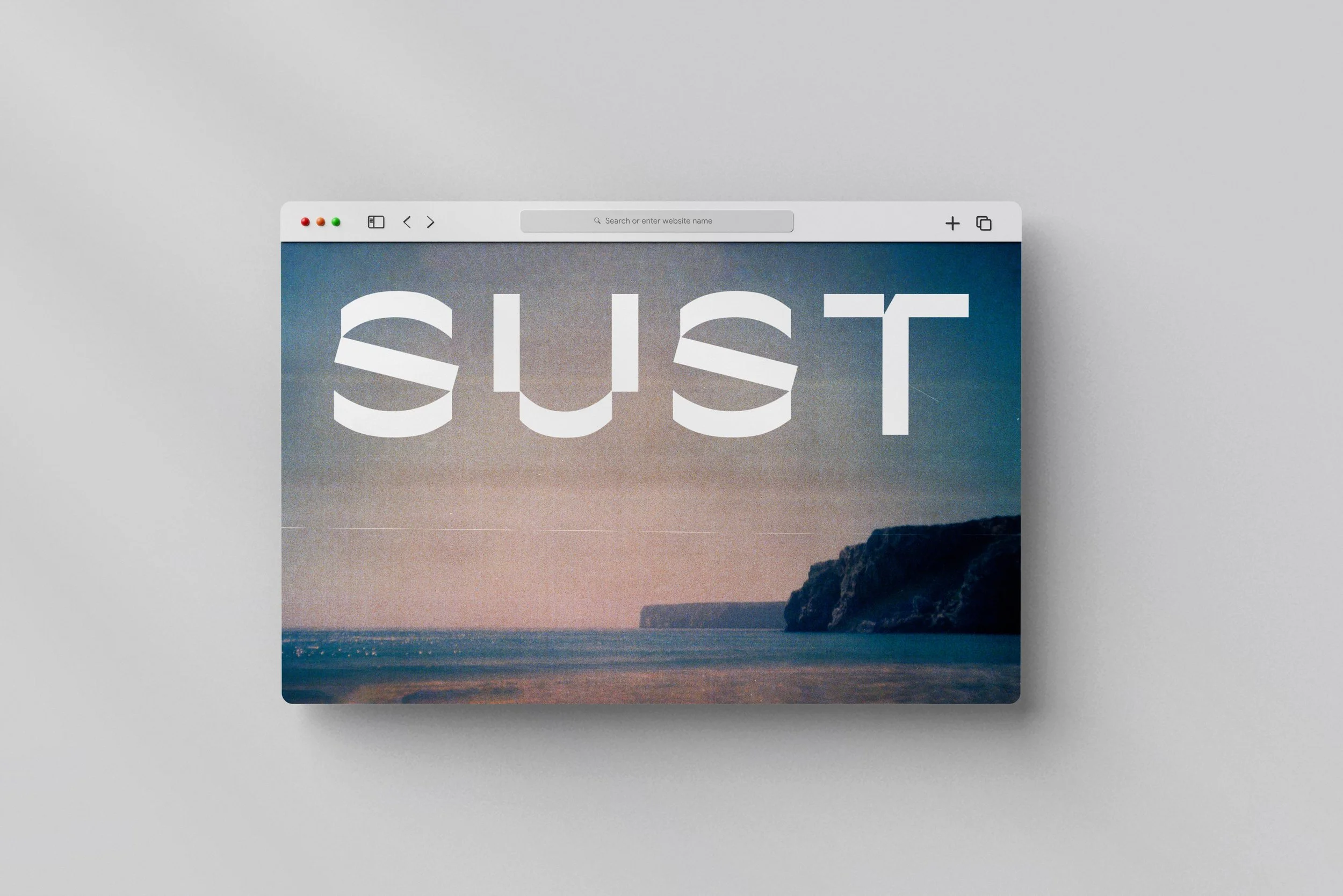
SUST.CO
Today we returned to 2020 to tell the story of a project that still needed to be posted here.
The Sust.co identity was a challenge proposed by Sofia Ferreira, who later hired our strategic consultancy services. We can only tell you a few details about the project and the client's plans. Still, we can say that it is linked to one of our central themes, "Craft", which means beautiful things, handmade and/or on a small scale and to last.
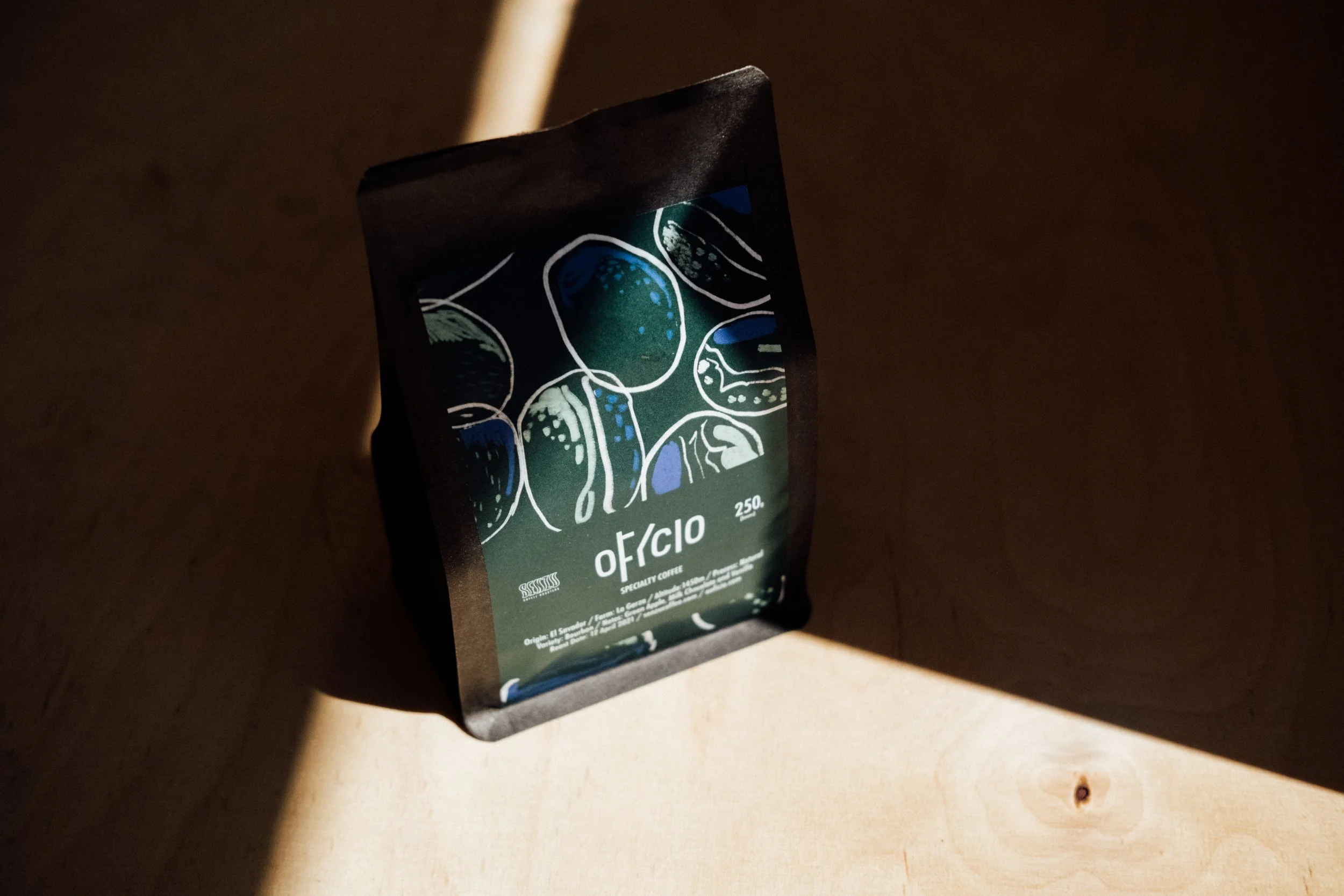
Ofício + Senzu Coffee Roasters: La Garza
After having the first editions sold out, Senzu Coffee Roasters roasted a new and bigger batch for our collaboration, this El Salvador (La Garza). Maria Helena designed the beautiful label.
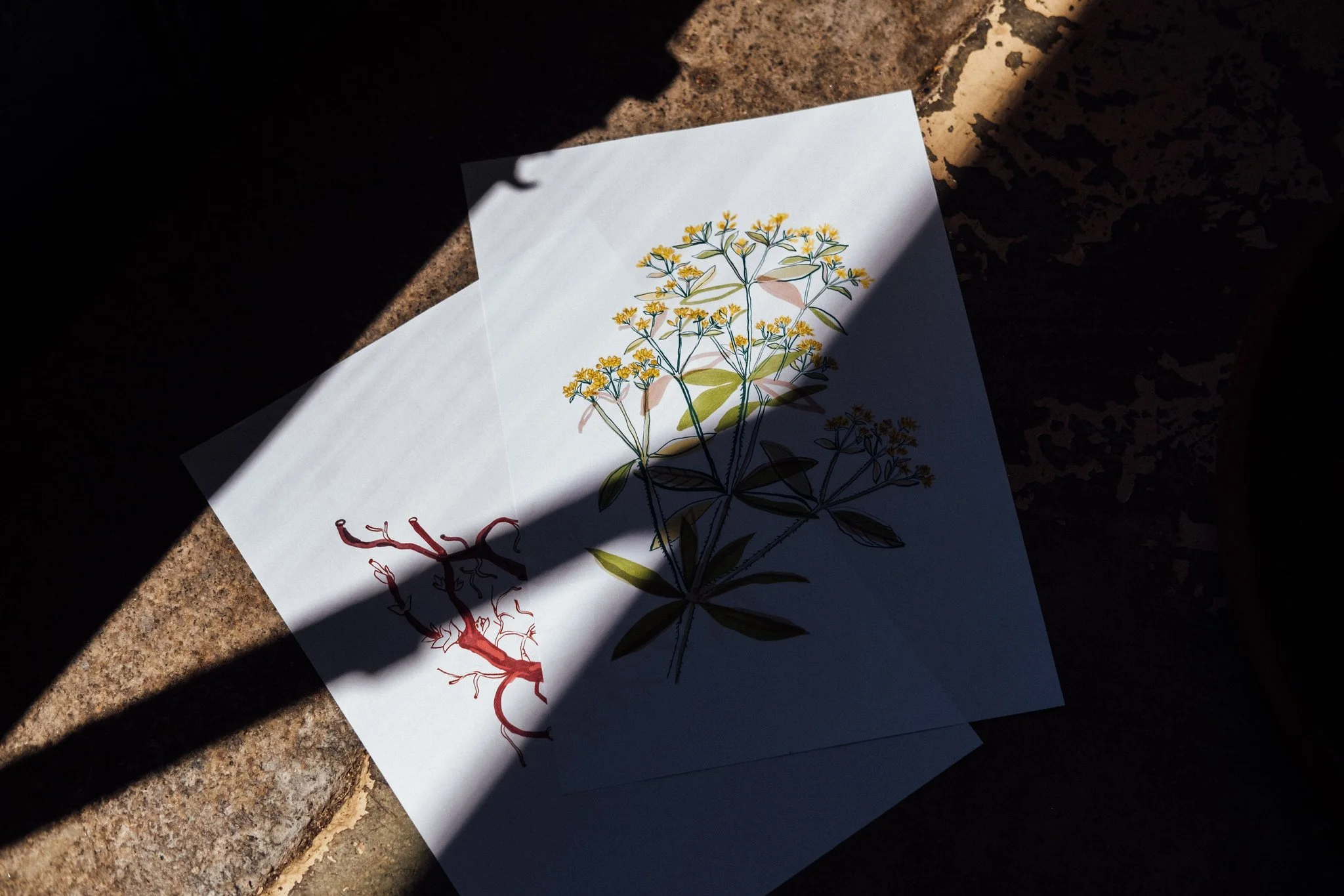
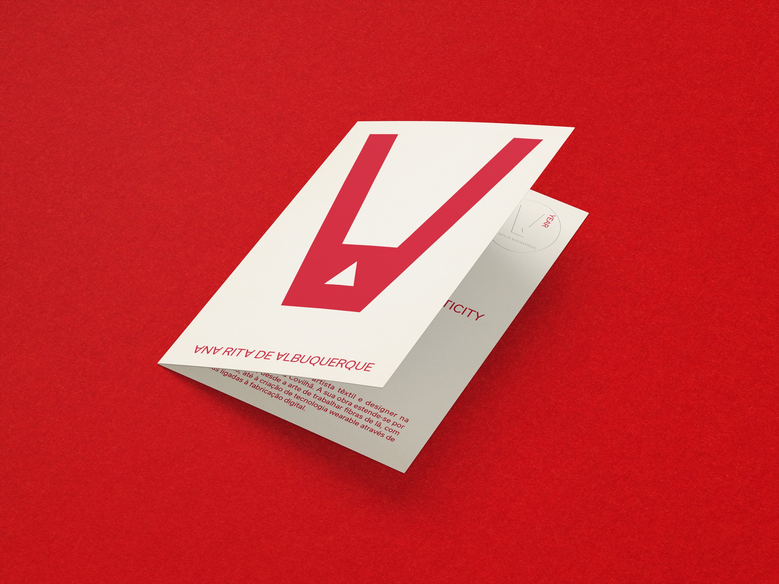
How we did Ana Rita de Albuquerque’s identity
Within the team, the objective of positioning the work on a multidisciplinary level was clear: we got inspiration from the work's very delicate but very organic and visceral character. We also considered wool's primitive rawness and the dialogue with technology: an invisible but ever-present second layer in many of her artworks. Finally, we took visual clues from music and the early eighties' sombre bohemia.
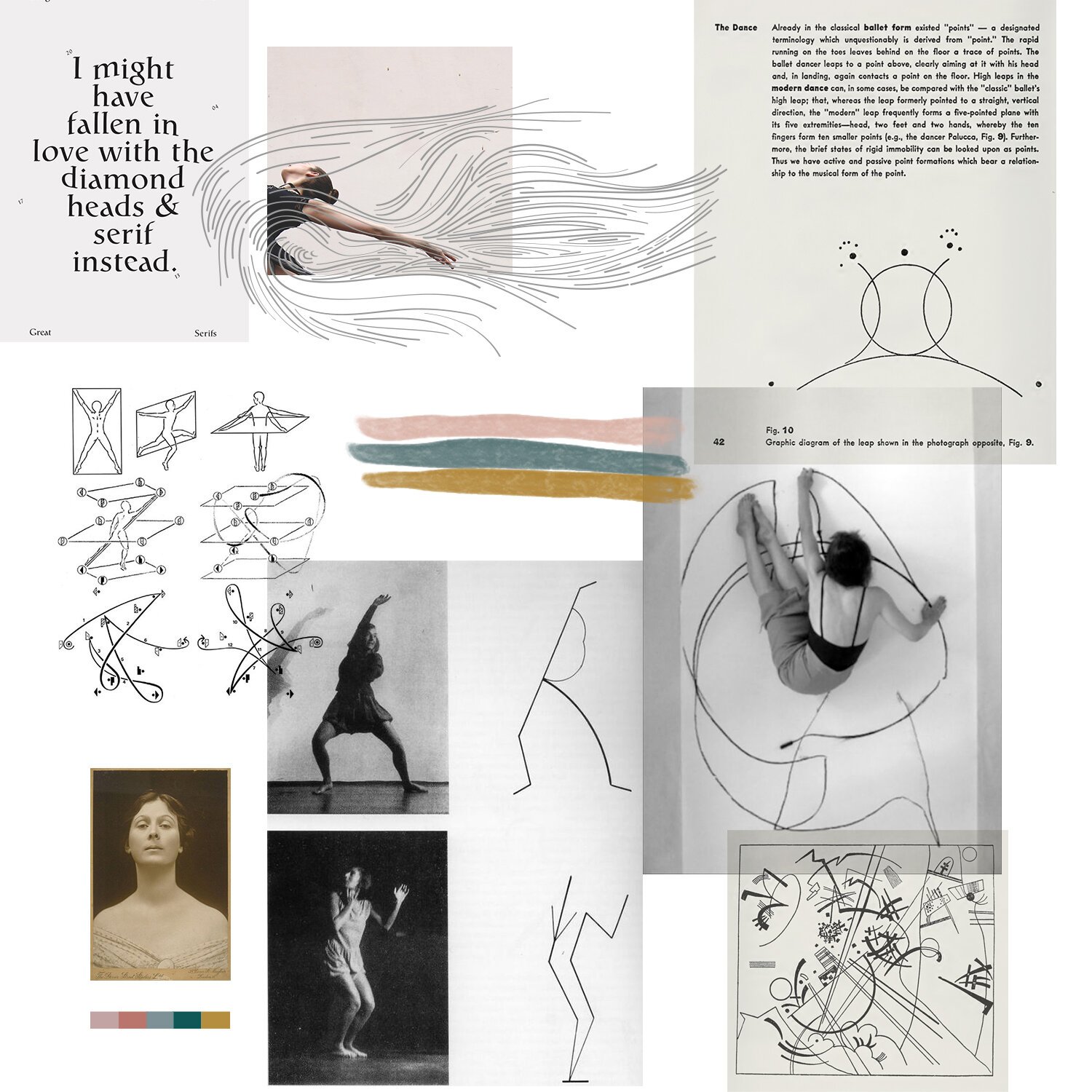
How we did Prata’s identity
“In my research, Wassily Kandinsky's "Point and line to plane" informed most of the process: I love this book, a marvellous piece exploring graphic expression, painting and geometry theories with scientific precision, relating them with dance and music.”
Ofício + Senzu Coffee Roasters: 3º Chapter
After the first two editions' success, the Costa Rica natural (sold out) and the Ethiopia natural (last few bags still available), Senzu Coffee Roasters roasted a new batch for our collaboration. The third chapter is a spectacular Ehtiópia Guji, washed.
How we did The Seed’s identity
In the weeks before starting the first drafts, Ricardo sent us his references, most of which were music-related. The '70s and early '80s rock bands were our starting point (do you remember when all the bands used to have a logo?), something very prevalent in the first drafts on paper.
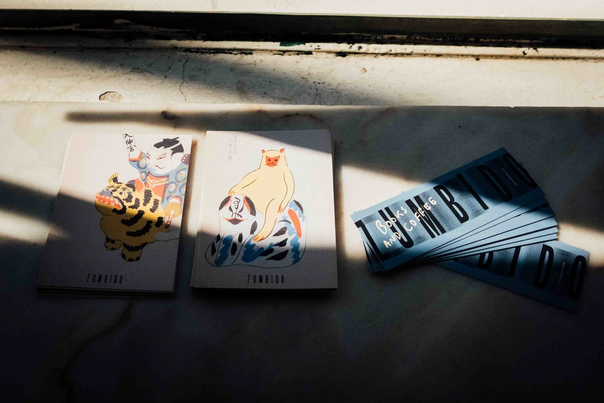
Editorial strategy for NEVOAZUL magazine
This project was short, lasting one month—a mentorship structured around three chapters. The first was dedicated to the magazine readers, the second to the editorial strategy and the third to the business model and the possible ways to professionalize the team editorial and content creation experience.

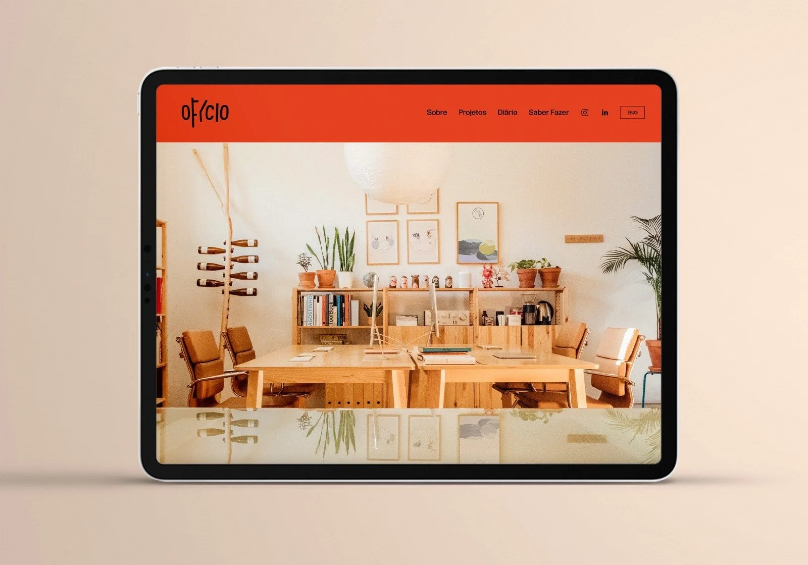
How we did the Ofício’s identity
“When designing Oficio's new identity, I had the feeling of being in a delicate position. I was both the designer and the client, along with Miguel Barbot. Having these two hats on implies an extra responsibility. The final design must reflect our practice, the things we like, the incredible men and women we represent and our style. The briefing consisted of designing a new identity reflecting the artisanal work of the craftsman, artists and makers with whom Ofício works. However, Barbot kept saying, "don't forget: you must design something you will be proud to use in your card".

Ofício + Senzu Coffee Roasters Special Edition
We have an old friendship with Senzu coffee roasters. It started with a mutual admiration for our work and passions and ended in this very special collaboration. Diogo is a good friend, the man behind Senzu's roaster and one of the heads running ABCoffee, the first speciality coffee school in Porto. He roasted a special edition batch to Ofício, which quickly sold out. It's a Costa Rica (El Perezoso, Natural), perfect for brewing in a Kalita Wave or a V60, two of our favourite methods.
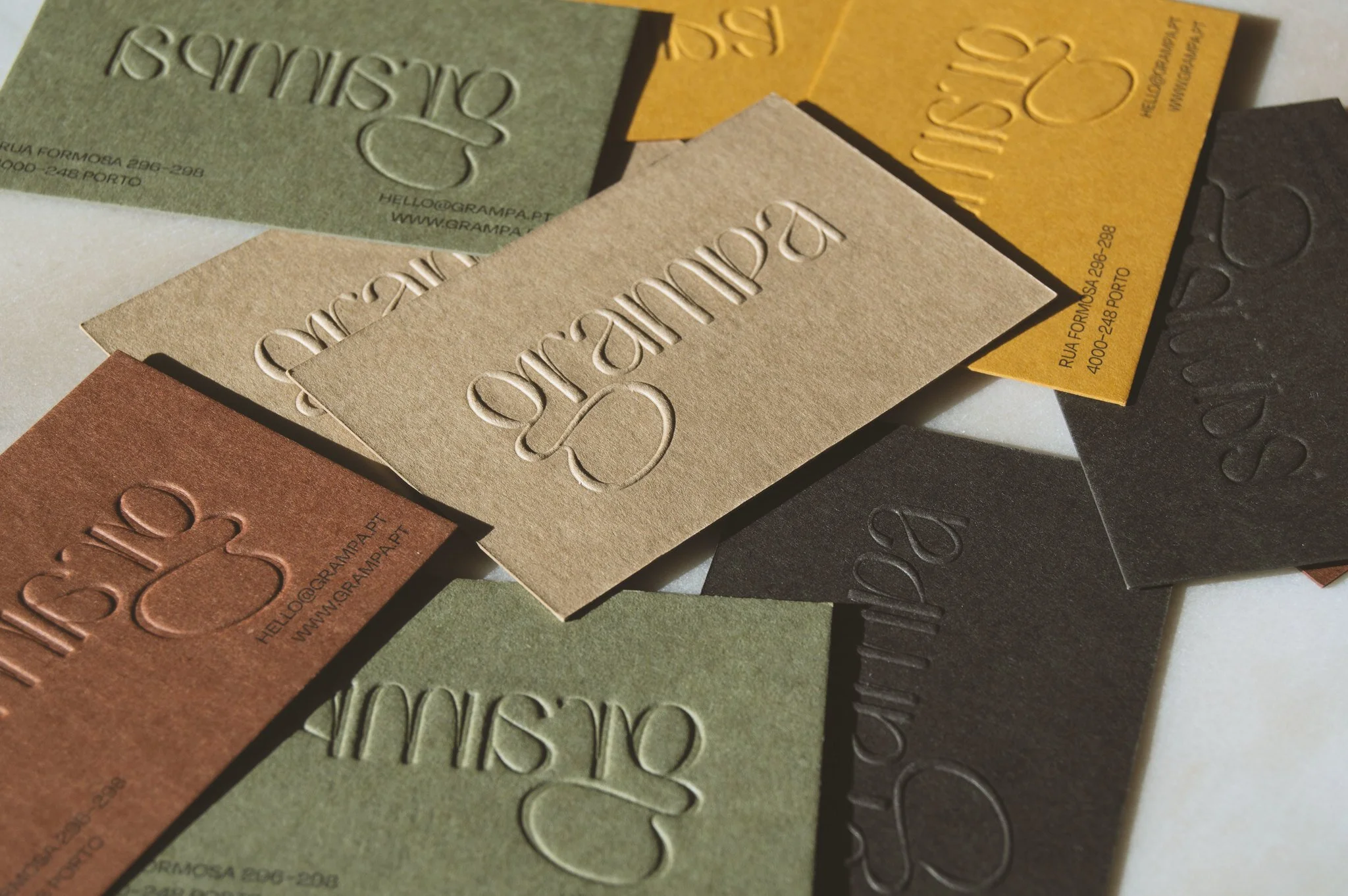
GRAMPA: a new identity for a historical department store in Porto’s Bolhão district
We started after Barbara's call asking Barbot's help in a crazy project of relaunching her grandparent's department store in downtown Porto. The new name, GRAMPA, refers to her heritage and the work of the previous generations, and a tool with the same name, a homage to handmade and small-scale production. It was a concise consulting project consisting of only three sessions.
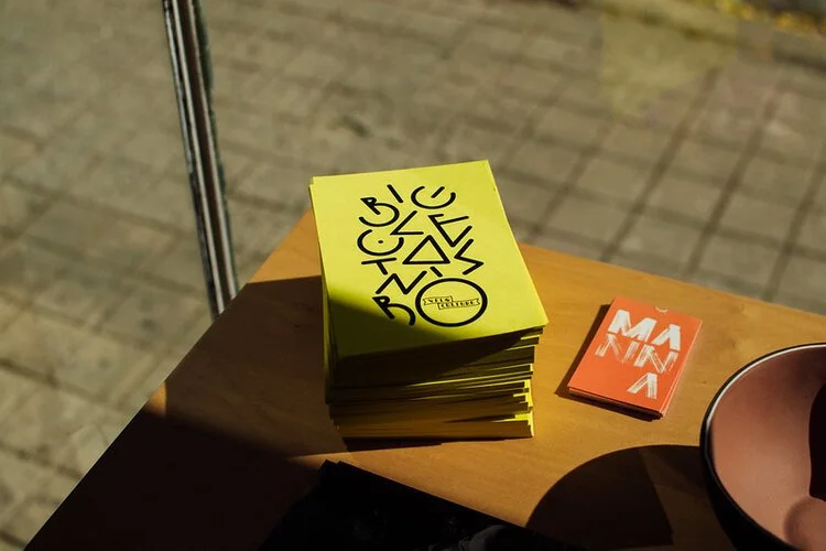
Velo Culture: Beautiful Bicycles (Bicicletas Bonitas)
Ofício recently finished a commission to Velo Culture, the illustration "Bicicletas Bonitas", which means Beautifull Bicycles in Portuguese, designed by Miguel Moreira. It will be a decade this year since I founded Velo Culture with two friends. The first Velo Culture bicycle shop opened in the early days of 2012 in Matosinhos, in the Fish Market. A few years later, we opened a second shop in Central Porto, which is now shared with the Ofício Studio.
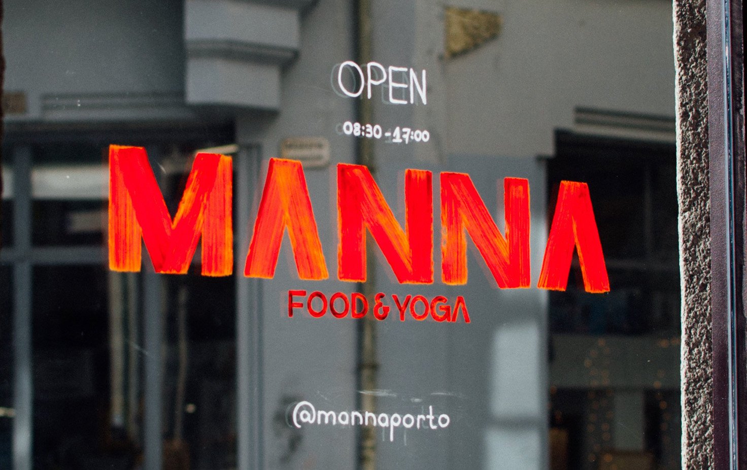
MANNA Food & Yoga, Porto
I met Sara and Helder in 2018. At the time, they proposed a challenge to plan the Manna project from scratch: a new restaurant and café in the heart of Porto. The vegan restaurant offers delicious food on-site, like sourdough bread, fermented veggies, speciality coffee, craft beer and natural wines. They also wanted to include a Yoga Studio with several classes running daily.