
How we made the BREAK IN CASE OF EMERGENCY identity
Hugo Branco from Vic - Aveiro Arts House and Navalha, Associação Cultural, challenged us to design the identity of Break In Case of Emergency 2023, a kind of festival dedicated to sharing practical knowledge on themes and trends that affect the music industry.
"BREAK IN CASE OF EMERGENCY is a two-week hybrid boot camp for independent musicians and labels, focused on exchanging practical skills concerning some of the most pressing aspects of today's independent music industry.
The event may be attended physically at the charming coastal town of Aveiro or remotely through digital access to live streaming of all activities.
Complementary #BREAKS will encourage participants' immersion in the territory and provide a safe harbour for sharing experiences, debating ideas and envisioning future collaborations and networks.
Hosted by a brilliant selection of national and international experts within each field, the program is divided into four thematic #TRACKS, composed of masterclasses, roundtables and practical assignments."
On the one hand, knowing Hugo and the sort of programme that his team was preparing, and on the other hand, being the first time that we worked together, we immediately felt the pressure to create something that would directly position the project and would allow its quick implementation.
We started, as always, working on moodboards, which were translating both the client's briefing, more oriented towards the design’s formal aspects, and our own vision for the project.
And what did the creative direction tell us? The project would go down to the end of the 70s and the collision between electronics and more analogue ways of making music.

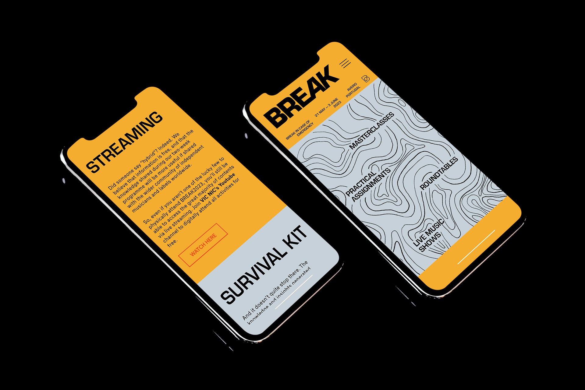

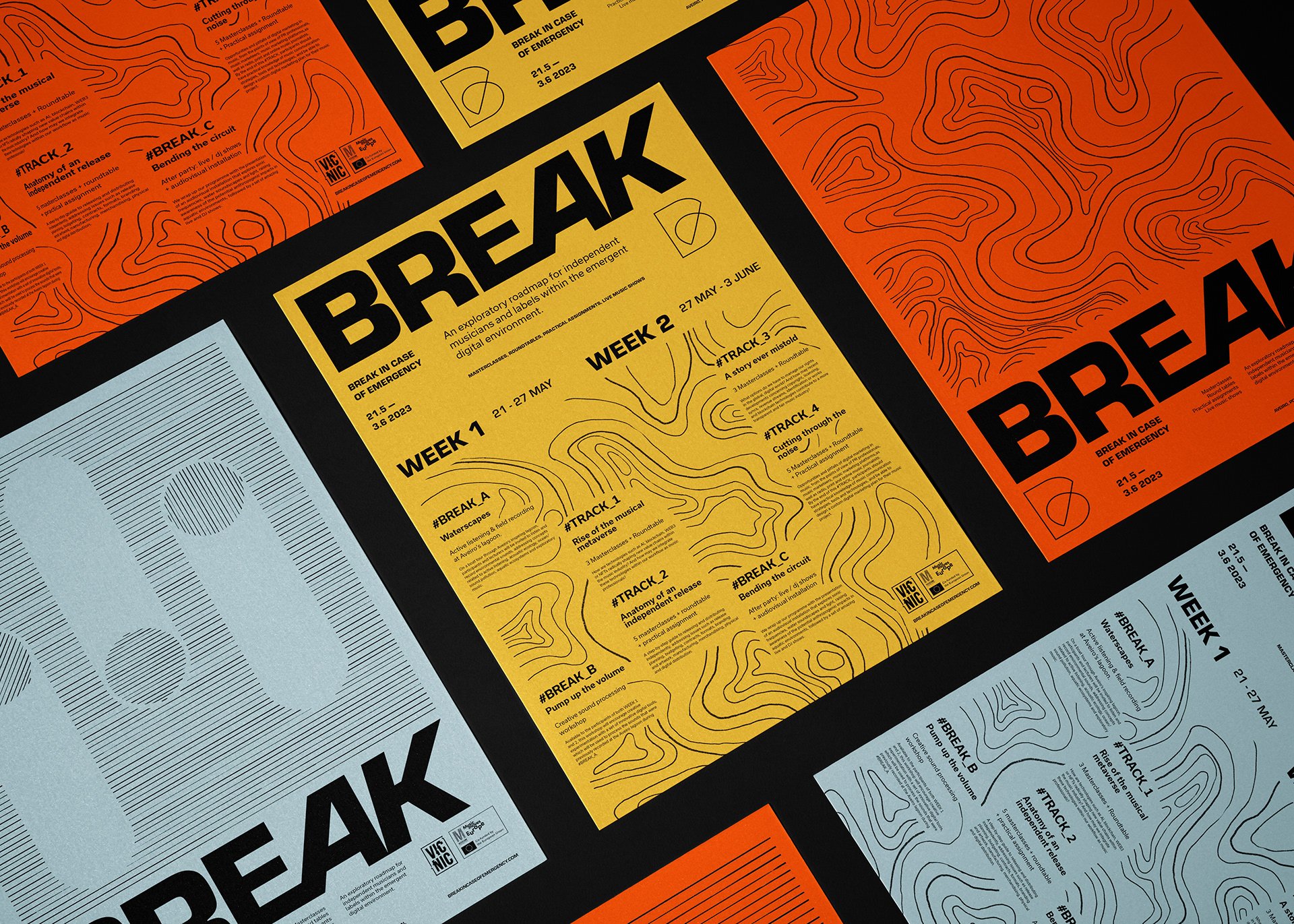
As in most of our projects, our focus immediately jumped to the typographic choice, having as a starting point the desire to use Eurostile by Aldo Novarese, who also designed the Forma that is the base of the Forma DJR (by David Jonathan Ross) that we use in our own identity.


The choice of Eurostile is justified by this:


Naturally, being sensitive people, we didn't want to abuse Eurostile's power, which we used in the logo (with a change to the A and K) and the titles and highlights. Complementary, we opted to resort again to Rui Abreu's R-Typography Usual, which we had already used in Ana Rita de Albuquerque's identity.
In addition to the technological inspiration, combining typography with strong and solid colours, we intended to bring another one more connected to the territory since the project has a substantial immersive component. This was achieved by introducing new colours and drawn elements with more organic looks.
The design project can already be seen in multiple supports, such as the website, posters and flyers, and social media.
Credits:
Creative Direction: Miguel Barbot, Maria Helena
Art Direction: Maria Helena
Graphic Design: Maria Helena, Mariana Teixeira, Sara Novais
Typography: Eurostile (Aldo Navorese) and Usual (R-Typography)