
Journal
In our blog, we tell stories about what we’re up to at the studio, our clients and the projects we are involved in. Here you can find complete case studies, photo reports or simply accounts of the beautiful things made by the creatives we work with.


How we made the GatewayCrafts identity
The challenge of GatewayCrafts Communication Design is to be itself an alluring gateway for potential students, as well as audiences looking for information and new discourses about creative industries, artisanal work and small-scale manufacturing. The goal is to communicate the project's positioning, what distinguishes it in this universe, demonstrate technical rigour with lightness and fluidity, and, above all, create curiosity.

How we made the BREAK IN CASE OF EMERGENCY identity
Hugo Branco from Vic - Aveiro Arts House and Navalha, Associação Cultural, challenged us to design the identity of Break In Case of Emergency 2023, a kind of festival dedicated to sharing practical knowledge on themes and trends that affect the music industry.
"BREAK IN CASE OF EMERGENCY is a two-week hybrid boot camp for independent musicians and labels, focused on exchanging practical skills concerning some of the most pressing aspects of today's independent music industry.”

How we made the ONEX. identity
Recently we finished the branding and graphic design strategy for a leading Portuguese catering solutions provider.
The challenge with ONEX (Onexperience Group) entailed simplifying how the brand is presented in different markets and developing a new identity and shared visual system for the seven companies composing the conglomerate.
We developed a comprehensive visual system to organize the brand presence in different media. The strategy was to put forward a strong presence, combining typographic elements with an expansible set of symbols and colours representing each of the present and future business areas.

How (and why) we made the new Ofício website
The project took several weeks, and, like all internal projects, creating a new website for Ofício was constantly pressured by the tight schedule of other things.
The need arose in 2021 when we launched the new Ofício identity. The site, which had evolved disorganizedly over the years, was no longer fulfilling its function, not even remotely. It didn't even respect the direction that Miguel Moreira had given our identity.

How we created Ana Paula Almeida's identity
Ana Paula Almeida, artist and maker, among many other things, came to us with a challenge. To think strategically about the brand, she was creating for a product and, based on that thought, to develop the entire visual identity.
The product in question is a lamp whose most distinctive feature (in addition to the design) is that it is built with wool yarn. These yarns are the leftover stock from the wool factory that now houses the New Hand Lab, a life project by Ana.
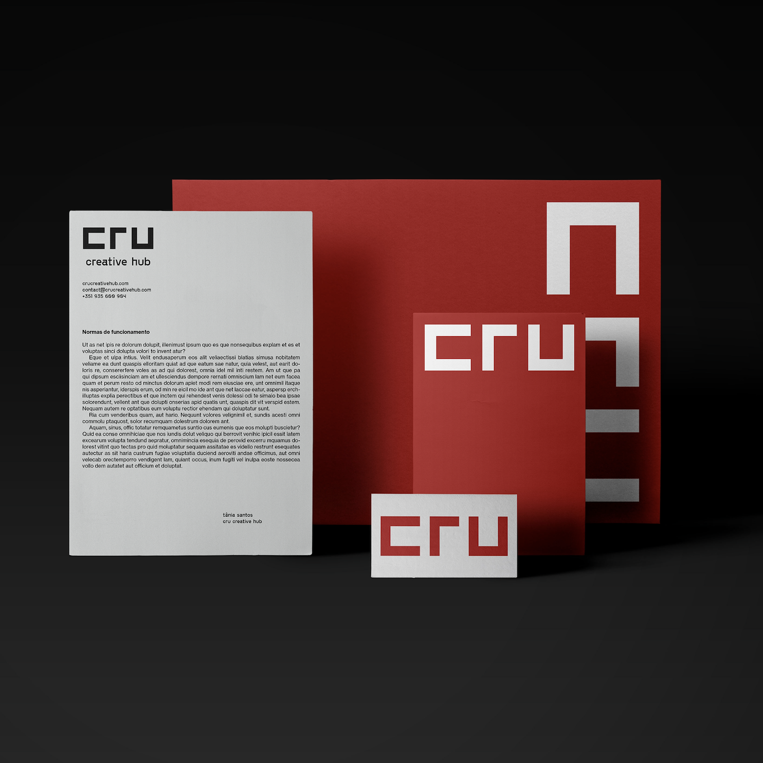
From co-work to creative hub: How we rebranded CRU
Cru was founded in 2012. The original logo was used for almost one decade until the founders asked us to help rebrand this iconic space in the heart of Porto's art district. By then, we had just finished a strategy project that repositioned Cru from a Cowork to a Creative Hub, something we will tell later in a different post.

SUST.CO
Today we returned to 2020 to tell the story of a project that still needed to be posted here.
The Sust.co identity was a challenge proposed by Sofia Ferreira, who later hired our strategic consultancy services. We can only tell you a few details about the project and the client's plans. Still, we can say that it is linked to one of our central themes, "Craft", which means beautiful things, handmade and/or on a small scale and to last.

How we did Ana Rita de Albuquerque’s identity
Within the team, the objective of positioning the work on a multidisciplinary level was clear: we got inspiration from the work's very delicate but very organic and visceral character. We also considered wool's primitive rawness and the dialogue with technology: an invisible but ever-present second layer in many of her artworks. Finally, we took visual clues from music and the early eighties' sombre bohemia.

How we did Prata’s identity
“In my research, Wassily Kandinsky's "Point and line to plane" informed most of the process: I love this book, a marvellous piece exploring graphic expression, painting and geometry theories with scientific precision, relating them with dance and music.”

How we did The Seed’s identity
In the weeks before starting the first drafts, Ricardo sent us his references, most of which were music-related. The '70s and early '80s rock bands were our starting point (do you remember when all the bands used to have a logo?), something very prevalent in the first drafts on paper.

How we did the Ofício’s identity
“When designing Oficio's new identity, I had the feeling of being in a delicate position. I was both the designer and the client, along with Miguel Barbot. Having these two hats on implies an extra responsibility. The final design must reflect our practice, the things we like, the incredible men and women we represent and our style. The briefing consisted of designing a new identity reflecting the artisanal work of the craftsman, artists and makers with whom Ofício works. However, Barbot kept saying, "don't forget: you must design something you will be proud to use in your card".

GRAMPA: a new identity for a historical department store in Porto’s Bolhão district
We started after Barbara's call asking Barbot's help in a crazy project of relaunching her grandparent's department store in downtown Porto. The new name, GRAMPA, refers to her heritage and the work of the previous generations, and a tool with the same name, a homage to handmade and small-scale production. It was a concise consulting project consisting of only three sessions.

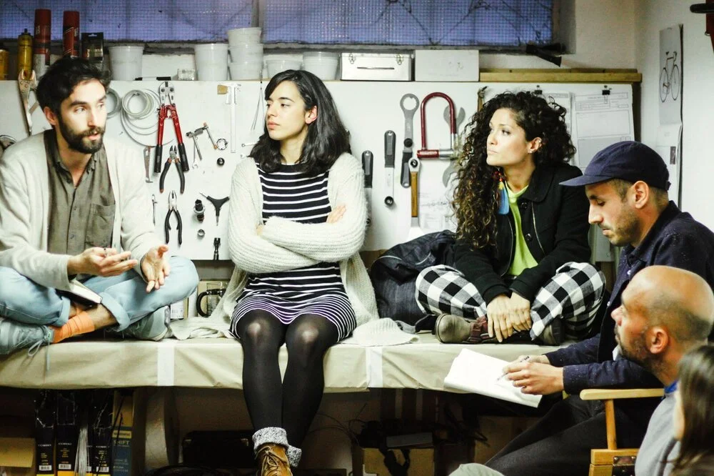
Velo Culture: Beautiful Bicycles (Bicicletas Bonitas)
Ofício recently finished a commission to Velo Culture, the illustration "Bicicletas Bonitas", which means Beautifull Bicycles in Portuguese, designed by Miguel Moreira. It will be a decade this year since I founded Velo Culture with two friends. The first Velo Culture bicycle shop opened in the early days of 2012 in Matosinhos, in the Fish Market. A few years later, we opened a second shop in Central Porto, which is now shared with the Ofício Studio.
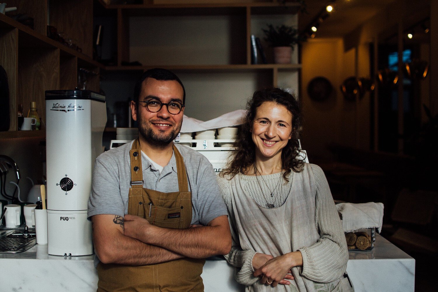
MANNA Food & Yoga, Porto
I met Sara and Helder in 2018. At the time, they proposed a challenge to plan the Manna project from scratch: a new restaurant and café in the heart of Porto. The vegan restaurant offers delicious food on-site, like sourdough bread, fermented veggies, speciality coffee, craft beer and natural wines. They also wanted to include a Yoga Studio with several classes running daily.
Conscious design, responsible consumption (video)
It has been one year since our brothers at Velo Culture, and our friends from Dome Ethical Store gathered together. On a stormy afternoon, Velo Culture hosted Dome Ethical Store and us to talk about Ethical Design.